
Join the Conversation
- Find Answers
- :
- Using Splunk
- :
- Splunk Search
- :
- How to create a custom table?
- Subscribe to RSS Feed
- Mark Topic as New
- Mark Topic as Read
- Float this Topic for Current User
- Bookmark Topic
- Subscribe to Topic
- Mute Topic
- Printer Friendly Page
- Mark as New
- Bookmark Message
- Subscribe to Message
- Mute Message
- Subscribe to RSS Feed
- Permalink
- Report Inappropriate Content
How to create a custom table?

Hello,
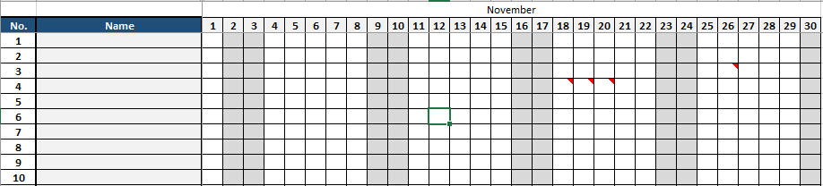
I want to create a table similar to the picture below, I have tried the table command but I can't seem to make it work. Is there any way? I also checked if I can work around the heatmap visualization but cannot seem to make it work. Any help is appreciated
- Mark as New
- Bookmark Message
- Subscribe to Message
- Mute Message
- Subscribe to RSS Feed
- Permalink
- Report Inappropriate Content

I think, you should be able to get your requirements meet with the answer from @cusello. However, In case you want to build custom dashboard you can consider using java script.
On the dashboard page you need to add your query with search tag.
<search id="cluster_details">
    <query>index= main sourcetype="data" | table hostname cluster_status</query>
  </search>
Then add a panel in the dashboard like following:
<row>
    <panel>
      <title>Table View</title>
      <html>
          <div id="table_data"></div>
      </html>
    </panel>

  </row>
In the JS , you need to fetch the results from the search query and prepare the table output as per your requirement.
function(mvc, SingleView, SearchManager) {
    var search_investigation = mvc.Components.get("table_data");
    if(search_pce_status){
        var abc = abc.data("results");
        search_pce_result.on("data",function(){
            console.log("In Data");
            if(abc.hasData()){
                var numRows = (abc.data().rows).length;
                console.log(numRows);
                var id = document.getElementById('pce_service_status');
                for(var index=0; index<numRows; index++){
                    create_service_div(id,"Not Running",abc.data().rows[index][0],"rgb(217, 63, 60);");
                    create_service_div(id,"Optional",abc.data().rows[index][2],"grey");
                    create_service_div(id,"Partial",abc.data().rows[index][1],"rgb(247, 188, 56);");
                    create_service_div(id,"Running",abc.data().rows[index][3],"rgb(101, 166, 55);");
                    create_service_div(id,"Unknown",abc.data().rows[index][4],"grey");

                }
            }
        });

        function create_service_div(parent,label,value,color){
    var col = document.createElement("div");
    col.setAttribute("class","css-class");
    var heading = document.createElement("div");
    heading.innerHTML = '<p class="css__font" style="color:'+color+'">'+label+':'+value+'</p>';
    col.appendChild(heading);
    parent.appendChild(col);
}

}
- Mark as New
- Bookmark Message
- Subscribe to Message
- Mute Message
- Subscribe to RSS Feed
- Permalink
- Report Inappropriate Content


Hi jannsenagustin,
To have the visualization you like, you have to build your search, something like this example
index=_* earliest=-1h@h latest=@h | chart count over index by date_minute limit=0
Otherwise, did you already seen in the Splunk 7.x Dashboard Examples? there is the Calendar Heatmap Visualization.
Or the Calendar Visualization app (downloadable from apps.splunk.com) that could be useful for you.
Bye.
Giuseppe



Join the Splunk Community Slack to learn, troubleshoot, and make connections with fellow Splunk practitioners in real time!
Join Splunk User Groups to connect and learn in-person by region or remotely by topic or industry.
Cisco Data Fabric from Architecture to Investigation, Better SOC Visibility, and More ...
The Trust Gap: Why a Data Foundation is Fundamental to an Agentic Enterprise
Data Management Digest – September 2026
