Are you a member of the Splunk Community?
- Find Answers
- :
- Using Splunk
- :
- Splunk Search
- :
- Re: How to change bar chart color based on its val...
- Subscribe to RSS Feed
- Mark Topic as New
- Mark Topic as Read
- Float this Topic for Current User
- Bookmark Topic
- Subscribe to Topic
- Mute Topic
- Printer Friendly Page
- Mark as New
- Bookmark Message
- Subscribe to Message
- Mute Message
- Subscribe to RSS Feed
- Permalink
- Report Inappropriate Content
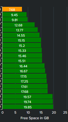
We are monitoring the C: drive free space of our whole infrastructure, and would like to create a bar chart with color coding based on different thresholds. We have tried different things in XML, in the query itself but nothing seems to be working for us... for now our query and graph looks like this:
|mstats latest(_value) as value WHERE metric_name=win:disk.Free_Megabytes AND index=myindex AND instance="C:" BY host
| eval Free Space (GB)=round((value)/1024,2)
|sort "Free Space (GB)" - asc | head 20
| table host "Free Space (GB)"
We would like to have a RED-AMBER-GREEN color based on the following limits RED= 0-3 AMBER 3-8 GREEN > 8
I have tried rangemap, and creating a new field based on these same limits to try to filter them in the XML but to no avail:
Any help in figuring this out is more than welcome.
Thanks!
- Mark as New
- Bookmark Message
- Subscribe to Message
- Mute Message
- Subscribe to RSS Feed
- Permalink
- Report Inappropriate Content
- Mark as New
- Bookmark Message
- Subscribe to Message
- Mute Message
- Subscribe to RSS Feed
- Permalink
- Report Inappropriate Content
You can actually do it by creating a new column for each of the ranges and store the Free GB in that column and then assign different colours to each of those 3 fields. Then if you configure your bar chart as stacked, you won't see any gaps between the bars for the null values.
See this example dashboard and look at how the result matrix is shaped. The fieldcolors config line defines the colours for each of the ranges.
<dashboard>
  <label>bars</label>
  <row>
    <panel>
      <chart>
        <search>
          <query>|makeresults count=20
| streamstats c
| eval host="host".c
| fields - c _time
| eval FreeGB=random() % 200000/10000
| rangemap field=FreeGB severe=0-2.99 elevated=3-7.99 low=8-100
| eval {range}=FreeGB
| sort FreeGB
| streamstats c
| fields - FreeGB range
| chart values(*) as * over host
| sort c
| fields - c</query>
          <earliest>-24h@h</earliest>
          <latest>now</latest>
          <sampleRatio>1</sampleRatio>
        </search>
        <option name="charting.axisLabelsX.majorLabelStyle.overflowMode">ellipsisNone</option>
        <option name="charting.axisLabelsX.majorLabelStyle.rotation">0</option>
        <option name="charting.axisTitleX.visibility">visible</option>
        <option name="charting.axisTitleY.text">Free Space in GB</option>
        <option name="charting.axisTitleY.visibility">visible</option>
        <option name="charting.axisTitleY2.visibility">visible</option>
        <option name="charting.axisX.abbreviation">none</option>
        <option name="charting.axisX.scale">linear</option>
        <option name="charting.axisY.abbreviation">none</option>
        <option name="charting.axisY.scale">linear</option>
        <option name="charting.axisY2.abbreviation">none</option>
        <option name="charting.axisY2.enabled">0</option>
        <option name="charting.axisY2.scale">inherit</option>
        <option name="charting.chart">bar</option>
        <option name="charting.chart.bubbleMaximumSize">50</option>
        <option name="charting.chart.bubbleMinimumSize">10</option>
        <option name="charting.chart.bubbleSizeBy">area</option>
        <option name="charting.chart.nullValueMode">gaps</option>
        <option name="charting.chart.showDataLabels">all</option>
        <option name="charting.chart.sliceCollapsingThreshold">0.01</option>
        <option name="charting.chart.stackMode">stacked</option>
        <option name="charting.chart.style">shiny</option>
        <option name="charting.drilldown">none</option>
        <option name="charting.fieldColors">{"severe": 0xFF0000, "elevated": 0xFF9900, "low":0x008000}</option>
        <option name="charting.layout.splitSeries">0</option>
        <option name="charting.layout.splitSeries.allowIndependentYRanges">0</option>
        <option name="charting.legend.labelStyle.overflowMode">ellipsisMiddle</option>
        <option name="charting.legend.mode">standard</option>
        <option name="charting.legend.placement">none</option>
        <option name="charting.lineWidth">2</option>
        <option name="height">502</option>
        <option name="refresh.display">progressbar</option>
        <option name="trellis.enabled">0</option>
        <option name="trellis.scales.shared">1</option>
        <option name="trellis.size">medium</option>
      </chart>
    </panel>
  </row>
</dashboard>
The syntax of
| eval {range}=FreeGB
will create a new column with the value of range and store the free GB in that.
Edited to include sorting
- Mark as New
- Bookmark Message
- Subscribe to Message
- Mute Message
- Subscribe to RSS Feed
- Permalink
- Report Inappropriate Content
- Mark as New
- Bookmark Message
- Subscribe to Message
- Mute Message
- Subscribe to RSS Feed
- Permalink
- Report Inappropriate Content
Hi @bowesmana ! Thanks so much for the detailed explanation, I had to adjust it to our metric and tag lookup but it worked like a charm!!
Thanks again!
- Mark as New
- Bookmark Message
- Subscribe to Message
- Mute Message
- Subscribe to RSS Feed
- Permalink
- Report Inappropriate Content
This is not possible with a bar chart. The bars for the series are drawn as a single shape so will all have the same colour.
- Mark as New
- Bookmark Message
- Subscribe to Message
- Mute Message
- Subscribe to RSS Feed
- Permalink
- Report Inappropriate Content
Thank you for your reply! it's a shame Splunk does not have an option to display different colors based on the value of a bar though... is there any app we could install to sort this out or any palliative action we could do?


