Are you a member of the Splunk Community?
- Find Answers
- :
- Using Splunk
- :
- Splunk Search
- :
- How do you make output from xyseries generate the ...
- Subscribe to RSS Feed
- Mark Topic as New
- Mark Topic as Read
- Float this Topic for Current User
- Bookmark Topic
- Subscribe to Topic
- Mute Topic
- Printer Friendly Page
- Mark as New
- Bookmark Message
- Subscribe to Message
- Mute Message
- Subscribe to RSS Feed
- Permalink
- Report Inappropriate Content
The following search:
sourcetype=my_log_type | timechart count by conn_type
generates the chart I want, with one exception: instead of the original conn_type (connection type) values, I want the chart to display more readable, descriptive values.
I want to replace the values after the timechart command. For reasons why, see my comment on a different question.
To rename the series, I append the following commands to the original search:
| untable _time conn_type value | lookup connection_types.csv conn_type output description | xyseries _time description value
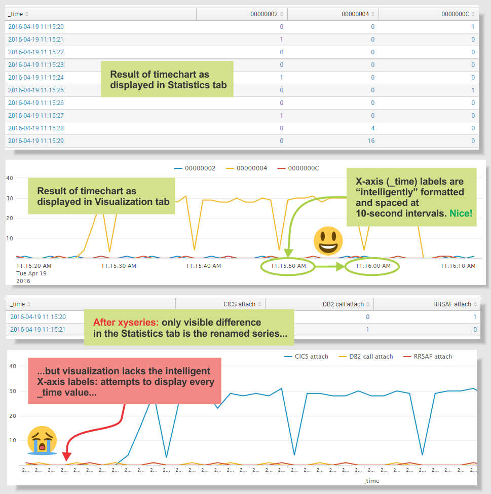
This has the desired effect of renaming the series, but the resulting chart lacks the intelligently formatted X-axis values generated by timechart.
How do I reproduce the intelligent X-axis values generated by timechart?
I do not want to hardcode span or bin values: I use this search in a dashboard whose time range might span years or fractions of a second. I want to take advantage of the way timechart chooses a default span based on the time range.
The following screenshots show the original "intelligent" X-axis labels generated by timechart, and the X-axis labels after xyseries:
- Mark as New
- Bookmark Message
- Subscribe to Message
- Mute Message
- Subscribe to RSS Feed
- Permalink
- Report Inappropriate Content
What about doing a stats and then a timechart?
sourcetype=my_log_type | bucket _time span=1s | stats count by _time, conn_type | lookup connection_types.csv conn_type output description | timechart sum(count) AS count by description
- Mark as New
- Bookmark Message
- Subscribe to Message
- Mute Message
- Subscribe to RSS Feed
- Permalink
- Report Inappropriate Content
I personally can not use timechart. Is there a way to do what timechart is doing with xyseries ?
EDIT: I found a solution:
I perform the xyseries, then the "untable", and then the timechart... But it really not efficient and optimized. That would be great to know exactly what the timechart command is doing...
- Mark as New
- Bookmark Message
- Subscribe to Message
- Mute Message
- Subscribe to RSS Feed
- Permalink
- Report Inappropriate Content
What about doing a stats and then a timechart?
sourcetype=my_log_type | bucket _time span=1s | stats count by _time, conn_type | lookup connection_types.csv conn_type output description | timechart sum(count) AS count by description
- Mark as New
- Bookmark Message
- Subscribe to Message
- Mute Message
- Subscribe to RSS Feed
- Permalink
- Report Inappropriate Content
Thank you, @Jeremiah! That works for me.
I've removed the span=1soption after reading the docs: bucket (and bin) seem to share the same default spanning behavior as timechart. I've also replaced the bucket command name with bin, because - tell me if I'm wrong - the bin command seems to be the "primary" command (for which bucket is an alias): the Splunk docs topic for bucket refers the reader to the bin topic.
I'd like to convert your comment into an answer so that I can accept it, but I can't see how to do that. I'm guessing I lack the authority - or karma points - for that option to appear in my user interface. Could you (or anyone reading this) please do that for me, or point me to where I can do that myself?
So, pushing timechart to the end of the search solves my problem. I'm still curious, though: timechart seems to be "doing stuff under the covers" (perhaps: generating "internal use only fields" that Splunk "hides" from users?) that I do not (yet?) have the wit to see.
- Mark as New
- Bookmark Message
- Subscribe to Message
- Mute Message
- Subscribe to RSS Feed
- Permalink
- Report Inappropriate Content
Looks like it is now an answer 🙂 accept away!

