Are you a member of the Splunk Community?
- Find Answers
- :
- Using Splunk
- :
- Splunk Search
- :
- How do you make a chart with repeating x axis valu...
- Subscribe to RSS Feed
- Mark Topic as New
- Mark Topic as Read
- Float this Topic for Current User
- Bookmark Topic
- Subscribe to Topic
- Mute Topic
- Printer Friendly Page
- Mark as New
- Bookmark Message
- Subscribe to Message
- Mute Message
- Subscribe to RSS Feed
- Permalink
- Report Inappropriate Content
How do you make a chart with repeating x axis values?
Hi all,
I have 2 columns like that I want to plot:
x y
1579 1
1707 2
1707 3
1707 4
1707 5
1707 6
1707 7
1707 8
1707 9
1707 10
When I see the visualization with this search command:
source="splunk_test1.txt" host="Sriharshas-MacBook-Pro.local" sourcetype="temp" | table x, y | sort y
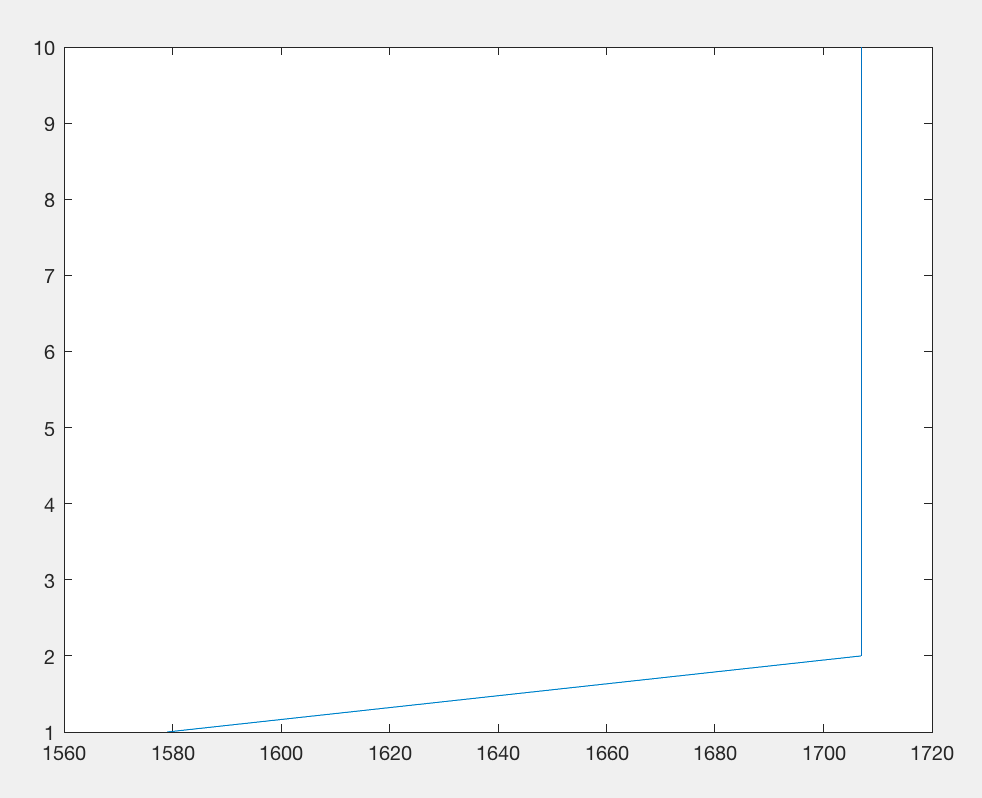
I get a plot like this:
But I am looking for a plot like this:
What should be my search command to get the required plot?
Thanks in advance!
- Mark as New
- Bookmark Message
- Subscribe to Message
- Mute Message
- Subscribe to RSS Feed
- Permalink
- Report Inappropriate Content
source="splunk_test1.txt" host="Sriharshas-MacBook-Pro.local" sourcetype="temp" | table x, y | sort y | stats max(x) by y
Instead of max(x), you could also try sum(x), depending on what that data represents
- Mark as New
- Bookmark Message
- Subscribe to Message
- Mute Message
- Subscribe to RSS Feed
- Permalink
- Report Inappropriate Content
This command:
source="splunk_test1.txt" sourcetype="temp" | table x, y | sort y | stats sum(x) as x1 by y | sort y
treats x1 as integer, but the plot is with x and y axis interchanged.
When I do this:
source="splunk_test1.txt" sourcetype="temp" | table x, y | sort y | stats sum(x) as x1 by y | sort y | table x1, y
I get the same plot as the one in the question.
It looks like, with repeating x-axis values (to generate a vertical line), the plotting routine changes the data type of the x-axis values.
I also tried this command to avoid repeating x-axis values:
source="splunk_test1.txt" sourcetype="temp" | table x, y | sort y | eval x = x+y
Even with this, I get the similar plot as the one in question


