
Join the Conversation
- Find Answers
- :
- Using Splunk
- :
- Splunk Search
- :
- How do you create 2 variables Y axis column cha...
- Subscribe to RSS Feed
- Mark Topic as New
- Mark Topic as Read
- Float this Topic for Current User
- Bookmark Topic
- Subscribe to Topic
- Mute Topic
- Printer Friendly Page
- Mark as New
- Bookmark Message
- Subscribe to Message
- Mute Message
- Subscribe to RSS Feed
- Permalink
- Report Inappropriate Content

Hello, I want create a column chart with 2 y-axis variables (AP and FP). I want AP to be the number of bars on the X axis and FP to be the color of bars. For example IF AP is 0 and FP is 0 we have 4 green bars, when AP is 4 and FP is 0 we have 1 green bar. If FP changes, the color of the bars changes. If AP changes the number of bars change .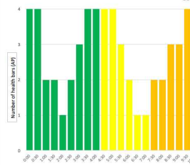
- Mark as New
- Bookmark Message
- Subscribe to Message
- Mute Message
- Subscribe to RSS Feed
- Permalink
- Report Inappropriate Content

You just need to make FP your series value, set the colors for each series, and do a stacked bar chart.
I have no idea in the world how you figure your number of bars. An AP value of 0 gets 4 bars, a value of 4 gets 0 bars? Not a clue. Just feed the chart the number of bars you want.
- Mark as New
- Bookmark Message
- Subscribe to Message
- Mute Message
- Subscribe to RSS Feed
- Permalink
- Report Inappropriate Content
Okay, you'll have to figure out whether you are looking for sum, max, avg, first, last or whatever for the AP and FUP values in any give one hour period, and adjust the stats command accordingly...
index=sandvine sourcetype=sql subscriber_name="$subscriberid$"
| bin _time span=1h
| stats sum(subscriber_ap) as SAP sum(subscriber_fup) as FUP
| eval chartbars=round(SAP/50)
| eval chartcolor=case(FUP>=150,"orange", FUP>=100,"yellow", true(),"green")
| timechart span=1h max(chartbars) by chartcolor
Then set the chart format to stacked, so that you wont get empty slots for the other two.
You may need some fiddling after that as per this page... http://docs.splunk.com/Documentation/Splunk/6.2.4/Viz/Chartcustomization ... to make green come out green and so on, but the basics are there for you.
- Mark as New
- Bookmark Message
- Subscribe to Message
- Mute Message
- Subscribe to RSS Feed
- Permalink
- Report Inappropriate Content
You just need to make FP your series value, set the colors for each series, and do a stacked bar chart.
I have no idea in the world how you figure your number of bars. An AP value of 0 gets 4 bars, a value of 4 gets 0 bars? Not a clue. Just feed the chart the number of bars you want.
- Mark as New
- Bookmark Message
- Subscribe to Message
- Mute Message
- Subscribe to RSS Feed
- Permalink
- Report Inappropriate Content

- Mark as New
- Bookmark Message
- Subscribe to Message
- Mute Message
- Subscribe to RSS Feed
- Permalink
- Report Inappropriate Content
Hello DalJeanis
I have two variables subscriber_ap and subscriber_fup. AP being a scale of 0- 4. FUP being a colour. So lets say you got subscriber_ap on 100 (it should mark on 2 on the y-axis) and subscriber_fup is on 200 it should put the color Red. I have used the commands attached but still no joy!




Join the Splunk Community Slack to learn, troubleshoot, and make connections with fellow Splunk practitioners in real time!
Join Splunk User Groups to connect and learn in-person by region or remotely by topic or industry.
Data Management Digest – September 2026
Federated Search for CloudWatch Unified Data Store Is Generally Available
Announcing Modern Navigation: A New Era of Splunk User Experience
