- Find Answers
- :
- Using Splunk
- :
- Splunk Search
- :
- Frequency Distribution charts?
- Subscribe to RSS Feed
- Mark Topic as New
- Mark Topic as Read
- Float this Topic for Current User
- Bookmark Topic
- Subscribe to Topic
- Mute Topic
- Printer Friendly Page
- Mark as New
- Bookmark Message
- Subscribe to Message
- Mute Message
- Subscribe to RSS Feed
- Permalink
- Report Inappropriate Content
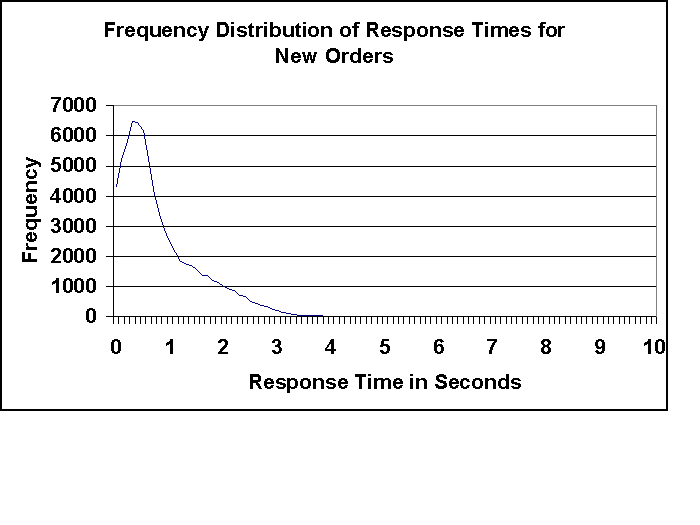
How can I compute a frequency distribution chart?
For example I want to take the time_taken from my IIS web-server log and plot it as a frequency distribution chart to figure out the execution time distribution.
So I can create images like the one below to figure out how well my actual server response time is like.

- Mark as New
- Bookmark Message
- Subscribe to Message
- Mute Message
- Subscribe to RSS Feed
- Permalink
- Report Inappropriate Content
If you want to use absolute values, just doing something like this should be enough (unless I'm misinterpreting what you want):
... | stats count by time_taken
...then go into the stats option and choose a line chart.
If you have many unique values for time_taken and want to group them together, you could use the bucket command for that.
