- Find Answers
- :
- Using Splunk
- :
- Splunk Search
- :
- Re: Can you help me format the x-axis of a timecha...
- Subscribe to RSS Feed
- Mark Topic as New
- Mark Topic as Read
- Float this Topic for Current User
- Bookmark Topic
- Subscribe to Topic
- Mute Topic
- Printer Friendly Page
- Mark as New
- Bookmark Message
- Subscribe to Message
- Mute Message
- Subscribe to RSS Feed
- Permalink
- Report Inappropriate Content
Can you help me format the x-axis of a timechart?
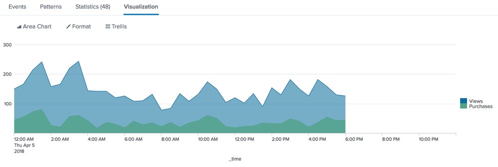
How do I format the x-axis to look like the first picture from the timechart documentation? To clarify,I want to have grouped labels for the hour, day / month, and year.
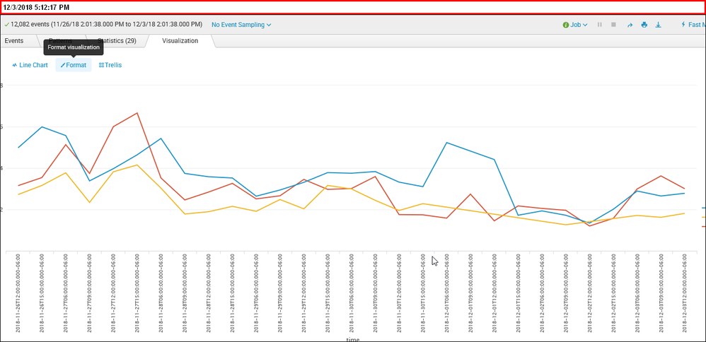
Currently, my x-axis looks like the second image.
Thanks for any help
- Mark as New
- Bookmark Message
- Subscribe to Message
- Mute Message
- Subscribe to RSS Feed
- Permalink
- Report Inappropriate Content
Hi,
your line chart looks like it is not coming from the timechart command.
Do you use the _time field? Or just time with values of the format %FT%T%z.
I tried to copy your effect and avoid using timechart on some internal data (last 24h):
index = _internal sourcetype=splunkd component=*process*
| stats count by component _time
| eval _time=strftime(_time,"%FT%T%z")
| xyseries _time component count
Even then the splunk search visulization formats my x axis of the line chart with "good" time labels.
But if I use this instead:
    index = _internal sourcetype=splunkd component=*process*
    | stats count by component _time
    | eval time=strftime(_time,"%FT%T%z")
    | xyseries time component count
The labels of the x axis look like in your chart.
Does this help?
Björn
- Mark as New
- Bookmark Message
- Subscribe to Message
- Mute Message
- Subscribe to RSS Feed
- Permalink
- Report Inappropriate Content
eventtype=SummaryTiming
| eval server=substr(source, 11, 6)
| search FunctionAction=ll.browse AND server=wfe* AND date_hour>=6 AND date_hour<18
| timechart cont=FALSE span=3h
  eval(round(avg(ExecutionTime),2)) as AvgExec
  by server
- Mark as New
- Bookmark Message
- Subscribe to Message
- Mute Message
- Subscribe to RSS Feed
- Permalink
- Report Inappropriate Content
Thanks for the help, I've posted my query above and I'm using the timechart in it. I ran your query and got the same display results initially but as it got more stats, splunk formatted the x-axis. To be clear, I want to get the formatting shown in the first image.
- Mark as New
- Bookmark Message
- Subscribe to Message
- Mute Message
- Subscribe to RSS Feed
- Permalink
- Report Inappropriate Content
timechart will format the x-axis for you depending on the timeframe and span you are using.
- Mark as New
- Bookmark Message
- Subscribe to Message
- Mute Message
- Subscribe to RSS Feed
- Permalink
- Report Inappropriate Content
Try this
| timechart .....
| fieldformat _time = strftime(_time, "%Y-%m-%d %H:%M")
- Mark as New
- Bookmark Message
- Subscribe to Message
- Mute Message
- Subscribe to RSS Feed
- Permalink
- Report Inappropriate Content
I uploaded what my graph currently looks like, is there a way to make the x-axis be formatted like the first image?


