Are you a member of the Splunk Community?
- Find Answers
- :
- Apps & Add-ons
- :
- Splunk Development
- :
- Splunk Dev
- :
- Color the graph depending of count
- Subscribe to RSS Feed
- Mark Topic as New
- Mark Topic as Read
- Float this Topic for Current User
- Bookmark Topic
- Subscribe to Topic
- Mute Topic
- Printer Friendly Page
- Mark as New
- Bookmark Message
- Subscribe to Message
- Mute Message
- Subscribe to RSS Feed
- Permalink
- Report Inappropriate Content
Hello,
I have different server running the same process. I like to count the "ERROR" in the logfile and the color of the graph should change depending on the number of errors. Like 0 to 2 error = green, 3 to 10 error yellow and above 11 error red. How can I realize this in a report.
My search is
index="Index_name" SEARCHSTRING |stats count by host
What I have to add, the the color of an host changes if the number of SEARCHSTRING is like written above.
Thx for your help.
- Mark as New
- Bookmark Message
- Subscribe to Message
- Mute Message
- Subscribe to RSS Feed
- Permalink
- Report Inappropriate Content
Hey which version of Splunk you are using?
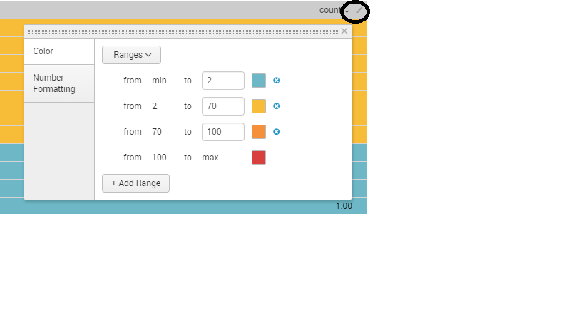
There is a formatting option available in newer version of splunk
Click on the Paint symbol>>Color>>Select Ranges and then specify ranges and give appropriate color.
let me know if this helps!
- Mark as New
- Bookmark Message
- Subscribe to Message
- Mute Message
- Subscribe to RSS Feed
- Permalink
- Report Inappropriate Content
- Mark as New
- Bookmark Message
- Subscribe to Message
- Mute Message
- Subscribe to RSS Feed
- Permalink
- Report Inappropriate Content
Hello,
this only works on tables. I need it for a graph. I want, that the graph changes its color depending on the count. Just like in the table.
- Mark as New
- Bookmark Message
- Subscribe to Message
- Mute Message
- Subscribe to RSS Feed
- Permalink
- Report Inappropriate Content
Sorry, I forgot my Version. It is 7.0.2
- Mark as New
- Bookmark Message
- Subscribe to Message
- Mute Message
- Subscribe to RSS Feed
- Permalink
- Report Inappropriate Content
which graph you are using ?
have you look at this two answers?
https://answers.splunk.com/answers/145120/bar-chart-column-color-based-on-value.html
https://answers.splunk.com/answers/58335/change-chart-bar-color-based-on-data-value.html
- Mark as New
- Bookmark Message
- Subscribe to Message
- Mute Message
- Subscribe to RSS Feed
- Permalink
- Report Inappropriate Content
Here is how
Create a new variable for each color of bar that you want: redCount, yellowCount, greenCount - for example
Assign the count value to the appropriate variable
Create a stacked column chart (or a stacked bar chart if you want it horizontally)
Put the chart in a dashboard, so that you can set the color attributes for the bars
Here is a simple XML example of the code snippet for a chart that should work:
 <chart>
       <searchString>index="Index_name" SEARCHSTRING |stats count by host
         | eval redCount = if(count>=11,count,0)
         | eval yellowCount = if(count<=3 AND count>=10,count,0)
         | eval greenCount = if(count<=2, count, 0)
         | fields - count</searchString>
       <title>Server Errors by Host - Last  24 hours</title>
       <earliestTime>-24h@h</earliestTime>
       <latestTime>@h</latestTime>
       <option name="charting.chart">column</option>
       <option name="charting.chart.stackMode">stacked</option>
       <option name="charting.fieldColors">{"redCount":0xFF0000,"yellowCount":0xFFFF00, "greenCount":0x73A550}</option>
       <option name="charting.legend.placement">none</option>
       <option name="charting.legend.placement">none</option>
       <option name="charting.axisLabelsX.majorLabelStyle.rotation">90</option>
     </chart>
Note that the last option sets the X-axis labels to print vertically on the column chart. If you prefer, you could set the charting.chart option to "bar" and then eliminate the option for charting.axisLabelsX.majorLabelStyle.rotation
- Mark as New
- Bookmark Message
- Subscribe to Message
- Mute Message
- Subscribe to RSS Feed
- Permalink
- Report Inappropriate Content
Hello mayurr98,
that helped. Thank you very much. I have to change the "<" and ">" to "<" and ">" but after that it works. Really great.

