- Find Answers
- :
- Using Splunk
- :
- Other Using Splunk
- :
- Reporting
- :
- Stacked bar graph that answer a question yes or no
- Subscribe to RSS Feed
- Mark Topic as New
- Mark Topic as Read
- Float this Topic for Current User
- Bookmark Topic
- Subscribe to Topic
- Mute Topic
- Printer Friendly Page
- Mark as New
- Bookmark Message
- Subscribe to Message
- Mute Message
- Subscribe to RSS Feed
- Permalink
- Report Inappropriate Content
I am a newbie to Splunk, I have found that I have been able to re-create most of my reports and build them out into a usable dashboard or report. I have one that I just cannot seem to get correct or all the information into the correct way. So here is what I have
(Source) email=*, recipient_group="*", reported_phish="*" | timechart count(reported_phish) by recipient_group
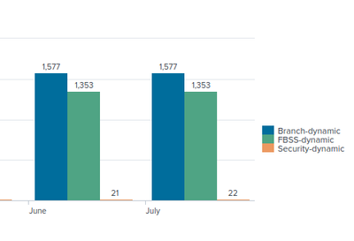
This gets me real close,it will split out the report into the three departments and give a total of all the email phishing scenarios available in the reported_phish field in grand total. If I change the reported_phish="Yes" I get everyone that has reported the phishing test or if I use reported_phish="No" I get the same for the people who have not reported the phish email, so I believe that the data I need is there for my graph.
What my final outcome would be is have the chart where every department has the count of yes or no answers in a total. below shows the grand totals and I would like to split the department to reflect yes and no along with the grand total. Again I apologize for not being able to find the answer. I have tried to split, append, different charts from the community and google and I am just drawing a total blank
Thank You in advance
Jeff
- Mark as New
- Bookmark Message
- Subscribe to Message
- Mute Message
- Subscribe to RSS Feed
- Permalink
- Report Inappropriate Content
ITWhisperer,
I do thank you for taking the time to answer my question. I didn't think of working in the X and Y axis of the chart to get different out comes other than from a search point of view. I will have to dive deeper into that part to see, if any other results can be found in the layout.
Again Thank you
Jeff
- Mark as New
- Bookmark Message
- Subscribe to Message
- Mute Message
- Subscribe to RSS Feed
- Permalink
- Report Inappropriate Content
The standard chart does not offer the capability you are after. Essentially, you have an x-axis (date in your case), a y-axis (count in your case), and a number of series (department in your case). These series can either be displayed side-by-side (as you have shown), or stacked. The functionality you require is for the series to be subdivided into yes/no and the departments to be side-by-side and the yes/no to be stacked within the departments. I have not seen a chart which matches this but that's not to say there isn't one.
- Mark as New
- Bookmark Message
- Subscribe to Message
- Mute Message
- Subscribe to RSS Feed
- Permalink
- Report Inappropriate Content
ITWhisperer,
I do thank you for taking the time to answer my question. I didn't think of working in the X and Y axis of the chart to get different out comes other than from a search point of view. I will have to dive deeper into that part to see, if any other results can be found in the layout.
Again Thank you
Jeff

