Join the Conversation
- Find Answers
- :
- Using Splunk
- :
- Other Using Splunk
- :
- Reporting
- :
- How to choose category colors in Treemap visualiza...
- Subscribe to RSS Feed
- Mark Topic as New
- Mark Topic as Read
- Float this Topic for Current User
- Bookmark Topic
- Subscribe to Topic
- Mute Topic
- Printer Friendly Page
- Mark as New
- Bookmark Message
- Subscribe to Message
- Mute Message
- Subscribe to RSS Feed
- Permalink
- Report Inappropriate Content
How to choose category colors in Treemap visualization
Hi everyone,
i'm having a little trouble with a Treemap visualization.
I'm using Splunk Enterprise v8.2.5 and Treemap is a custom Splunk visualization (I downloaded from splunkbase at this page).
I wanted to create a treemap with a dataset that, after aggregation, looks like the following table:
| category | subcategory | size | status |
| A | a | 1 | low |
| A | b | 2 | low |
| A | c | 10 | high |
| B | a | 5 | low |
| B | b | 3 | medium |
| B | c | 4 | high |
| C | a | 1 | medium |
| C | b | 2 | high |
| D | b | 7 | low |
| D | c | 5 | high |
In this example, the first level of the treemap hierarchy (parent category field) is represented by the field called "category"; the field "subcategory" represents the second level (child category field), the "size" field represents the numerical value by which each rectangle should be sized and the "status" field should set the color of each rectangle.
Here it is a sample XML for a dashboard with a treemap visualization based on some dummy data that looks like the above example:
<dashboard>
  <label>treemap example</label>
  <row>
    <panel>
      <viz type="treemap_app.treemap">
        <search>
          <query>| makeresults
| eval size=1, status="low", category="A", subcategory="a"
| append
    [| makeresults
    | eval size=2, status="low", category="A", subcategory="b" ]
| append
    [| makeresults
    | eval size=10, status="high", category="A", subcategory="c" ]
| append
    [| makeresults
    | eval size=5, status="low", category="B", subcategory="a" ]
| append
    [| makeresults
    | eval size=3, status="medium", category="B", subcategory="b" ]
| append
    [| makeresults
    | eval size=4, status="high", category="B", subcategory="c" ]
| append
    [| makeresults
    | eval size=1, status="medium", category="C", subcategory="a" ]
| append
    [| makeresults
    | eval size=2, status="high", category="C", subcategory="b" ]
| append
    [| makeresults
    | eval size=7, status="low", category="D", subcategory="b" ]
| append
    [| makeresults
    | eval size=5, status="high", category="D", subcategory="c" ]
| table category, subcategory, size, status
|  stats first(size) as size by category, subcategory, status</query>
          <earliest>-24h@h</earliest>
          <latest>now</latest>
          <sampleRatio>1</sampleRatio>
        </search>
        <option name="drilldown">none</option>
        <option name="refresh.display">progressbar</option>
        <option name="treemap_app.treemap.colorMode">categorical</option>
        <option name="treemap_app.treemap.maxCategories">10</option>
        <option name="treemap_app.treemap.maxColor">#dc4e41</option>
        <option name="treemap_app.treemap.minColor">#53a051</option>
        <option name="treemap_app.treemap.numOfBins">9</option>
        <option name="treemap_app.treemap.showLabels">true</option>
        <option name="treemap_app.treemap.showLegend">true</option>
        <option name="treemap_app.treemap.showTooltip">true</option>
        <option name="treemap_app.treemap.useColors">true</option>
        <option name="treemap_app.treemap.useZoom">true</option>
        <option name="trellis.enabled">0</option>
        <option name="trellis.scales.shared">1</option>
        <option name="trellis.size">medium</option>
      </viz>
    </panel>
  </row>
</dashboard>
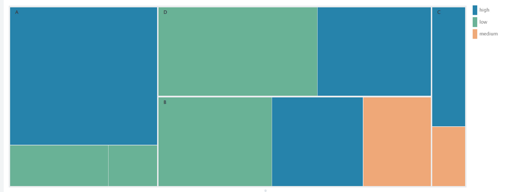
Below there is a screenshot of the result:
Treemap documentation says to use the following query to set a custom color based on a field different from the parent category field:
... | stats <stats_function>(<metric_field>) <stats_function>(<color_field>) by <parent_category_field> <child_category_field>
so first I tried the following query:
... | stats first(size) as size, first(status) as status by category, subcategory
but Splunk was returning this error:
Error rendering Treemap visualization: Check the Statistics tab.
To build a treemap with colors determined by a color field, the results table must include columns representing these four fields: <category>, <name>, <metric>, and <color>. The <color> and <metric> field values must be numeric.
So apparently both the metric and color aggregations must be numeric (side note: this is not explained in the documentation).
Then I tried this query:
... | stats first(size) as size by category, subcategory, status
i.e. I put the "status" field as 3-rd level grouping.
This time the visualization seems to work as I intended, i.e. the color of each rectangle is decided by the value of the status field (as seen in the screenshot above). However, it is not possibile to change the default color palette.
For my application I would like to set the color using this mapping:
- green when status="low"
- yellow when status="medium"
- red when status="high"
So far I was not able to find a way to modify the visualization (through the XML definition) in order to set a custom color mapping.
Does anyone know a way to do this?

