- Find Answers
- :
- Using Splunk
- :
- Dashboards & Visualizations
- :
- geostats how to add the country name
- Subscribe to RSS Feed
- Mark Topic as New
- Mark Topic as Read
- Float this Topic for Current User
- Bookmark Topic
- Subscribe to Topic
- Mute Topic
- Printer Friendly Page
- Mark as New
- Bookmark Message
- Subscribe to Message
- Mute Message
- Subscribe to RSS Feed
- Permalink
- Report Inappropriate Content
Hi there!
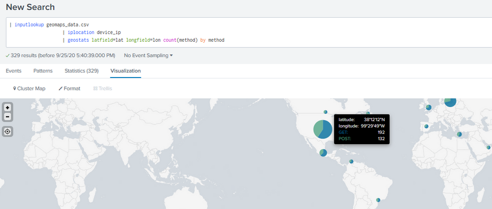
I'm playing a bit with the geostats sample from the Splunk Dashboards Example App. The samples produces a map with a breakdown by method (GET / POST) based on the coordinates creates a pie chart on the location.
The sample query looks pretty simple...
| inputlookup geomaps_data.csv
| iplocation device_ip
| geostats latfield=lat longfield=lon count(method) by method
I've tried adding the Country name to show up on the tooltip box but I didn't have any luck. My goal is to keep the breakdown for the methods to then color code the charts as well as add the Country name on top of the methods.
Any ideas on how can I accomplish that?
TIA!
- Mark as New
- Bookmark Message
- Subscribe to Message
- Mute Message
- Subscribe to RSS Feed
- Permalink
- Report Inappropriate Content
Values shown up from field given in by clause. You can show up only two axis. Count and country or count and menthod.
If this helps, give a like below.
- Mark as New
- Bookmark Message
- Subscribe to Message
- Mute Message
- Subscribe to RSS Feed
- Permalink
- Report Inappropriate Content
Values shown up from field given in by clause. You can show up only two axis. Count and country or count and menthod.
If this helps, give a like below.
- Mark as New
- Bookmark Message
- Subscribe to Message
- Mute Message
- Subscribe to RSS Feed
- Permalink
- Report Inappropriate Content
How about values(country) on geostats?
r. Ismo

