Dashboards & Visualizations

Why are there differences in Cluster Map visualization with the same search and data?

gcusello
SplunkTrust
SplunkTrust

Hi at all,

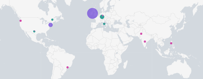
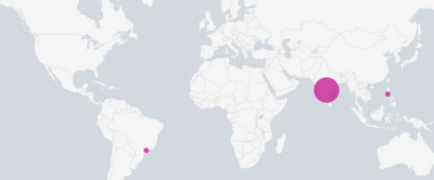
I found a difference in visualization of Cluster Map between dashboard and Search (or refreshing the panel) using the same data and search.

In dashboard
gcusello_0-1658819514265.png

in Search or refreshing the panel:

gcusello_1-1658819542098.png

As you can see the same data give different visualization .

Anyone has some idea why this happens?

Ciao.

Giuseppe

Labels (1)
Tags (1)
0 Karma
Got questions? Get answers!

Join the Splunk Community Slack to learn, troubleshoot, and make connections with fellow Splunk practitioners in real time!

Meet up IRL or virtually!

Join Splunk User Groups to connect and learn in-person by region or remotely by topic or industry.

Get Updates on the Splunk Community!

Persistent Queue at TcpOut — One of Splunk's Most Practical Features

Splunk introduced persistent queueing at the tcpout layer as one of the most practical resilience features in ...

Skip the Awkward Silence: Have a .conf-ersation at .conf26

Picture this. You arrive at .conf26 already having your socializing and networking plans mapped out. No ...

Rethinking Zero Trust: From Product Purchases to Logical Control Evidence

Implementing Zero Trust (ZT) across complex environments often falters at the very beginning due to a ...