- Find Answers
- :
- Using Splunk
- :
- Dashboards & Visualizations
- :
- Visual Dashboard using 4 fields in Stats count
- Subscribe to RSS Feed
- Mark Topic as New
- Mark Topic as Read
- Float this Topic for Current User
- Bookmark Topic
- Subscribe to Topic
- Mute Topic
- Printer Friendly Page
- Mark as New
- Bookmark Message
- Subscribe to Message
- Mute Message
- Subscribe to RSS Feed
- Permalink
- Report Inappropriate Content
I'm trying to create a visual dashboard (specifically a column graph or bar chart) using
index=guardium ruleDesc="OS Command Injection"
| stats count by dbUser, DBName, serviceName, sql
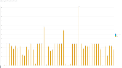
This is the graph I get:
I would like to group these fields into categories on the chart where one part would show count of 1-5 then 6-10...and so on. Then I could drill down a specific bar within the count group to view the fields for that bar in a table format. How would I go about doing this. I am new to splunk and have been stuck finding the best way to represent this data. I was given this search statement and was told to make a visual dashboard of it.
- Mark as New
- Bookmark Message
- Subscribe to Message
- Mute Message
- Subscribe to RSS Feed
- Permalink
- Report Inappropriate Content
You would do a second stats to roll them up like this ...
index=guardium ruleDesc="OS Command Injection"
| stats count by dbUser, DBName, serviceName, sql
| eval category = case(
    count < 6, "1-5",
    count < 11, "6-10",
    count < 16, "11-15",
    1==1, "16+"
)
| stats count by category
Then you would set up a drilldown on the chart to pass a token to another search and limit it based on the token..

