Join the Conversation
- Find Answers
- :
- Using Splunk
- :
- Dashboards & Visualizations
- :
- Re: Table customization Phone looking table CSS, p...
- Subscribe to RSS Feed
- Mark Topic as New
- Mark Topic as Read
- Float this Topic for Current User
- Bookmark Topic
- Subscribe to Topic
- Mute Topic
- Printer Friendly Page
- Mark as New
- Bookmark Message
- Subscribe to Message
- Mute Message
- Subscribe to RSS Feed
- Permalink
- Report Inappropriate Content

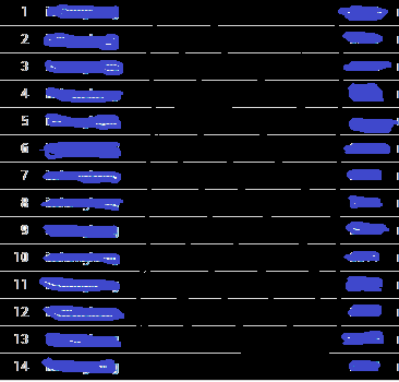
Would it possible to make that happen or the closest to it? A direction to the right path would be appreciate it in terms o modifying table css.
THANKS A LOT IN ADVANCE!
- Mark as New
- Bookmark Message
- Subscribe to Message
- Mute Message
- Subscribe to RSS Feed
- Permalink
- Report Inappropriate Content
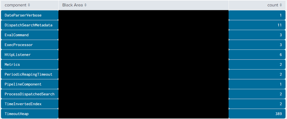
@Anmar0293 although your business purpose is still not clear for me, as per your request please find below the CSS overrides as requested. PS: Table Cell Color can be changed using Simple XML itself post 6.5 using UI --> Edit --> Format Table Cell option.
Following is the run anywhere dashboard code:
<dashboard>
  <label>Table formatting</label>
  <row>
    <panel>
      <html>
        <style>
          <!-- Width %: 1st Column=20%, 2nd Colum=60%, 3rd Column=20%-->
          #my_table thead th[data-sort-key="component"],
          #my_table thead th[data-sort-key="count"]{
            width:20% !important;
          }
          <!-- Index of component column is 0 and that of count is 2 -->
          #my_table tbody tr td[data-cell-index="0"],
          #my_table tbody tr td[data-cell-index="2"]{
            color: rgb(255, 255, 255) !important;
            background-color: rgb(0, 109, 156) !important;
            border-top-style: solid !important;
            border-bottom-style: solid !important;
            border-color: white !important;
            border-width: .1px !important;
            border-radius: 5px !important;
          }
        </style>
      </html>
      <table id="my_table">
        <search>
          <query>index=_internal sourcetype=splunkd log_level!=INFO
| stats count by component
| eval "Black Area"=""
| table component "Black Area" count</query>
          <earliest>-24h@h</earliest>
          <latest>now</latest>
          <sampleRatio>1</sampleRatio>
        </search>
        <option name="count">20</option>
        <option name="dataOverlayMode">none</option>
        <option name="drilldown">none</option>
        <option name="percentagesRow">false</option>
        <option name="rowNumbers">false</option>
        <option name="totalsRow">false</option>
        <option name="wrap">true</option>
        <!-- Set the "Black Area" field background color as Black-->
        <format type="color" field="Black Area">
          <colorPalette type="expression">if (value=="","#000000","#000000")</colorPalette>
        </format>
      </table>
    </panel>
  </row>
</dashboard>
| makeresults | eval message= "Happy Splunking!!!"
- Mark as New
- Bookmark Message
- Subscribe to Message
- Mute Message
- Subscribe to RSS Feed
- Permalink
- Report Inappropriate Content
Wonderful! @niketnilay Thanks a lot for your help this is exactly what i needed.
Would it be possible to add a static picture/image to replace the black area?
Thanks a lot again!
Warm regards,
- Mark as New
- Bookmark Message
- Subscribe to Message
- Mute Message
- Subscribe to RSS Feed
- Permalink
- Report Inappropriate Content
@niketnilay Just insert an image in the black area and it could be any image and static no changes.
- Mark as New
- Bookmark Message
- Subscribe to Message
- Mute Message
- Subscribe to RSS Feed
- Permalink
- Report Inappropriate Content
@Anmar0293 I was afraid that the question for adding image would come up again. But I do not get the requirement of adding image to the table. You have not answered my questions around your need for table visualization. I answered question only when you asked for table columns with specific column formatting. Please provide details around adding image in center column, its purpose and also the answers to my what if questions.
| makeresults | eval message= "Happy Splunking!!!"
- Mark as New
- Bookmark Message
- Subscribe to Message
- Mute Message
- Subscribe to RSS Feed
- Permalink
- Report Inappropriate Content
Is the number of rows in the table static or will they never exceed a certain number of rows? Are you planning to have a number next to different phone button icons?
- Mark as New
- Bookmark Message
- Subscribe to Message
- Mute Message
- Subscribe to RSS Feed
- Permalink
- Report Inappropriate Content
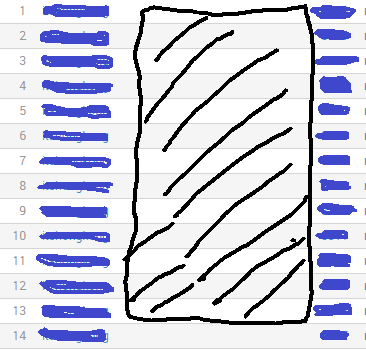
@msivill_splunk i updated the photo above. just a matter of colors in the table. since i don't have much flexiblity to apply pure html and javascript without the xml and data query, i'm lost into how to do it!
- Mark as New
- Bookmark Message
- Subscribe to Message
- Mute Message
- Subscribe to RSS Feed
- Permalink
- Report Inappropriate Content
With the Scalable Vector Graphics - Custom Visualization app you can paint images onto the page based on the data in Splunk (for example paint the button values onto the phone itself). However, given the dynamic nature of the rows coming in (i.e. no upper limit), I suspect using this visualisation won't work for this use case. If you know an upper limit for rows to could code a SVG visualization to handle this. If you look at the battery bars or truck examples in the SVG app it can "dynamically" handle up to 5 or 10 things because that is what the image was built to do.
Perhaps someone with CSS ninja skills might be able to help you out.
- Mark as New
- Bookmark Message
- Subscribe to Message
- Mute Message
- Subscribe to RSS Feed
- Permalink
- Report Inappropriate Content
@msivill_splunk i have experiance in CSS and i just need to be able to modify the rows colors inside the table.
Also, can i ingest the image inside the table? between the two value colored in blue?!
- Mark as New
- Bookmark Message
- Subscribe to Message
- Mute Message
- Subscribe to RSS Feed
- Permalink
- Report Inappropriate Content
@Anmar0293 The requirement/use case for middle phone diagram is not at all clear to me. So rather than asking us to give you table with two columns and a phone diagram in middle, please give us more context to the problem you are trying to solve and a mock of what you are trying to build (you can mask/anonymize any sensitive information).
Do you need help with only Table Cell Color rendering to Blue? Do they actually have to look like button? Why is there a phone overlapping a table? If table has 1 row what will happen to phone diagram will phone change to smart watch (pun intended ;))? What if there are no rows returned for table or what if 100 rows returned with 100 rows per page table configuration?
Community would be able to assist you better if you provide more details of your requirement.
| makeresults | eval message= "Happy Splunking!!!"
- Mark as New
- Bookmark Message
- Subscribe to Message
- Mute Message
- Subscribe to RSS Feed
- Permalink
- Report Inappropriate Content
Hello @niketnilay
I hope all is well. thank you for getting back to me.
forget about the image and the phone.
i just want to put the value in square background colored silver in both sides. the the distance in the middle between the two value (center) should be black. no phone no image nothing. just regular table that has the left and right side (values postions) inside a square or the background color of the values silver and the in between row color to be black!
- Mark as New
- Bookmark Message
- Subscribe to Message
- Mute Message
- Subscribe to RSS Feed
- Permalink
- Report Inappropriate Content
The rows are dynamic depends on the data I will receive but it could be applied for all the values or rows. The numbers are just to count the rows nothing else. Would it be possible to assist me please 😞 @msivill_splunk
- Mark as New
- Bookmark Message
- Subscribe to Message
- Mute Message
- Subscribe to RSS Feed
- Permalink
- Report Inappropriate Content
I can't quite visualise what you want to get to. Is the phone in the middle a static image, how does the phone buttons on the outside of the phone relate to what's on the phone screen. How does the phone screen change when only a few rows are returned vs many rows returned? Any chance of fleshing out your mockup showing one with few rows returned and one with many rows returned. I'm thinking about potentially another visualisation (Scalable Vector Graphics - Custom Visualization) but it depends on what you are trying to do and if that app might work.
- Mark as New
- Bookmark Message
- Subscribe to Message
- Mute Message
- Subscribe to RSS Feed
- Permalink
- Report Inappropriate Content
@msivill_splunk The image would just be black rectangular vertical image or color in the middle of the table. left and right value will just represent buttons. the image would be static. the value of the buttons will change. it doesn't really need to look like a button. it could be just the background of the value of the button. Please find the below:
- Mark as New
- Bookmark Message
- Subscribe to Message
- Mute Message
- Subscribe to RSS Feed
- Permalink
- Report Inappropriate Content
The rows are dynamic depends on the data I will receive but it could be applied for all the values or rows. The numbers are just to count the rows nothing else. Would it be possible to assist me please 😞 @msivill_splunk
- Mark as New
- Bookmark Message
- Subscribe to Message
- Mute Message
- Subscribe to RSS Feed
- Permalink
- Report Inappropriate Content
I have seen your skills in tables in many questions. Can you help please @niketnilay


