Are you a member of the Splunk Community?
- Find Answers
- :
- Using Splunk
- :
- Dashboards & Visualizations
- :
- Need to generate 2 Graphs (Bar chart and tine-seri...
- Subscribe to RSS Feed
- Mark Topic as New
- Mark Topic as Read
- Float this Topic for Current User
- Bookmark Topic
- Subscribe to Topic
- Mute Topic
- Printer Friendly Page
- Mark as New
- Bookmark Message
- Subscribe to Message
- Mute Message
- Subscribe to RSS Feed
- Permalink
- Report Inappropriate Content
Need to generate 2 Graphs (Bar chart and tine-series) on based on 2 categories
index=epaas_epaas2_idx ns=xyz365 (app_name="abc" OR app_name="xyz" OR app_name="lmn" OR app_name="deg") method!=GET (process=start OR (process=end AND (status="500"OR status="429" OR status="506"))) NOT("C360-GraphiQL-Postman") NOT("C360-GraphiQL-UI") NOT(MATCHBOX) NOT(TEST)
| bucket span=h _time | eval app_name = replace(app_name,"-a","")
| eval app_name = replace(app_name, "-b","")
| stats count(eval(process="start")) as total count(eval(process="end")) as error by _time app_name
| eval rate=round ((1-(error/total))*100,4)
| xyseries _time app_name rate error
| sort _time app_name error
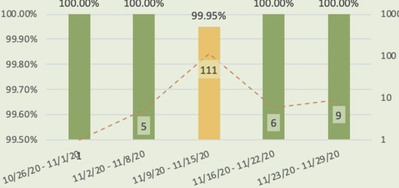
Query: I want to generate the chart based on Error and rate overlapping each other.
I am getting issue when applying Trellis, its not overlapping based on Error and rate. instead its generating individual chart separately. I am looking like above is mentioned in image.
- Mark as New
- Bookmark Message
- Subscribe to Message
- Mute Message
- Subscribe to RSS Feed
- Permalink
- Report Inappropriate Content
In your example search, app_name is the set {abc, xyz, lmn, deg}. If your producation data contains app_name values like foo-a or bar-b, you can leave your eval commands in place, but I'll remove them here.
xyseries only works with three fields, but you can easily resummarize your data with timechart:
index=epaas_epaas2_idx ns=xyz365 (app_name="abc" OR app_name="xyz" OR app_name="lmn" OR app_name="deg") method!=GET (process=start OR (process=end AND (status="500"OR status="429" OR status="506"))) NOT("C360-GraphiQL-Postman") NOT("C360-GraphiQL-UI") NOT(MATCHBOX) NOT(TEST)
| bucket span=h _time
| stats count(eval(process="start")) as total count(eval(process="end")) as error by _time app_name
| eval rate=round ((1-(error/total))*100,4)
| timechart span=h values(rate) as rate values(error) as error by app_name
On the Visualization tab, enable Trellis and split by app_name with an independent scale.
Select Column Chart and format the chart with error selected as the overlay field on a separate axis (View as Axis: On).
Splunk should display a series of column charts with success rate columns on the primary y-axis and an error count line on the secondary y-axis.
You can set Show Data Values to On in the chart configuration, but even with a large trellis size, the charts will be difficult to read. Unfortunately, core Splunk does not excel at labeling values in charts with many data points.

