
Turn on suggestions
Auto-suggest helps you quickly narrow down your search results by suggesting possible matches as you type.
Dashboards & Visualizations
×
Join the Conversation
Without signing in, you're just watching from the sidelines. Sign in or Register to connect, share, and be part of the Splunk Community.
- Find Answers
- :
- Using Splunk
- :
- Dashboards & Visualizations
- :
- Need to create Column chart for multiple elements
Options
- Subscribe to RSS Feed
- Mark Topic as New
- Mark Topic as Read
- Float this Topic for Current User
- Bookmark Topic
- Subscribe to Topic
- Mute Topic
- Printer Friendly Page
- Mark as New
- Bookmark Message
- Subscribe to Message
- Mute Message
- Subscribe to RSS Feed
- Permalink
- Report Inappropriate Content
Need to create Column chart for multiple elements

Narendra045
Explorer
11-18-2021
02:12 AM
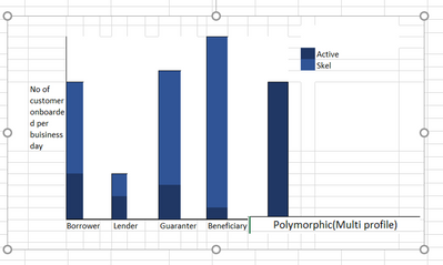
How to create a chart like the above one for different elements with multiple values
- Mark as New
- Bookmark Message
- Subscribe to Message
- Mute Message
- Subscribe to RSS Feed
- Permalink
- Report Inappropriate Content

scelikok

SplunkTrust
11-18-2021
03:55 AM
Hi @Narendra045,
You can below sample SPL and select "Column Chart" and format "stacked.
|stats dc(Active) as Active dc(Skel) as Skel by profile
If this reply helps you an upvote and "Accept as Solution" is appreciated.

Got questions? Get answers!
Join the Splunk Community Slack to learn, troubleshoot, and make connections with fellow Splunk practitioners in real time!
Meet up IRL or virtually!
Join Splunk User Groups to connect and learn in-person by region or remotely by topic or industry.
Get Updates on the Splunk Community!
Make Your Machine Data AI-Ready in Splunk
Every team is getting ready for AI agents.
Thursday, November 12, 2026 | 11AM PST / 2PM EST
...
Splunk Asynchronous Forwarding Explained
Splunk asynchronous forwarding is often misunderstood as simply setting autoLBVolume. That is not quite right. ...
How to Monitor AI Agents with Splunk Agent Observability
Let’s say I’m running a travel planning AI app in production. A user asks for three concise hotel options in ...
