Are you a member of the Splunk Community?
- Find Answers
- :
- Using Splunk
- :
- Dashboards & Visualizations
- :
- Re: Is there a way to display more than 20 charts ...
- Subscribe to RSS Feed
- Mark Topic as New
- Mark Topic as Read
- Float this Topic for Current User
- Bookmark Topic
- Subscribe to Topic
- Mute Topic
- Printer Friendly Page
- Mark as New
- Bookmark Message
- Subscribe to Message
- Mute Message
- Subscribe to RSS Feed
- Permalink
- Report Inappropriate Content
I have 30 hosts. I would like to see a chart of all 30 hosts using the trellis layout but only 20 (2 rows of 10 each) are displayed at a time. I know I can use the "Next" link to see the remaining 10 charts but I want to see all 30 at once so I can put it on a operations monitor.
Is there a way to display more than 20 charts using trellis layout?
The documentation makes no mention of any limits.
Limitations
     Fields generated with the eval command appear as aggregations in the trellis layout configuration menu.
     Trellis layout is not available for table visualizations or cluster maps.
     A predefined token is not available for aggregations used for splitting a visualization.
     Visualizations using trellis layout do not render in dashboard PDFs.
- Mark as New
- Bookmark Message
- Subscribe to Message
- Mute Message
- Subscribe to RSS Feed
- Permalink
- Report Inappropriate Content
<form>
<label>ups temp</label>
<search id="trellis">
<query> index=test NOT failed NOT resource sourcetype=ups_temp
| dedup object_id
| eval temp=round(temp_value,2)
| lookup ups_object_id object_id AS object_id OUTPUT equip_no
| table temp equip_no
| sort - temp
| streamstats count as filter
</query>
<earliest>$field1.earliest$</earliest>
<latest>$field1.latest$</latest>
</search>
<fieldset submitButton="false">
<input type="time" token="field1">
<label></label>
<default>
<earliest>-24h@h</earliest>
<latest>now</latest>
</default>
</input>
</fieldset>
<row>
<panel>
<single id="chartPanel1">
<search base="trellis">
<query>
| where filter > 0 AND filter < 21
| eval tmp="T"
| xyseries tmp equip_no temp
| fields - tmp</query>
</search>
<option name="drilldown">none</option>
<option name="trellis.enabled">1</option>
<option name="height">600</option>
</single>
</panel>
</row>
<row>
<panel>
<single id="chartPanel2">
<search base="trellis">
<query>
| where filter > 20 AND filter < 41
| eval tmp="T"
| xyseries tmp equip_no temp
| fields - tmp</query>
</search>
<option name="drilldown">none</option>
<option name="trellis.enabled">1</option>
<option name="height">600</option>
</single>
</panel>
</row>
<row>
<panel>
<single id="chartPanel3">
<search base="trellis">
<query>
| where filter > 40 AND filter < 61
| eval tmp="T"
| xyseries tmp equip_no temp
| fields - tmp</query>
</search>
<option name="drilldown">none</option>
<option name="trellis.enabled">1</option>
<option name="height">600</option>
</single>
</panel>
</row>
<row>
<panel>
<single id="chartPanel4">
<search base="trellis">
<query>
| where filter > 60 AND filter < 81
| eval tmp="T"
| xyseries tmp equip_no temp
| fields - tmp</query>
</search>
<option name="drilldown">none</option>
<option name="trellis.enabled">1</option>
<option name="height">600</option>
</single>
</panel>
</row>
<row>
<panel>
<single id="chartPanel5">
<search base="trellis">
<query>
| where filter > 80 AND filter < 101
| eval tmp="T"
| xyseries tmp equip_no temp
| fields - tmp</query>
</search>
<option name="drilldown">none</option>
<option name="trellis.enabled">1</option>
<option name="height">600</option>
</single>
</panel>
</row>
<row>
<panel>
<single id="chartPanel6">
<search base="trellis">
<query>
| where filter > 100 AND filter < 121
| eval tmp="T"
| xyseries tmp equip_no temp
| fields - tmp</query>
</search>
<option name="drilldown">none</option>
<option name="trellis.enabled">1</option>
<option name="height">600</option>
</single>
</panel>
</row>
<row>
<panel>
<single id="chartPanel7">
<search base="trellis">
<query>
| where filter > 120 AND filter < 141
| eval tmp="T"
| xyseries tmp equip_no temp
| fields - tmp</query>
</search>
<option name="drilldown">none</option>
<option name="trellis.enabled">1</option>
<option name="height">600</option>
</single>
</panel>
</row>
<row>
<panel>
<single id="chartPanel8">
<search base="trellis">
<query>
| where filter > 140 AND filter < 161
| eval tmp="T"
| xyseries tmp equip_no temp
| fields - tmp</query>
</search>
<option name="drilldown">none</option>
<option name="trellis.enabled">1</option>
<option name="height">600</option>
</single>
</panel>
</row>
</form>
Hi, @pgadhari
I haven't tried it, but I made it.
- Mark as New
- Bookmark Message
- Subscribe to Message
- Mute Message
- Subscribe to RSS Feed
- Permalink
- Report Inappropriate Content
I was able to achieve this by editing dashboard.js. You'll need to do this for whichever theme you're using (lite/dark).
Edit <splunk dir>/share/splunk/search_mrsparkle/exposed/build/pages/dark/dashboard.js
Look for "getFacetsPerPage:function" and change the return value from 20 to whatever pagination value you want.
Restart splunk and refresh the page.
- Mark as New
- Bookmark Message
- Subscribe to Message
- Mute Message
- Subscribe to RSS Feed
- Permalink
- Report Inappropriate Content
Vote for Trellis 1000 on Splunk Ideas! https://ideas.splunk.com/ideas/EID-I-862
- Mark as New
- Bookmark Message
- Subscribe to Message
- Mute Message
- Subscribe to RSS Feed
- Permalink
- Report Inappropriate Content
The Number Display VIz https://splunkbase.splunk.com/app/4537/ allows you to do an unlimited tiled trellis view.
Disclaimer: I wrote this app
- Mark as New
- Bookmark Message
- Subscribe to Message
- Mute Message
- Subscribe to RSS Feed
- Permalink
- Report Inappropriate Content
@ksarpol @DalJeanis @woodcock @pgadhari @to4kawa @rob_jordan @rich7177 @efavreau
If more than 20 trellis viz is required for Single Value or Status Indicator kind of viz (i.e. Icon, color, text kind of viz) and not for Column, Bar or any other chart following Table based hack can be used instead which is based on one of my recent answers: https://answers.splunk.com/answers/809414/issue-with-css-html-js-formatting-search-output.html?child...
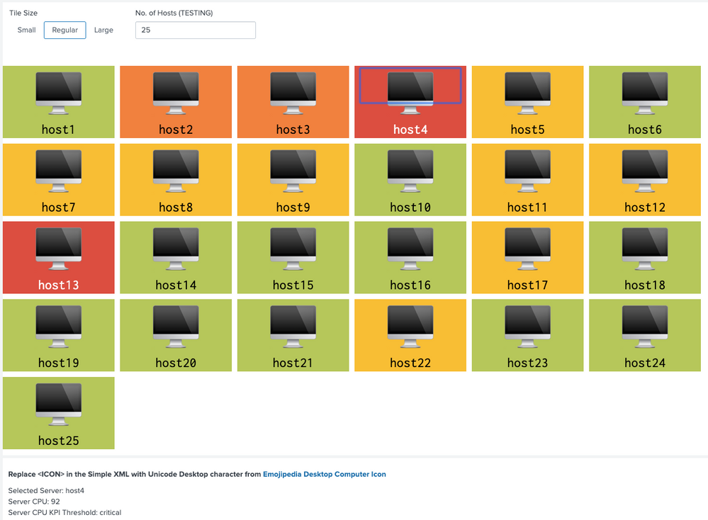
Following are the steps used to create Table results as Tile with Color, Icon and Value:
Step 1: Create a Table with required data like in the example host, cpu and threshold for color ( can also be used for dynamic icon refer to above answer).
Step 2: Create multi-value field for label (field to be displayed need to be added. Even for color format)
Step 3: Fields required for drilldown only can be hidden using underscore prefix.
Step 4: Apply CSS Override to convert Table layout to responsive Tile (i.e. tiles should overflow to next row based on browser width).
Step 5: Apply dynamic CSS size override based on Tile size selection i.e. Small, Regular or Large (more can be added or only static one can be used as per use case)
Step 6. Since Table value is Multi-Valued field, CSS override can be added based on index. For example index 0 is the threshold, which needs to be used for Tile color but not to be displayed. Also Tile Icon needs to be of larger size compared to Tile Label.
Step 7: Apply Table Cell color based on colorPalette expression.
Step 8: Create drilldown. Example uses required hidden fields but drilldown can use more dynamic default tokens like $click.value$ and $click.value2$. Refer to above answer for examples/discussion.
Once we create Table with Tiles, Icon and Color, we can obviously also set the number of rows (tiles) to be displayed in the table (for example some max value like 50, 100, 500 etc). I have used Text box to generate 25 Tiles by default which also sets no of rows to 25 (default example).
<option name="count">$tokHosts$</option>
Following is the Simple XML Code, please try out and confirm.
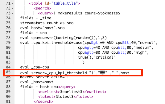
PS: Since Unicode Icons can not be attached to Splunk Answers, you would need to manually need to replace <ICON> in the Splunk search with required unicode like Desktop in this example. from https://emojipedia.org/desktop-computer/
<form>
  <label>Table with Unicode Character and Drilldown</label>
  <fieldset submitButton="false"></fieldset>
  <row>
    <panel>
      <input type="link" token="tokTileSize" searchWhenChanged="true">
        <label>Tile Size</label>
        <choice value="small">Small</choice>
        <choice value="regular">Regular</choice>
        <choice value="large">Large</choice>
        <default>regular</default>
        <change>
          <condition value="small">
            <set token="tokIconTopPadding">initial</set>
            <set token="tokLabelTopPadding">initial</set>
            <set token="tokIconFontSize">initial</set>
            <set token="tokLabelFontSize">initial</set>
            <set token="tokTileWidth">120px</set>
          </condition>
          <condition value="regular">
            <set token="tokIconTopPadding">40px</set>
            <set token="tokLabelTopPadding">25px</set>
            <set token="tokIconFontSize">600%</set>
            <set token="tokLabelFontSize">200%</set>
            <set token="tokTileWidth">180px</set>
          </condition>
          <condition value="large">
            <set token="tokIconTopPadding">60px</set>
            <set token="tokLabelTopPadding">35px</set>
            <set token="tokIconFontSize">800%</set>
            <set token="tokLabelFontSize">300%</set>
            <set token="tokTileWidth">240px</set>
          </condition>
        </change>
      </input>
      <input type="text" token="tokHosts" searchWhenChanged="true">
        <label>No. of Hosts (TESTING)</label>
        <default>25</default>
      </input>
      <html>
        <style>
           #table_tile table tbody{
             display:flex;
             flex-wrap: wrap;
           }
           #table_tile table th{
              display: none !important;
           }
           #table_tile table tbody tr{
             margin-right:10px;
             margin-bottom:10px;
           }
           #table_tile table tbody tr td{
             width: $tokTileWidth$;
             text-align: center;
             background: #fff;
           }
           #table_tile table tbody tr td div[data-mv-index="0"].multivalue-subcell{
              display:none;
           }
           #table_tile table tbody tr td div[data-mv-index="1"].multivalue-subcell{
              padding-top: $tokIconTopPadding$;
              font-size: $tokIconFontSize$;
           }
           #table_tile table tbody tr td div[data-mv-index="2"].multivalue-subcell{
              padding-top: $tokIconTopPadding$;
              font-size: $tokLabelTopPadding$;
           }
        </style>
      </html>
      <table id="table_tile">
        <search>
          <query>| makeresults count=$tokHosts$
| fields - _time
| streamstats count as sno
| eval host="host".sno
| fields - sno
| eval cpu=substr(tostring(random()),1,2)
| eval _cpu_kpi_threshold=case(cpu>=0 AND cpu<40,"normal",
                            cpu>=40 AND cpu<80,"medium",
                            cpu>=80 AND cpu<90,"high",
                            true(),"critical"
                              )
| eval _cpu=cpu
| eval server=_cpu_kpi_threshold."|"."<ICON>️️" ."|".host
| makemv server delim="|"
| eval _host=host
| fields - host cpu</query>
          <earliest>$earliest$</earliest>
          <latest>$latest$</latest>
        </search>
        <option name="count">$tokHosts$</option>
        <option name="refresh.display">progressbar</option>
        <format type="color" field="server">
          <colorPalette type="expression">if (match(value,"critical"), "#DC4E41", if(match(value,"high"),"#F1813F", if(match(value,"medium"),"#F8BE34","#B6C75A")))</colorPalette>
        </format>
        <drilldown>
          <set token="tokServer">$row._host$</set>
          <set token="tokCPU">$row._cpu$</set>
          <set token="tokCPUThreshold">$row._cpu_kpi_threshold$</set>
        </drilldown>
      </table>
    </panel>
  </row>
  <row>
    <panel>
      <title>Replace <ICON> in the Simple XML with Unicode Desktop character from https://emojipedia.org/desktop-computer/</title>;
      <html>
        <div>Selected Server: $tokServer$</div>
        <div>Server CPU: $tokCPU$</div>
        <div>Server CPU KPI Threshold: $tokCPUThreshold$</div>
      </html>
    </panel>
  </row>
</form>
PS: Also attaching the snippet of Simple XML search SPL where Unicode character needs to be replaced in the above code as Splunk Answers does not allow unicode character.
| makeresults | eval message= "Happy Splunking!!!"
- Mark as New
- Bookmark Message
- Subscribe to Message
- Mute Message
- Subscribe to RSS Feed
- Permalink
- Report Inappropriate Content
hi @niketnilay
good idea!
try printf("%c",tonumber("1F4BB",16))
sample:
| makeresults
| eval text=printf("%c",tonumber("1F4BB",16))
reference: https://answers.splunk.com/answers/802676/can-splunk-find-love.html
- Mark as New
- Bookmark Message
- Subscribe to Message
- Mute Message
- Subscribe to RSS Feed
- Permalink
- Report Inappropriate Content
@to4kawa thanks I know something new now 🙂 By the way good question with great answers!
By the way Splunk takes Unicode Character directly, however, Splunk Answers does not print it. So limitation is only while posting code here. With printf() approach it will work at both the places which is good to know!
| makeresults | eval message= "Happy Splunking!!!"
- Mark as New
- Bookmark Message
- Subscribe to Message
- Mute Message
- Subscribe to RSS Feed
- Permalink
- Report Inappropriate Content
<dashboard refresh="15">
  <label>threshold moniter</label>
  <row>
    <panel>
      <viz type="simple_xml_examples.tagcloud">
        <search>
          <query>| makeresults count=200
| streamstats count as host
| eval count = random() % 50 + 50
| table host count
| eval count=if(count > 98 ,100,10)</query>
          <earliest>-24h@h</earliest>
          <latest>now</latest>
          <sampleRatio>1</sampleRatio>
        </search>
        <option name="drilldown">none</option>
        <option name="simple_xml_examples.tagcloud.labelField">host</option>
        <option name="simple_xml_examples.tagcloud.maxFontSize">100</option>
        <option name="simple_xml_examples.tagcloud.minFontSize">10</option>
        <option name="simple_xml_examples.tagcloud.valueField">count</option>
        <option name="trellis.enabled">0</option>
        <option name="trellis.scales.shared">1</option>
        <option name="trellis.size">medium</option>
        <option name="height">500</option>
      </viz>
    </panel>
  </row>
</dashboard>
If you want to monitor when a threshold is crossed, here's an idea.
Tag Cloud is required.
- Mark as New
- Bookmark Message
- Subscribe to Message
- Mute Message
- Subscribe to RSS Feed
- Permalink
- Report Inappropriate Content
- Mark as New
- Bookmark Message
- Subscribe to Message
- Mute Message
- Subscribe to RSS Feed
- Permalink
- Report Inappropriate Content
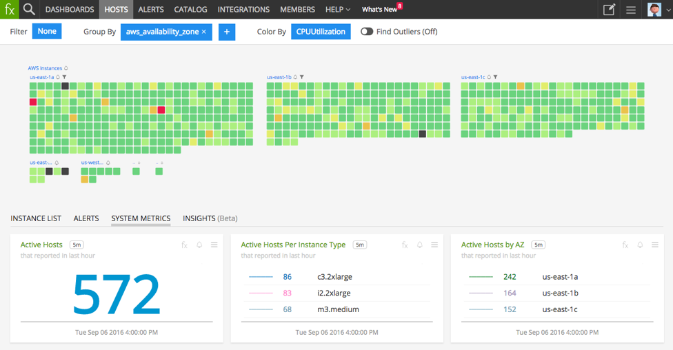
@to4kawa - see the above image. I am trying to use custom css to show all 156 values in one page. Lets see how it works out :-).
- Mark as New
- Bookmark Message
- Subscribe to Message
- Mute Message
- Subscribe to RSS Feed
- Permalink
- Report Inappropriate Content
It is cool 🙂 They have colors.
- Mark as New
- Bookmark Message
- Subscribe to Message
- Mute Message
- Subscribe to RSS Feed
- Permalink
- Report Inappropriate Content
Look at the BRILLIANT Bubble Chart hack here:
https://answers.splunk.com/answers/785029/what-is-the-best-way-to-get-100ish-greeenyellowred.html
Be sure to UpVote his answer (he deserves it).
- Mark as New
- Bookmark Message
- Subscribe to Message
- Mute Message
- Subscribe to RSS Feed
- Permalink
- Report Inappropriate Content
@woodcock - in my case scatterplot is not much helpful, as I have to show the all sensor device names and its corresponding temperatures. I was able to create the visualization using filter command provided by @to4kawa. But, thanks for your suggestions also.
- Mark as New
- Bookmark Message
- Subscribe to Message
- Mute Message
- Subscribe to RSS Feed
- Permalink
- Report Inappropriate Content
Not saying you want to do this, but I'm throwing it out there for other people who might stumble onto this use case.
The use case also seems like it might work to report on anomalous temps only. I know there's much to be said in being able to look at a large sea of green and know all is well, but why look at all?
index=speedtest sourcetype=speedtest-json  earliest=-24h
| eventstats avg(download_mb) as Average stdev(download_mb) as StdDev
| head 1
| eval threshold = Average-StdDev
| eval is_anomalous = if(download_mb<threshold, "Yes", "No")
| search is_anomalous = "Yes"
The above, in a mildly different but easily adaptable context, averages my speedtest results over the past 24 hours. Then takes the last values* and compares them to the previous 96 values (it's run every 15 minutes) minus the standard deviation, then only displays a result if the most recent result was below my One standard deviation threshold.
One could also easily just compare to numbers directly (the last 3 lines could all be replaced with | search download_mb<8 or even if in different context you'd like to just see all the times it was below what you want, replace the last 4 lines with | search download_mb<8.
Then, display only those that are anomalous. Stop looking at a sea of green, instead focus on the few that actually are a problem. This could be combined with a lot of other information then - if you aren't lookin at 156 but are instead focusing on the 4 that are having problems, you have a lot more room on that page to look for other things too!
*There are lots of ways to do this. Another method is an an appendcols with the subsearch returning the avg and stddev, something like
index=speedtest sourcetype=speedtest-json earliest=-24h
| timechart avg(download_mb) as AverageForPeriod
| appendcols
    [ search index=speedtest sourcetype=speedtest-json earliest=-24h
    | stats avg(download_mb) as OverallAverage stdev(download_mb) as StdDev ]
| filldown OverallAverage, StdDev
| where AverageForPeriod < OverallAverage - StdDev
And since I'm using timechart, I'm getting ~hourly averages (could probably make sure bins is set right in there, but for my purposes it's fine) and looking then where the hourly average is less than the overall average - the standard deviation. in this case in my test data there's no real patterns to the results, just a sprinkling of when it's lower than that. Which is expected, 1 Standard Deviation means about 30% of the results should be outside it. (two StdDevs would be only about 5% would be outside that.)
Anyway, instead of timechart, you could stats by host (or whatever), but take the average of all and look for anomalies. Or stats last() by host and look for hard-coded thresholds ... There are lots of options, which you need to do depends on your data.
So, I'm not saying to do this, nor even try it (though you should!), but I'm throwing this out there for others who stumble across this question and wanted a different thought to try applying.
- Mark as New
- Bookmark Message
- Subscribe to Message
- Mute Message
- Subscribe to RSS Feed
- Permalink
- Report Inappropriate Content
I also agree, but my customer wants to see status of all sensors including the anomalous one. In my query I have sort the highest temperature, so anyways it will be visible and also the user will be monitoring other sensors too. Thanks for your time and answer.
- Mark as New
- Bookmark Message
- Subscribe to Message
- Mute Message
- Subscribe to RSS Feed
- Permalink
- Report Inappropriate Content
I agree.
Even if I create a list screen with a table, it is better to display those that exceed the threshold.
- Mark as New
- Bookmark Message
- Subscribe to Message
- Mute Message
- Subscribe to RSS Feed
- Permalink
- Report Inappropriate Content
- Mark as New
- Bookmark Message
- Subscribe to Message
- Mute Message
- Subscribe to RSS Feed
- Permalink
- Report Inappropriate Content
whether this visualization is available in Splunk now ?
- Mark as New
- Bookmark Message
- Subscribe to Message
- Mute Message
- Subscribe to RSS Feed
- Permalink
- Report Inappropriate Content
- Mark as New
- Bookmark Message
- Subscribe to Message
- Mute Message
- Subscribe to RSS Feed
- Permalink
- Report Inappropriate Content
but this visualization will be difficult to understand by the users as it will not show the name of the sensors just the colors - red, green & blue. But still I will explore it. Thanks.
- Mark as New
- Bookmark Message
- Subscribe to Message
- Mute Message
- Subscribe to RSS Feed
- Permalink
- Report Inappropriate Content
Is tag cloud useless?
I think it is good.


