Are you a member of the Splunk Community?
- Find Answers
- :
- Using Splunk
- :
- Dashboards & Visualizations
- :
- How to change colors of column chart output?
- Subscribe to RSS Feed
- Mark Topic as New
- Mark Topic as Read
- Float this Topic for Current User
- Bookmark Topic
- Subscribe to Topic
- Mute Topic
- Printer Friendly Page
- Mark as New
- Bookmark Message
- Subscribe to Message
- Mute Message
- Subscribe to RSS Feed
- Permalink
- Report Inappropriate Content
How to change colors of column chart output?
I can't seem to figure this out. I've read every thread on here as well as Splunk docs relating to this. The spl output looks like I want it to, but on a dashboard everything is blue. I've added fieldColors to my source, but still can't get it to work. What am I missing? Attachment provided.
index=health_checks dev=false
| stats avg(eval(round(uptime_minutes*100,0))) as uptime, avg(eval(round(month_minutes*100,0))) as month, by customer
| eval score=round(uptime/month*100,0)
| eval range=case(score < 75, "severely degraded", score >= 75 AND score < 95, "slightly degraded", score >= 95, "healthy")
| stats count(score) as stacks by range
<option name="charting.fieldColors">{"healthy": 0x008000, "slightly degraded": 0xFFFF00, "severely degraded": 0xFF0000, "NULL": 0xC4C4C0}</option>
- Mark as New
- Bookmark Message
- Subscribe to Message
- Mute Message
- Subscribe to RSS Feed
- Permalink
- Report Inappropriate Content
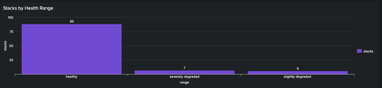
@somesoni2 This is how the output should look, but doing it this way will not show the three colors on the panel, and I've been unable to figure it out. Any ideas?
- Mark as New
- Bookmark Message
- Subscribe to Message
- Mute Message
- Subscribe to RSS Feed
- Permalink
- Report Inappropriate Content
- Mark as New
- Bookmark Message
- Subscribe to Message
- Mute Message
- Subscribe to RSS Feed
- Permalink
- Report Inappropriate Content
Use this query and in the visualization, select "Stack Mode" to "stacked" (middle option).
- Mark as New
- Bookmark Message
- Subscribe to Message
- Mute Message
- Subscribe to RSS Feed
- Permalink
- Report Inappropriate Content
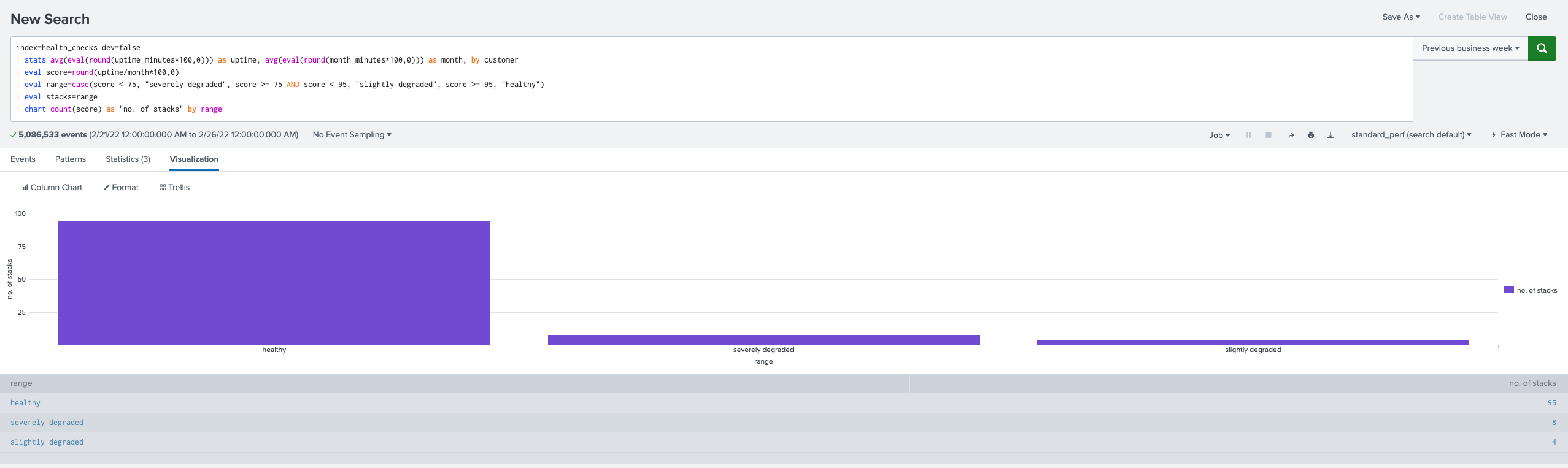
Thank you, @somesoni2 . Please see attachment. I copied/pasted your edits and got a group-by error, so I changed "by stacks range" to "by range", which gave me the same query results, but no change on the panel; columns are still blue. I removed the "NULL" reference as I got that from another thread but I don't need it.
- Mark as New
- Bookmark Message
- Subscribe to Message
- Mute Message
- Subscribe to RSS Feed
- Permalink
- Report Inappropriate Content
My bad. I just updated the query., try that.
That parser error was due to using same name in aggregated field in stats as in the by clause of the stats.
- Mark as New
- Bookmark Message
- Subscribe to Message
- Mute Message
- Subscribe to RSS Feed
- Permalink
- Report Inappropriate Content
Your charting.fieldColors expects fields with name “healthy”, slightly degraded”, “severely degraded” and “NULL” to be present in the search result. Your search gives fields “range” and “stacks” hence it fails. Try this workaround.
**Updated
index=health_checks dev=false
| stats avg(eval(round(uptime_minutes*100,0))) as uptime, avg(eval(round(month_minutes*100,0))) as month, by customer
| eval score=round(uptime/month*100,0)
| eval range=case(score < 75, "severely degraded", score >= 75 AND score < 95, "slightly degraded", score >= 95, "healthy")
| eval stacks=range
| chart count(score) by stacks range
- Mark as New
- Bookmark Message
- Subscribe to Message
- Mute Message
- Subscribe to RSS Feed
- Permalink
- Report Inappropriate Content
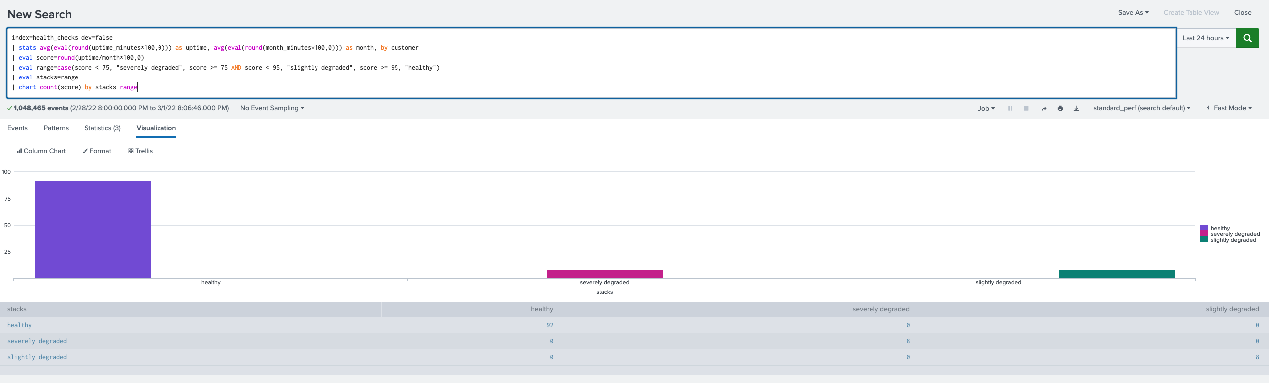
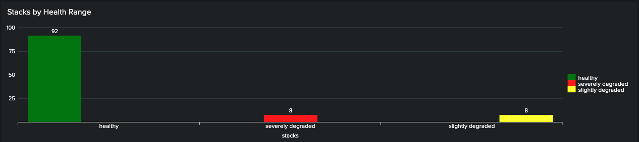
@somesoni2 I feel like this isn't right. See screenshots . The colors show up on the dashboard panel, but the bars are not centered on the x-axis, and the query output looks like it's wrong; like it's trying to chart zeros. Any thoughts? The table in the output seems unnecessarily redundant?

- Mark as New
- Bookmark Message
- Subscribe to Message
- Mute Message
- Subscribe to RSS Feed
- Permalink
- Report Inappropriate Content

Thanks for the Memories! Splunk University, .conf25, and our Community
Data Persistence in the OpenTelemetry Collector
Introducing Splunk 10.0: Smarter, Faster, and More Powerful Than Ever
