Join the Conversation
- Find Answers
- :
- Using Splunk
- :
- Dashboards & Visualizations
- :
- Re: How to Change color of result
- Subscribe to RSS Feed
- Mark Topic as New
- Mark Topic as Read
- Float this Topic for Current User
- Bookmark Topic
- Subscribe to Topic
- Mute Topic
- Printer Friendly Page
- Mark as New
- Bookmark Message
- Subscribe to Message
- Mute Message
- Subscribe to RSS Feed
- Permalink
- Report Inappropriate Content
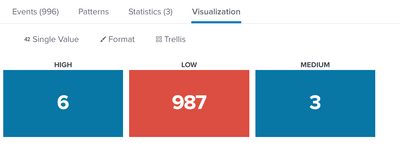
It possible if i would like to change color
High to Red
Medium to Yellow
Low to Green
If it possible to change color. Please help to recommend.
Best Regards,
CR
- Mark as New
- Bookmark Message
- Subscribe to Message
- Mute Message
- Subscribe to RSS Feed
- Permalink
- Report Inappropriate Content
I think he just wants to give his 3 single value panels static colors, regardless of the value. I guess one way to do that is to be a bit creative with the color ranges (0 to max set to the desired color and min to 0 set to some other color).
Edit: only just noticed this is using trellis, so it is just 1 visualization and you can't set 3 different color ranges for the different trellis 'sub-panels'. So my idea won't work. On a dashboard you could still use my idea if you set it up as 3 separate panels, rather than 1 panel with 3 visualizations using trellis.
- Mark as New
- Bookmark Message
- Subscribe to Message
- Mute Message
- Subscribe to RSS Feed
- Permalink
- Report Inappropriate Content
Hi @gcusello
Thank you for your response.
but i would like to change color not define by data in range but i would like to define color by severity
Example if search result have data in High severity i would like High show red color all data range.
Best Regards,
CR
- Mark as New
- Bookmark Message
- Subscribe to Message
- Mute Message
- Subscribe to RSS Feed
- Permalink
- Report Inappropriate Content
Hi @chakuttha,
let me understand: you want to define color based on a different field than the one visualized in the Single Panel?
I'm not sure that's possible!
Ciao.
Giuseppe
- Mark as New
- Bookmark Message
- Subscribe to Message
- Mute Message
- Subscribe to RSS Feed
- Permalink
- Report Inappropriate Content
I think he just wants to give his 3 single value panels static colors, regardless of the value. I guess one way to do that is to be a bit creative with the color ranges (0 to max set to the desired color and min to 0 set to some other color).
Edit: only just noticed this is using trellis, so it is just 1 visualization and you can't set 3 different color ranges for the different trellis 'sub-panels'. So my idea won't work. On a dashboard you could still use my idea if you set it up as 3 separate panels, rather than 1 panel with 3 visualizations using trellis.
- Mark as New
- Bookmark Message
- Subscribe to Message
- Mute Message
- Subscribe to RSS Feed
- Permalink
- Report Inappropriate Content
Hi @FrankVl
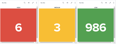
Very nice I have try following your recommend and result showing as i want.
Thank you so much for your recommend.
Best Regards,
CR
- Mark as New
- Bookmark Message
- Subscribe to Message
- Mute Message
- Subscribe to RSS Feed
- Permalink
- Report Inappropriate Content
Hi @chakuttha,
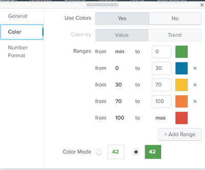
yes, you have to:
- go in Edit Mode of your dashboard,
- then click in "Format Visualization,
- than click on "Color and choose "Use Color",
- and then define the color for each range.
Ciao.
Giuseppe


