Turn on suggestions
Auto-suggest helps you quickly narrow down your search results by suggesting possible matches as you type.
Dashboards & Visualizations
×
Join the Conversation
Without signing in, you're just watching from the sidelines. Sign in or Register to connect, share, and be part of the Splunk Community.
- Find Answers
- :
- Using Splunk
- :
- Dashboards & Visualizations
- :
- How to avoid line chart data label overlap?
Options
- Subscribe to RSS Feed
- Mark Topic as New
- Mark Topic as Read
- Float this Topic for Current User
- Bookmark Topic
- Subscribe to Topic
- Mute Topic
- Printer Friendly Page
- Mark as New
- Bookmark Message
- Subscribe to Message
- Mute Message
- Subscribe to RSS Feed
- Permalink
- Report Inappropriate Content
How to avoid line chart data label overlap?
splunkkid
Path Finder
06-15-2021
09:36 PM
Hello,
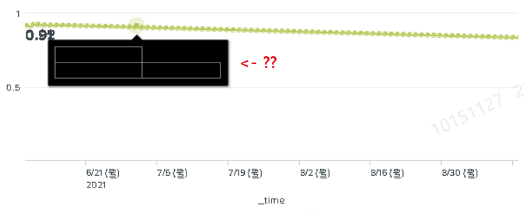
I made several line chart in my dashboard to visualize my data.
And I added minmax data label to my charts.
Is it possible to avoid the labels to be overlapped ? You can check my attached screen shot to see how it looks like currently.
Furthermore, In my charts, when I hover my mouse to line, it shows me only black boxes rather than the real data information.
Anyone knows how to fix this? Thank you!

Got questions? Get answers!
Join the Splunk Community Slack to learn, troubleshoot, and make connections with fellow Splunk practitioners in real time!
Meet up IRL or virtually!
Join Splunk User Groups to connect and learn in-person by region or remotely by topic or industry.
Get Updates on the Splunk Community!
Splunk App Dev Quarterly Roundup: AI, Agents, and Innovation!
Another quarter, another wave of innovation. From complex integrations to pushing the limits ...
What’s New in Splunk AI: Volume 02
Welcome to the second edition of “What’s New in Splunk AI” where we look at the latest and greatest updates, ...
Value Insights: Now Generally Available in the CMC
Organizations are under pressure to move faster, control cost, expand AI adoption, and prove value with more ...
