Turn on suggestions
Auto-suggest helps you quickly narrow down your search results by suggesting possible matches as you type.
Dashboards & Visualizations
×
Are you a member of the Splunk Community?
Sign in or Register with your Splunk account to get your questions answered, access valuable resources and connect with experts!
Turn on suggestions
Auto-suggest helps you quickly narrow down your search results by suggesting possible matches as you type.
- Find Answers
- :
- Using Splunk
- :
- Dashboards & Visualizations
- :
- How to avoid line chart data label overlap?
Options
- Subscribe to RSS Feed
- Mark Topic as New
- Mark Topic as Read
- Float this Topic for Current User
- Bookmark Topic
- Subscribe to Topic
- Mute Topic
- Printer Friendly Page
- Mark as New
- Bookmark Message
- Subscribe to Message
- Mute Message
- Subscribe to RSS Feed
- Permalink
- Report Inappropriate Content
How to avoid line chart data label overlap?
splunkkid
Path Finder
06-15-2021
09:36 PM
Hello,
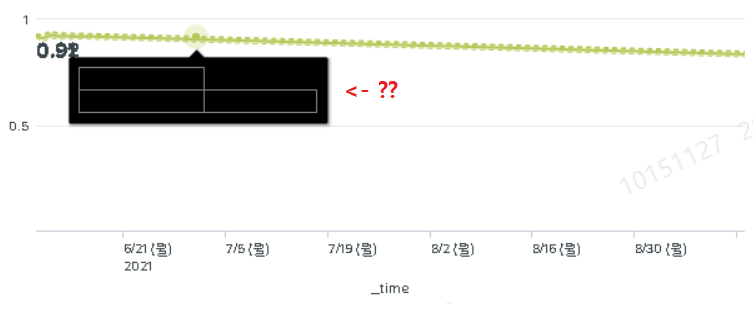
I made several line chart in my dashboard to visualize my data.
And I added minmax data label to my charts.
Is it possible to avoid the labels to be overlapped ? You can check my attached screen shot to see how it looks like currently.
Furthermore, In my charts, when I hover my mouse to line, it shows me only black boxes rather than the real data information.
Anyone knows how to fix this? Thank you!
Career Survey
First 500 qualified respondents will receive a $20 gift card! Tell us about your professional Splunk journey.
Get Updates on the Splunk Community!
Splunkbase Unveils New App Listing Management Public Preview
Splunkbase Unveils New App Listing Management Public PreviewWe're thrilled to announce the public preview of ...
Leveraging Automated Threat Analysis Across the Splunk Ecosystem
Are you leveraging automation to its fullest potential in your threat detection strategy?Our upcoming Security ...
Can’t Make It to Boston? Stream .conf25 and Learn with Haya Husain
Boston may be buzzing this September with Splunk University and .conf25, but you don’t have to pack a bag to ...
