Turn on suggestions
Auto-suggest helps you quickly narrow down your search results by suggesting possible matches as you type.
Dashboards & Visualizations
×
Are you a member of the Splunk Community?
Sign in or Register with your Splunk account to get your questions answered, access valuable resources and connect with experts!
Turn on suggestions
Auto-suggest helps you quickly narrow down your search results by suggesting possible matches as you type.
- Find Answers
- :
- Using Splunk
- :
- Dashboards & Visualizations
- :
- Re: How can I show a key to define each color of m...
Options
- Subscribe to RSS Feed
- Mark Topic as New
- Mark Topic as Read
- Float this Topic for Current User
- Bookmark Topic
- Subscribe to Topic
- Mute Topic
- Printer Friendly Page
- Mark as New
- Bookmark Message
- Subscribe to Message
- Mute Message
- Subscribe to RSS Feed
- Permalink
- Report Inappropriate Content
How can I show a key to define each color of my pie-chart?
tamduong16
Contributor
08-11-2017
02:54 PM
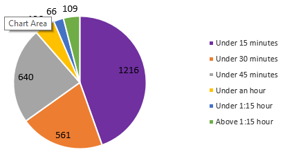
Is there a way I could get Splunk to display piechart like this?
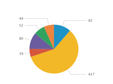
I want it to display what each color is and the count of each slice. I were able to get it to display only the count for each slice (below image) but I need to see the description of the color on the side.
- Mark as New
- Bookmark Message
- Subscribe to Message
- Mute Message
- Subscribe to RSS Feed
- Permalink
- Report Inappropriate Content
woodcock
Esteemed Legend
08-11-2017
04:20 PM
Run this search and show it as a pie chart. Then look at how it looks on the Statistics tab; make your data look like that and it will show properly:
index=_* | chart count BY sourcetype
- Mark as New
- Bookmark Message
- Subscribe to Message
- Mute Message
- Subscribe to RSS Feed
- Permalink
- Report Inappropriate Content
lfedak_splunk

Splunk Employee
08-11-2017
03:17 PM
Hey @tamduong16, This might help you: https://answers.splunk.com/answers/170278/how-to-add-a-color-coded-legend-with-text-to-a-pie.html
Get Updates on the Splunk Community!
Modernize your Splunk Apps – Introducing Python 3.13 in Splunk
We are excited to announce that the upcoming releases of Splunk Enterprise 10.2.x and Splunk Cloud Platform ...
New Release | Splunk Cloud Platform 10.1.2507
Hello Splunk Community!We are thrilled to announce the General Availability of Splunk Cloud Platform 10.1.2507 ...
🌟 From Audit Chaos to Clarity: Welcoming Audit Trail v2
🗣 You Spoke, We Listened
Audit Trail v2 wasn’t written in isolation—it was shaped by your voices.
In ...


