Join the Conversation
- Find Answers
- :
- Using Splunk
- :
- Dashboards & Visualizations
- :
- How can I get stacked bar chart value?
- Subscribe to RSS Feed
- Mark Topic as New
- Mark Topic as Read
- Float this Topic for Current User
- Bookmark Topic
- Subscribe to Topic
- Mute Topic
- Printer Friendly Page
- Mark as New
- Bookmark Message
- Subscribe to Message
- Mute Message
- Subscribe to RSS Feed
- Permalink
- Report Inappropriate Content
Hi all, I'm counting the number of empty/non-empty values from a columns called FromTelNumber and rename them as Conference and AudioVideo, then I need to count the sum when values from several other columns meet certain conditions(e.g. One column's value needs to >3.5, one needs to <500..) and display at the bottom of each stacked bar.
I've tried index="skype_session" | stats count(eval(isnull(FromTelNumber))) AS Conference count(eval( isnotnull(FromTelNumber))) AS Audio | transpose but it would only produce this bar chart. When I tried adding stacked bar chart command no result was found.
Does anyone know how to do that? Thanks!
[UPDATED PIC BASED ON ANSWER]
- Mark as New
- Bookmark Message
- Subscribe to Message
- Mute Message
- Subscribe to RSS Feed
- Permalink
- Report Inappropriate Content
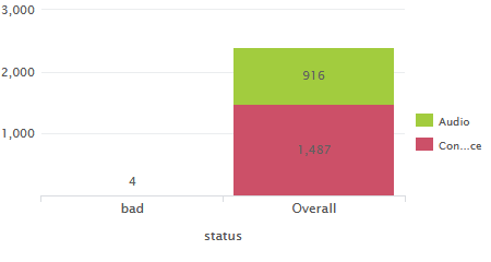
[UPDATED ANSWER] based on details provided. Please try out the following and confirm!
index="skype_session"
| eval status=case(OverallAvgNetworkMOS <3.5,"bad",true(),"good"), session_type=if(isnull(FromTelNumber),"Conference","Audio")
| chart count by  status session_type
| addtotals row=f col=t labelfield="status" label="Overall"
| search status!="good"
PS: If you do not add the final search filter, you can plot Audio/Video stats for good calls as well. 🙂
@dannili try the following:
index="skype_session"
| stats count(eval(isnull(FromTelNumber))) AS Conference count(eval( isnotnull(FromTelNumber))) AS Audio
| eval field="skype_session"
| table field Conference Audio
You are better off plotting this as a bar chart instead of column since you have only one bar with two stacks.
| makeresults | eval message= "Happy Splunking!!!"
- Mark as New
- Bookmark Message
- Subscribe to Message
- Mute Message
- Subscribe to RSS Feed
- Permalink
- Report Inappropriate Content
Now I use this search string but the result would only display the first two count. Also I want Con and Video separated in two bar.
index="skype_session" | stats count(eval(isnull(FromTelNumber))) AS Conference count(eval( isnotnull(FromTelNumber))) AS Audio count(eval(isnull(FromTelNumber) AND OverallAvgNetworkMOS < 3.5)) AS Con_bad count(eval(isnotnull(FromTelNumber) AND OverallAvgNetworkMOS < 3.5)) AS Audio_bad |  eval field="skype_session"
 | table field Conference Con_bad Audio Audio_bad
- Mark as New
- Bookmark Message
- Subscribe to Message
- Mute Message
- Subscribe to RSS Feed
- Permalink
- Report Inappropriate Content
@dannili I have updated my answer based on the details provided. Please try out and confirm!
| makeresults | eval message= "Happy Splunking!!!"
- Mark as New
- Bookmark Message
- Subscribe to Message
- Mute Message
- Subscribe to RSS Feed
- Permalink
- Report Inappropriate Content
Hi I just tried your solution. Seems that you put counted two types as the overall bar and filtered bad ones as another bar? Sorry if I was misleading but I was trying to get the two type as separate bars and bad ones from each type is stacked in respective bar(filtered based on several conditions). (You can find the updated pic in the question) Thanks
- Mark as New
- Bookmark Message
- Subscribe to Message
- Mute Message
- Subscribe to RSS Feed
- Permalink
- Report Inappropriate Content
@dannili with your previous comment I was under impression that you needed to show Audio and Video comparisons in your chart.
The current query give you count of Bad Audio and Bad Video as first stacked bar and Total Audio and Total Video as seconds stacked Bar. You should ideally make it Bar Chart or Stacked 100% for better showing the results.
If you need anything else you might have to give more example of data and also a mock up (whiteboard or paint) for desired output, for us to assist you better.
| makeresults | eval message= "Happy Splunking!!!"
- Mark as New
- Bookmark Message
- Subscribe to Message
- Mute Message
- Subscribe to RSS Feed
- Permalink
- Report Inappropriate Content
Okay thanks for your help.
- Mark as New
- Bookmark Message
- Subscribe to Message
- Mute Message
- Subscribe to RSS Feed
- Permalink
- Report Inappropriate Content
Thanks for your quick response but I think you may have misunderstood my question. I'm going to display two bars(Conference and AudioVideo) with two stacks, one stack is the total stats count already posted, the other is sth in this bar when certain conditions are met. Now I'm having trouble with display the other stack. Cuz the whole purpose of this stacked bar is to show the comparison between 2 media type.

