
Join the Conversation
- Find Answers
- :
- Using Splunk
- :
- Dashboards & Visualizations
- :
- Creating Pie Chart with three separate fields and ...
- Subscribe to RSS Feed
- Mark Topic as New
- Mark Topic as Read
- Float this Topic for Current User
- Bookmark Topic
- Subscribe to Topic
- Mute Topic
- Printer Friendly Page
- Mark as New
- Bookmark Message
- Subscribe to Message
- Mute Message
- Subscribe to RSS Feed
- Permalink
- Report Inappropriate Content
Creating Pie Chart with three separate fields and their percentage value

Hi All,
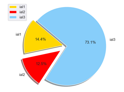
I need to build pie chart for three separate fields which should display the field name and its percentage in the same pie chart.
Eg: ial1, ial2 and ial3 are three different fields in Splunk. It should display in the attached format. Could someone help me on this.
- Mark as New
- Bookmark Message
- Subscribe to Message
- Mute Message
- Subscribe to RSS Feed
- Permalink
- Report Inappropriate Content


the standard pie chart doesn't display percentages except when you hover over the various segments. Is this sufficient? If so, you just need a table with id and count(?) and visualise that as a pie chart e.g.
| stats count by id
- Mark as New
- Bookmark Message
- Subscribe to Message
- Mute Message
- Subscribe to RSS Feed
- Permalink
- Report Inappropriate Content
@P_raju
You can use fieldsummary command to do this. Example:
index="_internal"| fieldsummary | table field, distinct_count
If you find my solution/debugging steps fruitful, an upvote would be appreciated.
- Mark as New
- Bookmark Message
- Subscribe to Message
- Mute Message
- Subscribe to RSS Feed
- Permalink
- Report Inappropriate Content
Hi,
In Splunk, the fields are distinct as attached. Let me know how to combine these fields into single field so that i can create pie chart.

Regards,
P_raju
- Mark as New
- Bookmark Message
- Subscribe to Message
- Mute Message
- Subscribe to RSS Feed
- Permalink
- Report Inappropriate Content
You can try it as:
index<your_index> | fields ia_*| fieldsummary | table field, distinct_countPie chart will create sections depending on count of each field and calculate percentage by default (visible by hovering on each segment).
- Mark as New
- Bookmark Message
- Subscribe to Message
- Mute Message
- Subscribe to RSS Feed
- Permalink
- Report Inappropriate Content
I have assumed you want to count the ia* fields - if you want something else, change the stats function - the key is to then transpose to get each ia* value as a different event
| gentimes start=-1 increment=10m
| eval id="ia".(random()%3)."_users"
| table id
| eval {id}=random()%10
| fields - id


| stats count(ia*_users) as ia*_users
| transpose 0

Join the Splunk Community Slack to learn, troubleshoot, and make connections with fellow Splunk practitioners in real time!
Join Splunk User Groups to connect and learn in-person by region or remotely by topic or industry.
Your Feedback. Our Roadmap. Visit the PX Feedback Booth at .conf26
Agentic SOC Triage: Investigating Splunk ES Notables with MCP Server and a Local LLM
Painting a Clearer Picture: Creating Cross-Domain Visibility with AI Canvas
