Are you a member of the Splunk Community?
- Find Answers
- :
- Using Splunk
- :
- Dashboards & Visualizations
- :
- Re: Colors on bar chart without changing bar size?
- Subscribe to RSS Feed
- Mark Topic as New
- Mark Topic as Read
- Float this Topic for Current User
- Bookmark Topic
- Subscribe to Topic
- Mute Topic
- Printer Friendly Page
- Mark as New
- Bookmark Message
- Subscribe to Message
- Mute Message
- Subscribe to RSS Feed
- Permalink
- Report Inappropriate Content
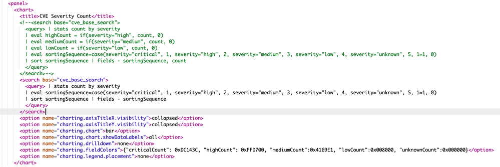
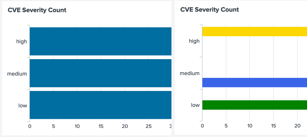
So I've gone through I don't know how many of the questions and answers on coloring bar charts but still having no luck.

What the heck is going on and how can I fix it?
- Mark as New
- Bookmark Message
- Subscribe to Message
- Mute Message
- Subscribe to RSS Feed
- Permalink
- Report Inappropriate Content
@woodcock I took your suggestion and started from scratch, removed the results sorting too and tried both
| stats count by severity
and
| chart count by severity
to see if there would be any difference. Unfortunately neither made any change. I kept digging and found a reference to using transpose to fix it. So I added the following to the end of my query
 | stats count by severity

        | eval sortingSequence=case(severity="critical", 1, severity="high", 2, severity="medium", 3, severity="low", 4, severity="unknown", 5, 1=1, 0)

        | sort sortingSequence | fields - sortingSequence | transpose 0 header_field="severity" column_name="severity"
Once I added the tranpose it would then recognise the values for the series and color them correctly. I do have a rogue "count" label on the Y axis instead of "high,medium,low" that now though that I can't figure out how to get rid of but I'll accept it.
- Mark as New
- Bookmark Message
- Subscribe to Message
- Mute Message
- Subscribe to RSS Feed
- Permalink
- Report Inappropriate Content
Here is a way that is more controllable than using transpose; it allows you to set the stray count string to anything that you like:
| windbag
| eval severity =(random() % 4) + 1
| eval severity = case(severity==1, "critical", severity==2, "high", severity=3, "medium", severity==4, "low")
| stats count by severity
| eval sortingSequence=case(severity="critical", 1, severity="high", 2, severity="medium", 3, severity="low", 4, severity="unknown", 5, 1=1, 0)
| eval severities = printf("%*s", len(severity) + sortingSequence, severity)
| fields - sortingSequence
| eval severity = "count"
| xyseries severity severities count
- Mark as New
- Bookmark Message
- Subscribe to Message
- Mute Message
- Subscribe to RSS Feed
- Permalink
- Report Inappropriate Content
@woodcock I took your suggestion and started from scratch, removed the results sorting too and tried both
| stats count by severity
and
| chart count by severity
to see if there would be any difference. Unfortunately neither made any change. I kept digging and found a reference to using transpose to fix it. So I added the following to the end of my query
 | stats count by severity

        | eval sortingSequence=case(severity="critical", 1, severity="high", 2, severity="medium", 3, severity="low", 4, severity="unknown", 5, 1=1, 0)

        | sort sortingSequence | fields - sortingSequence | transpose 0 header_field="severity" column_name="severity"
Once I added the tranpose it would then recognise the values for the series and color them correctly. I do have a rogue "count" label on the Y axis instead of "high,medium,low" that now though that I can't figure out how to get rid of but I'll accept it.
- Mark as New
- Bookmark Message
- Subscribe to Message
- Mute Message
- Subscribe to RSS Feed
- Permalink
- Report Inappropriate Content
See my new answer for more control without transpose.
- Mark as New
- Bookmark Message
- Subscribe to Message
- Mute Message
- Subscribe to RSS Feed
- Permalink
- Report Inappropriate Content
It should work the way that you have it. When I have problems like this, I just start over with the search in an ad-hoc search window, set as much as I can ad-hoc, making sure that it looks good, and then do Save as and Dashbaord Panel and add it to my dashboard that way. Then add this XML manually to finish it off:
<init>
   <set token="COLOR_RED">0xDC143C</set>
   <set token="COLOR_YELLOW">0xFFD700</set>
   <set token="COLOR_BLUE">0x4160E1</set>
   <set token="COLOR_BLACK">0x000000</set>
</init>
...
<chart>
....
   <option name="charting.fieldColors">{high:$COLOR_RED$,medium:$COLOR_YELLOW$,low:$COLOR_BLUE$}</option>
</chart>
- Mark as New
- Bookmark Message
- Subscribe to Message
- Mute Message
- Subscribe to RSS Feed
- Permalink
- Report Inappropriate Content
Never post pictures without also posting the plain text.
- Mark as New
- Bookmark Message
- Subscribe to Message
- Mute Message
- Subscribe to RSS Feed
- Permalink
- Report Inappropriate Content
Good point, thanks.
- Mark as New
- Bookmark Message
- Subscribe to Message
- Mute Message
- Subscribe to RSS Feed
- Permalink
- Report Inappropriate Content
I had to read your screen and then type it in to comment. What a pain.

