Are you a member of the Splunk Community?
- Find Answers
- :
- Using Splunk
- :
- Dashboards & Visualizations
- :
- Chart problems : Stacked 2 values by users over se...
- Subscribe to RSS Feed
- Mark Topic as New
- Mark Topic as Read
- Float this Topic for Current User
- Bookmark Topic
- Subscribe to Topic
- Mute Topic
- Printer Friendly Page
- Mark as New
- Bookmark Message
- Subscribe to Message
- Mute Message
- Subscribe to RSS Feed
- Permalink
- Report Inappropriate Content
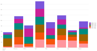
We've had several changes going on to some dashboards I've been doing, including new data. Where we used to be dealing with only PRD data, we're adding some TST data activity as well. The chart I'm trying to do is a to show counts of activity by PRD and TST, stacked, for each of our 3 current users over the last 7 months. We want an at a glance view of how much work is being done, by whom and where, and how one user compares to the other. I can do it as separate charts, but it can be confusing. 1 person's count scale peaks at 25 where the other peaks at 66, so if you don't look at the fine print, User A doesn't look like they are doing a third of the work of User B.
I've tried several variations of charts, timecharts, etc., but either they don't work, combine PRD/TST into one total or they don't stack.
Best result for me would be one column (or bar if need be) per user per month, with two separate totals for PRD and TST counts, stacked on each other.
- Mark as New
- Bookmark Message
- Subscribe to Message
- Mute Message
- Subscribe to RSS Feed
- Permalink
- Report Inappropriate Content
The closest you can do is combine both user and environment into one field:
| makeresults | eval name="Ana,Joe,Rob", env="PRD,TST", date="1-1-2022,2-1-2022,3-1-2022,4-1-2022,5-1-2022,6-1-2022,7-1-2022,8-1-2022"
| foreach * [| eval <<FIELD>>=SPLIT(<<FIELD>>, ",") | mvexpand <<FIELD>> | eval event_ct=(random() % 30) + 1]
| eval _time=strptime(date, "%m-%d-%Y")
| eval event_name="[".env."] - ".name
| timechart span=1mon sum(event_ct) AS event_ct BY event_name
- Mark as New
- Bookmark Message
- Subscribe to Message
- Mute Message
- Subscribe to RSS Feed
- Permalink
- Report Inappropriate Content
I've tried something similar, but not exactly like that. It is better than what I have now. I'm thinking of adding counts to the values and have a careful color list so that one user is greens, another blues, the third reds. Done this so it is easy to see which values belong to who, and you don't have to mouse over to get exact counts.
Thanks

