- Mark as New
- Bookmark Message
- Subscribe to Message
- Mute Message
- Subscribe to RSS Feed
- Permalink
- Report Inappropriate Content
I know someone is going to say this has been answered many times but...I have gone through every example I can find here in the Community and have yet to find something that will work. I have a monitor that runs every 5 minutes to validate a web URL is alive and it records the number of milliseconds for the total response time. My query returns two values _time and total_time for each 5 minute ping. I can use the "pencil" on the right to add color and ranges to the table display but it does not flow into visualization. My search:
index=xxx_website_monitoring sourcetype=web_ping https://my.website.com | stats values(total_time) by _time
The column chart works but I need to make each column Green, Yellow or Red based on the value of total_time like:
| eval red = if(total_time>=500,total_time,0)
| eval yellow = if(total_time<500 AND total_time>=300,total_time,0)
| eval green = if(total_time<300, total_time, 0)
However, none of the examples I have found work because they expect Func(Expression) or if([bool expr], [expr], or some other command combination and not just a Field. Here is the chart with the default Blue. total_response on the Y and _time on the X:
Here is an example of what does not work:
index=xxx_website_monitoring sourcetype=web_ping https://my.website.com | stats values(total_time) by _time
| eval red = if(total_time>=500,total_time,0)
| eval yellow = if(total_time<500 AND total_time>=300,total_time,0)
| eval green = if(total_time<300, total_time, 0)
<chart>
<searchName>URLMonitor</searchName>
<title>Clarifire URL Response Times</title>
<option name="charting.chart">column</option>
<option name="charting.fieldColors">{"red":0xFF0000,"yellow":0xFFFF00, "green":0x73A550}</option>
<option name="charting.legend.placement">none</option>
<option name="charting.axisLabelsX.majorLabelStyle.rotation">90</option>
</chart>
Error in 'eval' command: Fields cannot be assigned a boolean result. Instead, try if([bool expr], [expr], [expr]).
- Mark as New
- Bookmark Message
- Subscribe to Message
- Mute Message
- Subscribe to RSS Feed
- Permalink
- Report Inappropriate Content
This last reply worked perfectly. I was able to create chart with the normal theme and with the dark theme. My users will have a choice as to how they want to see the data.
Thank you!!
- Mark as New
- Bookmark Message
- Subscribe to Message
- Mute Message
- Subscribe to RSS Feed
- Permalink
- Report Inappropriate Content
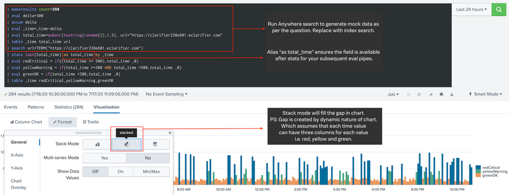
@srewarrior if you would notice the series name in Legend of your screenshot, your stats aggregation is changing the field name from total_time to values(total_time). Because of this the field total_time is not available for subsequent eval.
So try changing your search to
index=xxx_website_monitoring sourcetype=web_ping https://my.website.com
| stats values(total_time) as total_time by _time
| eval red = if(total_time>=500,total_time,0)
| eval yellow = if(total_time<500 AND total_time>=300,total_time,0)
| eval green = if(total_time<300, total_time, 0)
| table _time red, yellow, green
Following is a run anywhere example based on the SPL, sample screenshot provided. Please try out and confirm. PS: You would need to replace the run anywhere data generation with your actual index search for SPL to work with your data.
<dashboard theme="dark">
<label>Color By Range</label>
<row>
<panel>
<html>
<style>
#total_time_kpi g.highcharts-legend-item text tspan:nth-child(2){
font-size:110% !important;
font-weight:bold !important;
fill:lightgrey !important;
}
</style>
</html>
<chart id="total_time_kpi">
<search>
<query>| makeresults count=288
| eval delta=300
| accum delta
| eval _time=_time-delta
| eval total_time=substr(tostring(random()),1,3), url="https://clarifier238e601.eclarifier.com"
| table _time total_time url
| search url=TERM("https://clarifier238e601.eclarifier.com")
| stats last(total_time) as total_time by _time
| eval redCritical = if((total_time >= 500),total_time ,0)
| eval yellowWarning = if(total_time >=300 AND total_time <500,total_time ,0)
| eval greenOK = if(total_time <300,total_time ,0)
| table _time redCritical,yellowWarning,greenOK</query>
<earliest>-24h@h</earliest>
<latest>now</latest>
<sampleRatio>1</sampleRatio>
</search>
<option name="charting.axisLabelsX.majorLabelStyle.overflowMode">ellipsisNone</option>
<option name="charting.axisLabelsX.majorLabelStyle.rotation">0</option>
<option name="charting.axisTitleX.visibility">collapsed</option>
<option name="charting.axisTitleY.visibility">visible</option>
<option name="charting.axisTitleY2.visibility">visible</option>
<option name="charting.axisX.abbreviation">none</option>
<option name="charting.axisX.scale">linear</option>
<option name="charting.axisY.abbreviation">none</option>
<option name="charting.axisY.scale">linear</option>
<option name="charting.axisY2.abbreviation">none</option>
<option name="charting.axisY2.enabled">0</option>
<option name="charting.axisY2.scale">inherit</option>
<option name="charting.chart">area</option>
<option name="charting.chart.bubbleMaximumSize">50</option>
<option name="charting.chart.bubbleMinimumSize">10</option>
<option name="charting.chart.bubbleSizeBy">area</option>
<option name="charting.chart.nullValueMode">gaps</option>
<option name="charting.chart.showDataLabels">none</option>
<option name="charting.chart.sliceCollapsingThreshold">0.01</option>
<option name="charting.chart.stackMode">stacked</option>
<option name="charting.chart.style">shiny</option>
<option name="charting.drilldown">none</option>
<option name="charting.fieldColors">{"redCritical":"#DC4E41","yellowWarning":"#F8BE34","greenOK":"#5CC05C"}</option>
<option name="charting.layout.splitSeries">0</option>
<option name="charting.layout.splitSeries.allowIndependentYRanges">0</option>
<option name="charting.legend.labelStyle.overflowMode">ellipsisMiddle</option>
<option name="charting.legend.mode">seriesCompare</option>
<option name="charting.legend.placement">right</option>
<option name="charting.lineWidth">2</option>
<option name="trellis.enabled">0</option>
<option name="trellis.scales.shared">1</option>
<option name="trellis.size">medium</option>
</chart>
</panel>
</row>
</dashboard>| makeresults | eval message= "Happy Splunking!!!"
- Mark as New
- Bookmark Message
- Subscribe to Message
- Mute Message
- Subscribe to RSS Feed
- Permalink
- Report Inappropriate Content
This last reply worked perfectly. I was able to create chart with the normal theme and with the dark theme. My users will have a choice as to how they want to see the data.
Thank you!!
- Mark as New
- Bookmark Message
- Subscribe to Message
- Mute Message
- Subscribe to RSS Feed
- Permalink
- Report Inappropriate Content
@srewarrior Glad your customers have more options. Seems like you Accepted your own answer instead of mine posted above! Kindly correct 🙂
| makeresults | eval message= "Happy Splunking!!!"
- Mark as New
- Bookmark Message
- Subscribe to Message
- Mute Message
- Subscribe to RSS Feed
- Permalink
- Report Inappropriate Content
sample:
index=_internal
| timechart count
| eval status=case(count>100," >100",count>10,"100-10",1=1,"10>")
| chart values(count) as count by _time status
How about doing something like this?
- Mark as New
- Bookmark Message
- Subscribe to Message
- Mute Message
- Subscribe to RSS Feed
- Permalink
- Report Inappropriate Content
This is the problem I have with all the examples so far. Unless I am missing something, I am not count'ing anything. I am not avg'ing. I am not using any function. I simply want to take value in total_response (response time in milliseconds) and graph it in the appropriate color. I am new to Splunk but it seems like a fairly simple task. I have time and response time every five minutes. Nothing super fancy and complicated. I can't believe that no one has thought of this simplistic use case before me. I want my dashboard users to see yellow and red columns for each occurrence when response time hits the appropriate thresholds.


