- Find Answers
- :
- Using Splunk
- :
- Dashboards & Visualizations
- :
- Building a dashboard to help tune our network sens...
- Subscribe to RSS Feed
- Mark Topic as New
- Mark Topic as Read
- Float this Topic for Current User
- Bookmark Topic
- Subscribe to Topic
- Mute Topic
- Printer Friendly Page
- Mark as New
- Bookmark Message
- Subscribe to Message
- Mute Message
- Subscribe to RSS Feed
- Permalink
- Report Inappropriate Content
Hello all,
I am fairly new to the Splunk Community and have been learning a lot over the past few weeks. Currently, my team is building a dashboard based on sensor data that can help us tune our sensors further.
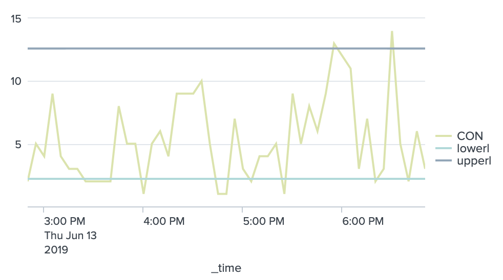
Essentially, we are creating a line chart for each sensor IP address (using trellis if that helps) based on the count (of seeing this sensor) every 5 minutes or so using bins and charts. We currently have standard deviation lines based on each count with some sensitivity. The idea is that we have a window between the two lines. This is demonstrating some "normal" traffic. This will help us show outliers and could give us some different insight over time (we would like to eventually be able to compare this data with much earlier data).
In any case, I am having trouble outlining the outliers that are clearly represented in the chart that is shown. And my line in the search to identify outliers just identifies them all as outliers which is incorrect... I'm unsure of what I am doing wrong and also see how much of a pain it is the track count over time as a variable and be able to do things with it (such as the outliers) and such.
A side issue is that when the count is 0 (meaning the sensor didn't show up) the standard deviation line also is just missing represented with a null value. Anyway, I can make the graph look prettier and have it just go along with the rest of the line?
So, questions are as follow:
- How can I clearly show the outliers? Highlight them? Maybe even color in the area under or over between the outlier and standard deviation line?
- How can I fix my standard deviation line so there isn't blanks?
index=networkdata sourcetype=json
| bin _time span=5m
| eventstats count(seen.indicator) as "Count" by seen.indicator _time
| eventstats avg(Count) as "newAVG" by seen.indicator
| eventstats stdev(Count) as "newSTD" by seen.indicator
| eval upper = newAVG+(newSTD*1.5)
| eval lower = newAVG-(newSTD*1.5)
| eval isOutlier=if("Count" < lower OR "Count" > upper, 1, 0)
| chart count(seen.indicator) as CON, eval(values(upper)) as upperl, eval(values(lower)) as lowerl over _time by seen.indicator
- Mark as New
- Bookmark Message
- Subscribe to Message
- Mute Message
- Subscribe to RSS Feed
- Permalink
- Report Inappropriate Content
@cxr5971 the isOutlier field is getting removed because of the use of chart command which retains only the CON, lowerl and upperl. You should calculate isOutlier chart command not before. Also by seen.indicator does not seem required as you are having only one series plotted CON when you use split by.
Following is the updated query
  index=networkdata sourcetype=json
 | bin _time span=5m
 | eventstats count(seen.indicator) as "Count" by seen.indicator _time
 | eventstats avg(Count) as "newAVG" by seen.indicator
 | eventstats stdev(Count) as "newSTD" by seen.indicator
 | eval upper = newAVG+(newSTD*1.5)
 | eval lower = newAVG-(newSTD*1.5)
 | timechart span=5m count(seen.indicator) as CON, eval(values(upper)) as upperl, eval(values(lower)) as lowerl
 | eval isOutlier=if(CON < lowerl OR CON > upperl, 1, 0)
Coming to your second question there are few options to show outliers better in Splunk.
Option 1) Splunk's built in chart (using some of Splunk 7.x features)
a) Use Chart Overlay to show Outlier on Y2 axis (all versions)
    <option name="charting.chart.overlayFields">isOutlier</option>
    <option name="charting.axisY2.abbreviation">none</option>
    <option name="charting.axisY2.enabled">1</option>
    <option name="charting.axisY2.maximumNumber">1</option>
    <option name="charting.axisY2.minimumNumber">0</option>
    <option name="charting.axisY2.scale">inherit</option>
    <option name="charting.axisTitleY2.visibility">visible</option>
    <option name="charting.axisLabelsY2.majorUnit">1</option>
b) Use charting.fieldColors to have specific colors for different series (all versions)
<option name="charting.fieldColors">{"CON":"0x003366","upperl": "0xFF6600","lowerl": "0xFFD700","isOutlier":"0x8B0000"}</option>
c) Use charting.fieldDashStyles to have different series line styles (Splunk 7x)
<option name="charting.fieldDashStyles">{"CON":"solid","upperl": "shortDot","lowerl": "shortDot","isOutlier":"longDashDot"}</option>
d) Enable Series Compare for Chart Legends for better comparison on timechart
<option name="charting.legend.mode">seriesCompare</option>
PS: I have used CSS Style override (optional) for better visibility of series comparison.
Option 2) Use Outlier Chart from the Splunk Machine Learning Toolkit App.
Option 3) Create chart similar to outlier chart using Splunk's Built In Chart: Refer to my answer: https://answers.splunk.com/answers/747177/how-to-add-a-reference-line-to-an-outlier-chart-cr.html
Please find below the Simple XML run anywhere dashboard example for example in Option 1 above
<dashboard>
  <label>Show Outlier on Chart</label>
  <row>
    <panel>
      <html depends="$alwaysHideCSSPanel$">
        <style>
          div#outlierChart svg g.highcharts-legend g.highcharts-legend-item text tspan:nth-child(2){
            font-size: 120% !important;
            fill: black !important;
            font-weight: bold !important;
          }
        </style>
      </html>
      <chart id="outlierChart">
        <search>
          <query>index=_internal sourcetype=splunkd log_level="ERROR"
 | bin _time span=5m
 | eventstats count as "Count" by log_level _time
 | eventstats avg(Count) as "newAVG" by log_level
 | eventstats stdev(Count) as "newSTD" by log_level
 | eval upper = newAVG+(newSTD*1.5)
 | eval lower = newAVG-(newSTD*1.5)
 | chart count as CON, eval(values(upper)) as upperl, eval(values(lower)) as lowerl by _time
 | eval isOutlier=if(CON < lowerl OR CON > upperl, 1, 0)</query>
          <earliest>-24h@h</earliest>
          <latest>now</latest>
          <sampleRatio>1</sampleRatio>
        </search>
        <option name="charting.axisLabelsX.majorLabelStyle.overflowMode">ellipsisNone</option>
        <option name="charting.axisLabelsX.majorLabelStyle.rotation">0</option>
        <option name="charting.axisLabelsY2.majorUnit">1</option>
        <option name="charting.axisTitleX.visibility">visible</option>
        <option name="charting.axisTitleY.visibility">visible</option>
        <option name="charting.axisTitleY2.visibility">visible</option>
        <option name="charting.axisX.abbreviation">none</option>
        <option name="charting.axisX.scale">linear</option>
        <option name="charting.axisY.abbreviation">none</option>
        <option name="charting.axisY.scale">linear</option>
        <option name="charting.axisY2.abbreviation">none</option>
        <option name="charting.axisY2.enabled">1</option>
        <option name="charting.axisY2.maximumNumber">1</option>
        <option name="charting.axisY2.minimumNumber">0</option>
        <option name="charting.axisY2.scale">inherit</option>
        <option name="charting.chart">line</option>
        <option name="charting.chart.bubbleMaximumSize">50</option>
        <option name="charting.chart.bubbleMinimumSize">10</option>
        <option name="charting.chart.bubbleSizeBy">area</option>
        <option name="charting.chart.nullValueMode">gaps</option>
        <option name="charting.chart.overlayFields">isOutlier</option>
        <option name="charting.chart.showDataLabels">none</option>
        <option name="charting.chart.sliceCollapsingThreshold">0.01</option>
        <option name="charting.chart.stackMode">default</option>
        <option name="charting.chart.style">shiny</option>
        <option name="charting.drilldown">none</option>
        <option name="charting.fieldColors">{"CON":"0x003366","upperl": "0xFF6600","lowerl": "0xFFD700","isOutlier":"0x8B0000"}</option>
        <option name="charting.fieldDashStyles">{"CON":"solid","upperl": "shortDot","lowerl": "shortDot","isOutlier":"longDashDot"}</option>
        <option name="charting.layout.splitSeries">0</option>
        <option name="charting.layout.splitSeries.allowIndependentYRanges">0</option>
        <option name="charting.legend.labelStyle.overflowMode">ellipsisMiddle</option>
        <option name="charting.legend.mode">seriesCompare</option>
        <option name="charting.legend.placement">right</option>
        <option name="charting.lineWidth">2</option>
        <option name="trellis.enabled">0</option>
        <option name="trellis.scales.shared">1</option>
        <option name="trellis.size">medium</option>
      </chart>
    </panel>
  </row>
</dashboard>
| makeresults | eval message= "Happy Splunking!!!"
- Mark as New
- Bookmark Message
- Subscribe to Message
- Mute Message
- Subscribe to RSS Feed
- Permalink
- Report Inappropriate Content
Here is my issue now, I have the isOutlier line charted. It is only 0 or 1, depending on if the count value (which is also charted) is an outlier.
Is there some way, via xml or otherwise, that I can change the color or highlighting on the count line to something else if the outlier value (which I have also charted but is specific to each count event) is set to 1?
- Mark as New
- Bookmark Message
- Subscribe to Message
- Mute Message
- Subscribe to RSS Feed
- Permalink
- Report Inappropriate Content
Did you create an overlay for isOutlier? Also do you have seriesCompare turned on for legend?
Hope this should solve your issue. If not you need to provide more details on the issue.
| makeresults | eval message= "Happy Splunking!!!"
- Mark as New
- Bookmark Message
- Subscribe to Message
- Mute Message
- Subscribe to RSS Feed
- Permalink
- Report Inappropriate Content
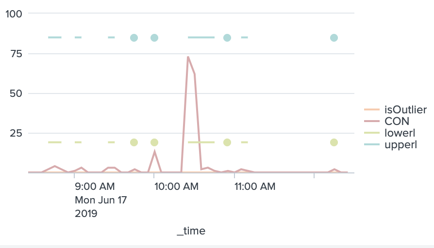
SOLVED( Hello @niketnilay thank you for your response. The formatting options that you have listed are pretty helpful but I may have used a bad graph example for you. Above is an extra picture that better represents what I meant by "holes in the upper and lower lines". Because the count at certain areas is just 0, then the standard deviation lines (upperl, lowerl) decide to be a nothing value. Creating spaces in the graph. Also the "by seen.indicator" is important because I have many indicators so if I don't have that then it will clump it into one graph.
Also the isOutlier field is still 0 regardless of if it is placed before or after the chart command. Using your graphical XML code, is there even a reason for the isOutlier variable? I want to be able to outline all the outliers in some way and just make them visible while perhaps being clickable with a drilldown so someone could go look at the events in that time frame.)
The problems listed in this comment were solved. I was able to fill the gaps easily with the filldown command....Also I was able to get the Outliers to be applied properly.


