- Splunk Answers
- :
- Using Splunk
- :
- Dashboards & Visualizations
- :
- Re: Bar/Column Chart Color for Multi Values
- Subscribe to RSS Feed
- Mark Topic as New
- Mark Topic as Read
- Float this Topic for Current User
- Bookmark Topic
- Subscribe to Topic
- Mute Topic
- Printer Friendly Page
- Mark as New
- Bookmark Message
- Subscribe to Message
- Mute Message
- Subscribe to RSS Feed
- Permalink
- Report Inappropriate Content
Hello,
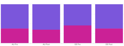
Below Column Chart Results and visualization, I wanted to show different colors for field Values.
like AU Pre & AU Post as one color
DE Pre & DE Post as one color.
I'm using this but doesn't work
<option name="charting.fieldColors">{"AU Pre":0x333333,"AU Post":0xd93f3c,"JP Pre":0xeeeeee,"JP Post":0x65a637,"DE Pre":0xeeeeee,"DE Post":0x65a637}</option>
market limit spend
| AU Pre | 1462912 | 884854 |
| AU Post | 2160567 | 1166031 |
| DE Pre | 91217 | 76973 |
| DE Post | 160221 | 97906 |
| JP Pre | 1621712 | 1015115 |
| JP Post | 2787394 | 1282541 |
- Mark as New
- Bookmark Message
- Subscribe to Message
- Mute Message
- Subscribe to RSS Feed
- Permalink
- Report Inappropriate Content
That particular property is keyed off of your Y fields, not the X-field that you'd like. For example, to change the colors with your field names, you'd do something like this - but I understand this isn't what you're looking for:
<option name="charting.fieldColors">{"limit":0x333333,"spend":0xd93f3c}</option>
I came up with a real hack way to do this...someone who knows more than me might have a better way,,,
Since this chart property is keyed off the name of the y-fields, then you could custom-name all the Y-fields so you can reference them in the fieldColors property. Here is some example SPL with a bunch of evals to really show how you can split these up:
| makeresults format=csv data="market,limit,spend
\"AU Pre\",	1462912,	884854
\"AU Post\",	2160567,	1166031
\"DE Pre\",	91217,	76973
\"DE Post\",	160221,	97906"

| eval AU_Pre_limit = if(market="AU Pre",limit,null)
| eval AU_Post_limit = if(market="AU Post",limit,null)
| eval DE_Pre_limit = if(market="DE Pre",limit,null)
| eval DE_Post_limit = if(market="DE Post",limit,null)
| table market, AU_Pre_limit, AU_Post_limit, DE_Pre_limit, DE_Post_limit, spend
Then you can build a fieldColors property like this:
        <option name="charting.fieldColors">
         {"AU_Pre_limit":0x333333,"AU_Post_limit":0xd93f3c, "DE_Pre_limit":0xeeeeee,"DE_Post_limit":0x65a637, "spend":0xaa0000}
        </option>
Here is an example dashboard. I will also attach the SimpleXML in a PDF so you can try it out:
** Again...this is very hack and I typically try and keep as much formatting/display info out of my SPL as I can (or at least put it way at the end or do it as a post-process). This totally breaks any MVC-patterns I like to follow. But...if you have something you just need to get working and pretty for now, this will do.


