Turn on suggestions
Auto-suggest helps you quickly narrow down your search results by suggesting possible matches as you type.
Dashboards & Visualizations
×
Join the Conversation
Without signing in, you're just watching from the sidelines. Sign in or Register to connect, share, and be part of the Splunk Community.
- Find Answers
- :
- Using Splunk
- :
- Dashboards & Visualizations
- :
- Re: Assign colors to trellis based on status
Options
- Subscribe to RSS Feed
- Mark Topic as New
- Mark Topic as Read
- Float this Topic for Current User
- Bookmark Topic
- Subscribe to Topic
- Mute Topic
- Printer Friendly Page
- Mark as New
- Bookmark Message
- Subscribe to Message
- Mute Message
- Subscribe to RSS Feed
- Permalink
- Report Inappropriate Content
Assign colors to trellis based on status
schou87
Path Finder
05-21-2021
08:04 AM
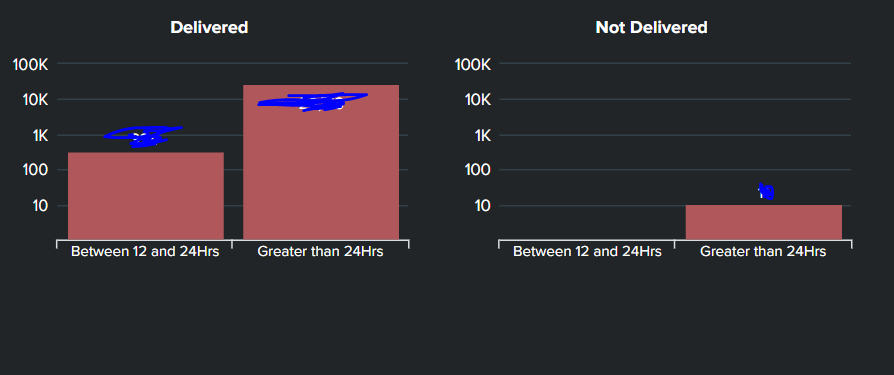
Hi, I have a column chart trellis split into two parts basis status - Delivered and Not Delivered. How do I go ahead and color the two charts differently based on status? I have attached the snapshot of trellis.
Regards
- Mark as New
- Bookmark Message
- Subscribe to Message
- Mute Message
- Subscribe to RSS Feed
- Permalink
- Report Inappropriate Content
kamlesh_vaghela

SplunkTrust
05-21-2021
09:38 AM
Can you please try this sample code?
<dashboard>
  <label>Trellis Column</label>
  <row>
    <panel>
       <html depends="$alwaysHideCSS$">
        <style>
          #columnchart1 #facet-viz_splitby_field_Status_splitby_value_Delivered #column .highcharts-graph {
            fill:#00ff00;
          }
          #columnchart1 #facet-viz_splitby_field_Status_splitby_value_Not_Delivered #column .highcharts-graph {
            fill:#ff0000;
          }

        </style>
      </html>
      <chart id="columnchart1">
        <search>
          <query>| makeresults count=10
| eval c=1
| accum c
| eval A=case((c%3)==0,"Between 12 and 24 Hrs",1=1,"Greater Than 24 Hrs"),Status=case((c%2)==0,"Not Delivered",1=1,"Delivered")
| xyseries A Status c</query>
          <earliest>-24h@h</earliest>
          <latest>now</latest>
          <sampleRatio>1</sampleRatio>
        </search>
        <option name="charting.axisLabelsX.majorLabelStyle.overflowMode">ellipsisNone</option>
        <option name="charting.axisLabelsX.majorLabelStyle.rotation">0</option>
        <option name="charting.axisTitleX.visibility">collapsed</option>
        <option name="charting.axisTitleY.visibility">collapsed</option>
        <option name="charting.axisTitleY2.visibility">collapsed</option>
        <option name="charting.axisX.abbreviation">none</option>
        <option name="charting.axisX.scale">linear</option>
        <option name="charting.axisY.abbreviation">none</option>
        <option name="charting.axisY.scale">linear</option>
        <option name="charting.axisY2.abbreviation">none</option>
        <option name="charting.axisY2.enabled">0</option>
        <option name="charting.axisY2.scale">inherit</option>
        <option name="charting.chart">column</option>
        <option name="charting.chart.bubbleMaximumSize">50</option>
        <option name="charting.chart.bubbleMinimumSize">10</option>
        <option name="charting.chart.bubbleSizeBy">area</option>
        <option name="charting.chart.nullValueMode">gaps</option>
        <option name="charting.chart.showDataLabels">none</option>
        <option name="charting.chart.sliceCollapsingThreshold">0.01</option>
        <option name="charting.chart.stackMode">default</option>
        <option name="charting.chart.style">shiny</option>
        <option name="charting.drilldown">none</option>
        <option name="charting.layout.splitSeries">0</option>
        <option name="charting.layout.splitSeries.allowIndependentYRanges">0</option>
        <option name="charting.legend.labelStyle.overflowMode">ellipsisMiddle</option>
        <option name="charting.legend.mode">standard</option>
        <option name="charting.legend.placement">none</option>
        <option name="charting.lineWidth">2</option>
        <option name="trellis.enabled">1</option>
        <option name="trellis.scales.shared">1</option>
        <option name="trellis.size">medium</option>
      </chart>
    </panel>
  </row>
</dashboard>
Thanks
KV
▄︻̷̿┻̿═━一
If this reply helps you, an upvote would be appreciated.
Got questions? Get answers!
Join the Splunk Community Slack to learn, troubleshoot, and make connections with fellow Splunk practitioners in real time!
Meet up IRL or virtually!
Join Splunk User Groups to connect and learn in-person by region or remotely by topic or industry.
Get Updates on the Splunk Community!
Index This | What travels the world but is also stuck in place?
April 2026 Edition
Hayyy Splunk Education Enthusiasts and the Eternally Curious!
We’re back with this ...
Discover New Use Cases: Unlock Greater Value from Your Existing Splunk Data
Realizing the full potential of your Splunk investment requires more than just understanding current usage; it ...
Continue Your Journey: Join Session 2 of the Data Management and Federation Bootcamp ...
As data volumes continue to grow and environments become more distributed, managing and optimizing data ...
