Join the Conversation
- Find Answers
- :
- Apps & Add-ons
- :
- All Apps and Add-ons
- :
- All Apps and Add-ons
- :
- Timeline - Custom Visualization: Why is the gettin...
- Subscribe to RSS Feed
- Mark Topic as New
- Mark Topic as Read
- Float this Topic for Current User
- Bookmark Topic
- Subscribe to Topic
- Mute Topic
- Printer Friendly Page
- Mark as New
- Bookmark Message
- Subscribe to Message
- Mute Message
- Subscribe to RSS Feed
- Permalink
- Report Inappropriate Content
Timeline - Custom Visualization: Why is the getting tooltip partially hidden, and is there a workaround or bug fix planned?
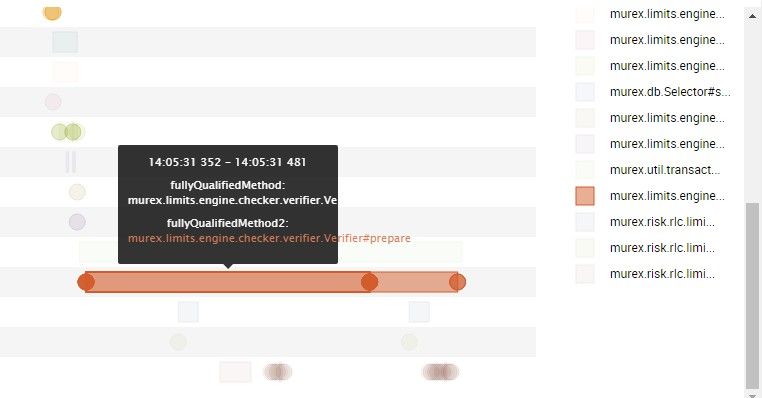
Thank you for a great acheivement in making the visualizations easier to work with! I use the new Timeline Custom Visualization. It is very handy, but unfortunately, I have an issue with it. When a time interval for a given category starts at the far left (beginning) and spans half or more of the total interval for the timeline chart, the tooltip get truncated. As far as I can see, the tooltip behaves as expected in all other situations.
Anyone else experiencing this? Is there a workaround available, or a bug fix to be expected?
Thanks!
Sven Emil
- Mark as New
- Bookmark Message
- Subscribe to Message
- Mute Message
- Subscribe to RSS Feed
- Permalink
- Report Inappropriate Content
Hi
Thanks for this and it works for some of my graphs.
But is there a way to make the box bigger please :). In the below image i use this graph for code line analysis and this can get very large
- Mark as New
- Bookmark Message
- Subscribe to Message
- Mute Message
- Subscribe to RSS Feed
- Permalink
- Report Inappropriate Content
There is an updated version 1.2 released yesterday (June, 1. 2017).
- Mark as New
- Bookmark Message
- Subscribe to Message
- Mute Message
- Subscribe to RSS Feed
- Permalink
- Report Inappropriate Content
Great, i will download and take a look - cheers 🙂
- Mark as New
- Bookmark Message
- Subscribe to Message
- Mute Message
- Subscribe to RSS Feed
- Permalink
- Report Inappropriate Content
Hello @sves,
Thank you for the feedback. There is no workaround for bad tooltip truncation but we will look at fixing this in an upcoming maintenance release.
Thanks again.
- Mark as New
- Bookmark Message
- Subscribe to Message
- Mute Message
- Subscribe to RSS Feed
- Permalink
- Report Inappropriate Content
(Bump) still no fix/ETA?
- Mark as New
- Bookmark Message
- Subscribe to Message
- Mute Message
- Subscribe to RSS Feed
- Permalink
- Report Inappropriate Content
ETA is still a few weeks out, but the next release should contain a fix for this.
- Mark as New
- Bookmark Message
- Subscribe to Message
- Mute Message
- Subscribe to RSS Feed
- Permalink
- Report Inappropriate Content
- Mark as New
- Bookmark Message
- Subscribe to Message
- Mute Message
- Subscribe to RSS Feed
- Permalink
- Report Inappropriate Content
Yes, i am gettging the same i am on the latest version of SPLUNK 6.5.2
- Mark as New
- Bookmark Message
- Subscribe to Message
- Mute Message
- Subscribe to RSS Feed
- Permalink
- Report Inappropriate Content
Can we have an update on the fix ? We have lot of use cases to use the timeline app, but can't use it because of this bug.
- Mark as New
- Bookmark Message
- Subscribe to Message
- Mute Message
- Subscribe to RSS Feed
- Permalink
- Report Inappropriate Content
Hi everyone, we don't have an ETA for this yet, but feel free to send me an email, so I can let you know when there an update is in the works.


