- Apps & Add-ons
- :
- All Apps and Add-ons
- :
- All Apps and Add-ons
- :
- Re: Creating a line graph that displays raw array ...
- Subscribe to RSS Feed
- Mark Topic as New
- Mark Topic as Read
- Float this Topic for Current User
- Bookmark Topic
- Subscribe to Topic
- Mute Topic
- Printer Friendly Page
- Mark as New
- Bookmark Message
- Subscribe to Message
- Mute Message
- Subscribe to RSS Feed
- Permalink
- Report Inappropriate Content
hi
after writ in the search "source="tcp:514" sourcetype="syslog" | chart values(_raw)" i see the results:
values(_raw)
10,20,30,40
how i can displays chart thet x-axis is simple runnung index (1,2,3,4,5...)
and y-axis is the 10,20,30,40 values.?
now i can only seccuss to chart one value by time.
thanks
- Mark as New
- Bookmark Message
- Subscribe to Message
- Mute Message
- Subscribe to RSS Feed
- Permalink
- Report Inappropriate Content
ok i find solution:
i use mvexpand to split the value into event, then rename time as serial
the plot is serial number in x
source="tcp:514"
| streamstats values(_raw) as value
| makemv value
| mvexpand value
| streamstats count AS _time
| rename _time AS serial
i have more question bus i save it to another post
thanks
| table serial value | head 2001
- Mark as New
- Bookmark Message
- Subscribe to Message
- Mute Message
- Subscribe to RSS Feed
- Permalink
- Report Inappropriate Content
hi @erez10121012
Please convert your comment into an answer and accept it for the benefit of other forum members
- Mark as New
- Bookmark Message
- Subscribe to Message
- Mute Message
- Subscribe to RSS Feed
- Permalink
- Report Inappropriate Content
another suggestion:
what about use mvexpand to create multiple events based on a multivalue field and plot it by _time.
where time start from 0 in steps of 1 sec, for example?
thanks
- Mark as New
- Bookmark Message
- Subscribe to Message
- Mute Message
- Subscribe to RSS Feed
- Permalink
- Report Inappropriate Content
hi @erez10121012
I had a look at your events and the first query i had given
      | eval _raw=split(_raw,",")
         |  streamstats count as row |eval row=row-1|mvexpand  _raw
         |  chart values(_raw) by row
first i split your raw events which is nothing but 4 packets value by a comma.
I add a eval to the row to reduce it by 1 (so row1 becomes row 0)
just check if this works.
NOTE - check after splitting the values of _raw should come as a number, else use |eval _raw=tonumber(_raw) AFTER the split.
- Mark as New
- Bookmark Message
- Subscribe to Message
- Mute Message
- Subscribe to RSS Feed
- Permalink
- Report Inappropriate Content
if it help to solve my problem, i can send to spunk the x axis and y axis in the same array, for example
row 1:
-72,0,-76,1,-84,2 etc
whare
y0,x0,y1,x1 etc
- Mark as New
- Bookmark Message
- Subscribe to Message
- Mute Message
- Subscribe to RSS Feed
- Permalink
- Report Inappropriate Content
Still stuck on this topic, I'd love to get help or direction...
- Mark as New
- Bookmark Message
- Subscribe to Message
- Mute Message
- Subscribe to RSS Feed
- Permalink
- Report Inappropriate Content
hi
still a not success to plot an array as function of the INDEX of the array: array(INDEX).
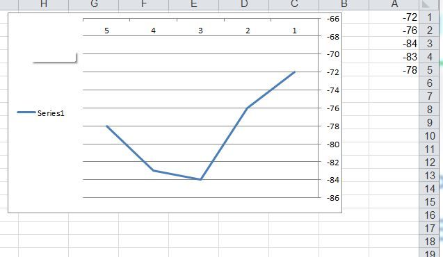
another example is OFFICE EXCEL: when i plot column the x-axis is the running index 1,2,3,4.... and the y-axis is the value.
i have 4000 value on each array, so i prefer not to send each value in different socket.
thanks
- Mark as New
- Bookmark Message
- Subscribe to Message
- Mute Message
- Subscribe to RSS Feed
- Permalink
- Report Inappropriate Content
- Mark as New
- Bookmark Message
- Subscribe to Message
- Mute Message
- Subscribe to RSS Feed
- Permalink
- Report Inappropriate Content
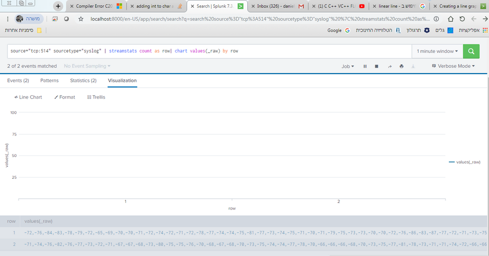
still not clear, how i the above a snapshot of values for row #1?
it looks like a series of values for rows 1-5?
- Mark as New
- Bookmark Message
- Subscribe to Message
- Mute Message
- Subscribe to RSS Feed
- Permalink
- Report Inappropriate Content
maybe you are right. i dont want to plot all the rows in the same time.
i want to plot row 1 for example, but if i plot by _TIME i see one column in Given time.
but i want to plot by _(0,1,2,3,4...)
so for 0 the value is -72
for 1 the value is -76
etc
thanks
- Mark as New
- Bookmark Message
- Subscribe to Message
- Mute Message
- Subscribe to RSS Feed
- Permalink
- Report Inappropriate Content
@erez10121012 for the two raw events in your example how do you want to plot them on chart? Can you add a mock screenshot or whiteboard snap explaining the same. Chart is not the right visualization for display raw data.
You can try out Event Annontation or Chart Tooltip Text as options but I dont think that kind of requirement for raw data makes sense, so please add a mock screenshot of output with some sample data: https://answers.splunk.com/answers/613705/using-dashboard-for-presentation.html
| makeresults | eval message= "Happy Splunking!!!"
- Mark as New
- Bookmark Message
- Subscribe to Message
- Mute Message
- Subscribe to RSS Feed
- Permalink
- Report Inappropriate Content
hi @erez10121012 ,
I have been thinking a bit about your requirement. The chart or stats or most commands will expect a numerical count on the y axis to plot a line/column or whatever else is the chosen viz format. You really can't have a value like 10,20,30,40 as 3 numerical values in the y axis.
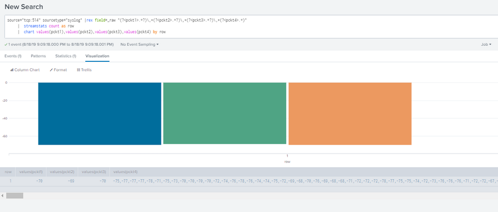
But I think what you need is one line each for each packet. The value 10,let us call this pckt1 you can chart this as a line across all your _raw events. Same goes for the other packets. In your events you have values for 4 packets. Try this
    | rex field=_raw "(?<pckt1>.*?)\,+(?<pckt2>.*?)\,+(?<pckt3>.*?)\,+(?<pckt4>.*)"
    |  streamstats count as row
    |  chart values(pckt1),values(pckt2),values(pckt3),values(pckt4) by row
This way if say pckt1 (which is all showing value of 10) jumps or you have a packet loss , the corresponding line will increase or decrease
- Mark as New
- Bookmark Message
- Subscribe to Message
- Mute Message
- Subscribe to RSS Feed
- Permalink
- Report Inappropriate Content
hi
i success to separate the value, but raw is always ‘1’ and all the data plot in the same line
thanks
- Mark as New
- Bookmark Message
- Subscribe to Message
- Mute Message
- Subscribe to RSS Feed
- Permalink
- Report Inappropriate Content
try this
source="tcp:514" sourcetype="syslog" | streamstats count as row| chart values(_raw) by row
- Mark as New
- Bookmark Message
- Subscribe to Message
- Mute Message
- Subscribe to RSS Feed
- Permalink
- Report Inappropriate Content
- Mark as New
- Bookmark Message
- Subscribe to Message
- Mute Message
- Subscribe to RSS Feed
- Permalink
- Report Inappropriate Content
hi @erez10121012 I apologize if I came out as rude,I didn't mean to.
This is a confusing situation, you can have 4000 lines or 4000 columns, splunk viz limits to 10 K.
BUT
will that be readable for end users?
Either way you are bound to find the chart too cramped. Are you looking for a dashboard panel or just a standalone search viz for this issue?
If you are considering a dashboard panel, I strongly recommend a summary view as a top level panel and then changing it to more details on drill down etc. If you are looking for a standalone search(or a dashboard panel for that matter) I don't think this vizs. are going to be of much help. You can build something technically but the viz will be all cramped and too 'dense' to interpret.
you have 4 values for each event, I suggest considering a pie with treliis view for each of the four
- Mark as New
- Bookmark Message
- Subscribe to Message
- Mute Message
- Subscribe to RSS Feed
- Permalink
- Report Inappropriate Content
hi @Sukisen1981
yes im looking for a dashboard panel, the user need to see the plot, if you can see in The picture above:
most of the value is between -75 to -60 , only few peaks are at -40 so the user can see it.
about the vizs: i just try different ways to fine the solution, but still i cant find how to plot the array
- Mark as New
- Bookmark Message
- Subscribe to Message
- Mute Message
- Subscribe to RSS Feed
- Permalink
- Report Inappropriate Content
- Mark as New
- Bookmark Message
- Subscribe to Message
- Mute Message
- Subscribe to RSS Feed
- Permalink
- Report Inappropriate Content
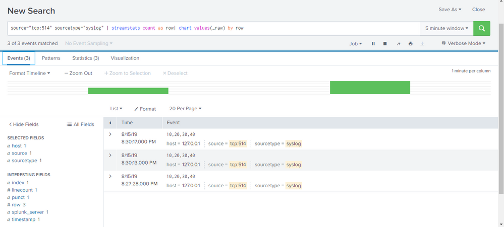
i don't understand your requirement you want one straight horizontal line as x axis changes? what you have shown is the event snapshot, it just shows 3 events being indexed..can you clarify more?
- Mark as New
- Bookmark Message
- Subscribe to Message
- Mute Message
- Subscribe to RSS Feed
- Permalink
- Report Inappropriate Content
@Sukisen1981 <" i don't understand your requirement you want one straight horizontal line as x axis changes? what you have shown is the event snapshot, it just shows 3 events being indexed..can you clarify more? ">
for example , in this picture we see 3 event, i want to take the first event (10,20,30) and plot it as function of generic running index (0,1,2,3....).
the graph of this event look like Diagonal line.


