- Find Answers
- :
- Using Splunk
- :
- Splunk Search
- :
- create table/chart like excel pivot
- Subscribe to RSS Feed
- Mark Topic as New
- Mark Topic as Read
- Float this Topic for Current User
- Bookmark Topic
- Subscribe to Topic
- Mute Topic
- Printer Friendly Page
- Mark as New
- Bookmark Message
- Subscribe to Message
- Mute Message
- Subscribe to RSS Feed
- Permalink
- Report Inappropriate Content
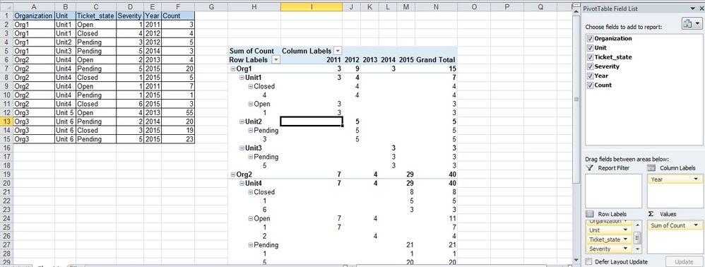
I need to make a chart of nested columns like we can do in excel pivot.
Sample data and required view is given in the screenshot:
Is it possible to achieve this in SPLUNK? If not, what best can be done in this case? Please advise.
Thank you so much!
- Mark as New
- Bookmark Message
- Subscribe to Message
- Mute Message
- Subscribe to RSS Feed
- Permalink
- Report Inappropriate Content
Try something like this
your base search giving fields Organization Unit Ticket_state Severity Year Count
| eval RowLabel=Organiation."-".Unit."-".Ticket_state."-".Severity | chart sum(count) as count over RowLabel by Year
| addtotals fieldname="Total" 2* | eval Org=mvindex(split(RowLabel,"-"),0)| appendpipe [| stats sum(*) as * by Org | eval RowLabel=Org."Z"]
| sort RowLabel | fields - Org
- Mark as New
- Bookmark Message
- Subscribe to Message
- Mute Message
- Subscribe to RSS Feed
- Permalink
- Report Inappropriate Content
Thanks a lot, somesoni2! Your solution worked nicely and is giving correct results...
However, for some reason the values under RowLabel are coming in one row and are not grouped. And some values under RowLabel column have 'Z' appended in the end.
Please advise. Thank you!
Not able to upload the screenshot, so pasting values here:
RowLabel 2011 2012 2013 2014 2015 Total
Computer Management-Financial Department-3-Active 1 8 9
Science Management-Physics Department-3-Deferred - Other 1 1
Engineering Management-IT Department-3-Queued 1 1
Chemistry ManagementZ 2 9 11
- Mark as New
- Bookmark Message
- Subscribe to Message
- Mute Message
- Subscribe to RSS Feed
- Permalink
- Report Inappropriate Content
Take a look at the appendpipe command. I think it will get you started.

