- Find Answers
- :
- Using Splunk
- :
- Splunk Search
- :
- Why does chart remove the empty x-values made with...
- Subscribe to RSS Feed
- Mark Topic as New
- Mark Topic as Read
- Float this Topic for Current User
- Bookmark Topic
- Subscribe to Topic
- Mute Topic
- Printer Friendly Page
- Mark as New
- Bookmark Message
- Subscribe to Message
- Mute Message
- Subscribe to RSS Feed
- Permalink
- Report Inappropriate Content
Why does chart remove the empty x-values made with |makecontinuous?
I want to make an evenly spaced x-axis in a dataset with gaps in it and then use chart to make a trellis view based on the variable "testsubject"
I use |makecontinuous to pad a data set with empty x-values to get the distance between the existing data points right in a chart.
The search looks like this:
| tstats avg(ReadCVM1) as ReadCVM1 avg(ReadCVM2) as ReadCVM2 avg(ReadCVM3) as ReadCVM3 avg(ReadCVM4) as ReadCVM4 avg(ReadCVM5) as ReadCVM5 avg(ReadCVM6) as ReadCVM6 avg(ReadCVM7) as ReadCVM7 avg(ReadCVM8) as ReadCVM8 avg(ReadCVM9) as ReadCVM9 avg(ReadCVM10) as ReadCVM10 avg(ReadStackPot) as ReadStackPot avg(ReadCoolTempOut) as ReadCoolTempOut latest(RunPolCurve) as RunPolCurve where index=test_station_log_data AND (testsubject IN (P1211,P1213)) by ReadCurrent testsubject
|where RunPolCurve=1
|eval RoundCurrent = round(ReadCurrent)
|sort testsubject ReadCurrent
|eval RoundCurrent = round(ReadCurrent)
|makecontinuous RoundCurrent span=1
|filldown testsubject
|chart avg(ReadCVM1) as ReadCVM1 avg(ReadCVM2) as ReadCVM2 avg(ReadCVM3) as ReadCVM3 avg(ReadCVM4) as ReadCVM4 avg(ReadCVM5) as ReadCVM5 avg(ReadCVM6) as ReadCVM6 avg(ReadCVM7) as ReadCVM7 avg(ReadCVM8) as ReadCVM8 avg(ReadCVM9) as ReadCVM9 avg(ReadCVM10) as ReadCVM10 by RoundCurrent testsubject
If I remove the chart command, gaps in RoundCurrent has been filled like I want. See below:
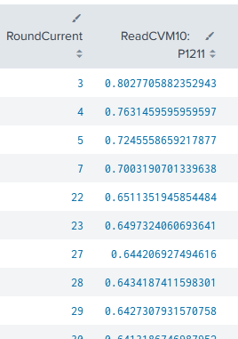
After I run the |chart command, the padded regions have been removed again.Can I prevent this from happening?
I found out that I can get them back by running |makecontinuous after the |chart command, but then I loose the ability to make a trellis view split by "testsubject". I need this to present it properly in a dashboard.
Any help would be greatly appreciated.


