- Find Answers
- :
- Using Splunk
- :
- Splunk Search
- :
- Need help on predict command usage in graph
- Subscribe to RSS Feed
- Mark Topic as New
- Mark Topic as Read
- Float this Topic for Current User
- Bookmark Topic
- Subscribe to Topic
- Mute Topic
- Printer Friendly Page
- Mark as New
- Bookmark Message
- Subscribe to Message
- Mute Message
- Subscribe to RSS Feed
- Permalink
- Report Inappropriate Content
I have a trend graph that shows some data then its predicting out that data a couple days forward. However, The prediction starts when the normal data starts, when I would rather have the prediction start on the graph when there is no previous data. Basically attaching itself to the previous trendline and adding on with it's prediction. Is there a way to do this?
- Mark as New
- Bookmark Message
- Subscribe to Message
- Mute Message
- Subscribe to RSS Feed
- Permalink
- Report Inappropriate Content
timechart span=5min avg(p) as Act |predict Act AS pred algorithm=LLP5 upper95=high lower95=low holdback=30 future_timespan=70 | eval pred=if(isnull(Act),pred,Act)
==
Assuming Act as actuals & pred as predicted field names
- Mark as New
- Bookmark Message
- Subscribe to Message
- Mute Message
- Subscribe to RSS Feed
- Permalink
- Report Inappropriate Content
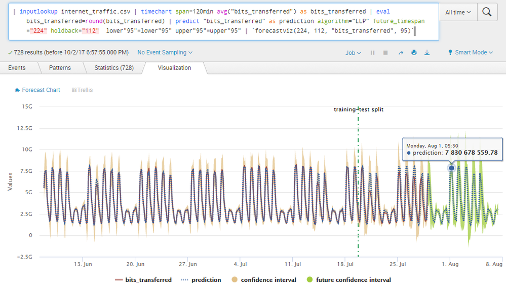
@kdimaria, if your intention is to distinguish prediction chart between current time span and future time span, you can try installing Machine Learning Toolkit app (https://splunkbase.splunk.com/app/2890/) which adds Forecast Chart visualization. As you can see the Current Time Series is highlighted in Red and Future Time Series in Blue, Current Confidence Interval in Orange and Future Confidence Interval in Green.
Refer to documentation for passing predict command parameters to forecastviz or modvizpredict macro: https://docs.splunk.com/Documentation/MLApp/latest/User/Customvisualizations#Forecast_Chart_.28Forec...
You can also refer to Forecast Time Series documentation on http://docs.splunk.com/Documentation/MLApp/latest/User/ForecastTimeSeries
Please try out and confirm.
| makeresults | eval message= "Happy Splunking!!!"
- Mark as New
- Bookmark Message
- Subscribe to Message
- Mute Message
- Subscribe to RSS Feed
- Permalink
- Report Inappropriate Content
timechart span=5min avg(p) as Act |predict Act AS pred algorithm=LLP5 upper95=high lower95=low holdback=30 future_timespan=70 | eval pred=if(isnull(Act),pred,Act)
==
Assuming Act as actuals & pred as predicted field names
- Mark as New
- Bookmark Message
- Subscribe to Message
- Mute Message
- Subscribe to RSS Feed
- Permalink
- Report Inappropriate Content
@Sukisen1981 , This works but when I eval the predict field, it gets rid of the upper and lower limit possibilities. Is there a way to keep those in the graph as well?
- Mark as New
- Bookmark Message
- Subscribe to Message
- Mute Message
- Subscribe to RSS Feed
- Permalink
- Report Inappropriate Content
Hi,
Yes, I get what you mean - high(pred) and low(pred) ae missing. However, try this :
timechart span=5min avg(p) as Act |predict Act AS pred algorithm=LLP5 upper95=high lower95=low holdback=30 future_timespan=70 | eval pred=if(isnull(Act),pred,Act) |rename high(pred) AS X|fields _time,Act,X,pred
You will get X plotted as the high limit values.///apply same and rename low(pred) to Y .
Choose X and Y names as something like hmmm maybe - "High / Low Limit"
I use he MLTK app like @niketnilay is saying....

