- Find Answers
- :
- Using Splunk
- :
- Splunk Search
- :
- Is it possible to create a multivalue visualizatio...
- Subscribe to RSS Feed
- Mark Topic as New
- Mark Topic as Read
- Float this Topic for Current User
- Bookmark Topic
- Subscribe to Topic
- Mute Topic
- Printer Friendly Page
- Mark as New
- Bookmark Message
- Subscribe to Message
- Mute Message
- Subscribe to RSS Feed
- Permalink
- Report Inappropriate Content
Is it possible to create a multivalue visualization for each value of a grouped field?
Hello,
I am trying to create a variable sized visualization based on the value of a field grouped by another field. To explain what I mean, I have a table with temperatures:
CITY,TEMP
Tokyo,6.67
New York,10.29
Rio de Janeiro,29.54
Bamako,32.56
Milano,9.27
Port Elizabeth,19.41
Norilsk,-24.43
Perth,16.72
What I would like to do is create a single visualization that gives me say, a single value or gauge, for each city. I would like to avoid having to create a separate search for each city and add a separate visualization. I'd just like to be able to create a single visualization that includes all values in a table.
Is this possible?
Thank you!
Andrew
- Mark as New
- Bookmark Message
- Subscribe to Message
- Mute Message
- Subscribe to RSS Feed
- Permalink
- Report Inappropriate Content
If the requirement is just to have a single visualization for all the cities how about trying this (selecting a bar chart)
your query to return the City and temp
| chart values(temp) as Temp over City
which might look something like below:
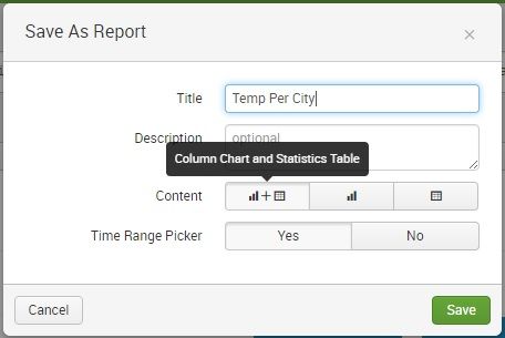
You can also use the option of save as report and include both the table and the graph while doing so.
Updating as per comments
Additionally do the following:
1) Rather than bar graph, select line graph as visualization.
2) In Formatting click on Genral > Show Data Values >> On
3) In dashboard source xml, make the line chart to match the colour of the background 🙂 which is white 0xFFFFFF in this case by using charting.seriesColors chart options:
<option name="charting.seriesColors">[0xFFFFFF]</option>
That should get the way you want it.
- Mark as New
- Bookmark Message
- Subscribe to Message
- Mute Message
- Subscribe to RSS Feed
- Permalink
- Report Inappropriate Content
Yes, I was also considering this, but it's not quite what I'm looking for. If I can substitute the columns with just the value and remove the axis then it would be perfect! Any way of doing that through dashboard formatting?
- Mark as New
- Bookmark Message
- Subscribe to Message
- Mute Message
- Subscribe to RSS Feed
- Permalink
- Report Inappropriate Content
I apologize but I cannot understand which "axis" are you trying to remove? Can you elaborate please? However both the other requirement of removing the bars and having the numbers can be achieved as follows:
1) Rather than bar graph, select line graph as visualization.
2) In Formatting click on Genral > Show Data Values >> On
3) In dashboard source xml, make the line chart to match the colour of the background 🙂 which is white 0xFFFFFF in this case by using charting.seriesColors chart options:
<option name="charting.seriesColors">[0xFFFFFF]</option>
The result should be close to what you require, the only thing I am not sure of is which axis you wanted to remove.
Let me know if it helped.
- Mark as New
- Bookmark Message
- Subscribe to Message
- Mute Message
- Subscribe to RSS Feed
- Permalink
- Report Inappropriate Content
I followed your suggestions and managed to get this:

In terms of the axis, I wanted to get rid of the Y axis, or at least hide the values so they don't appear. I was disappointed to know that versino 6.5.0 no longer allows you to change the label font and size... that would have been great.
I guess this is the closest I'll get to what I was hoping to achieve, thanks!
- Mark as New
- Bookmark Message
- Subscribe to Message
- Mute Message
- Subscribe to RSS Feed
- Permalink
- Report Inappropriate Content
Thanks, If it helps resolve your issue , please accept the answer so this question can be closed. I am updating the answer with the recent comments that solved the question.
- Mark as New
- Bookmark Message
- Subscribe to Message
- Mute Message
- Subscribe to RSS Feed
- Permalink
- Report Inappropriate Content
The lowest hanging fruit would be to take and adapt the "Tables with Data Bars" example from the Splunk 6.x Dashboard Examples app at https://splunkbase.splunk.com/app/1603/ / http://localhost:8000/en-US/app/simple_xml_examples/custom_table_data_bar


