Turn on suggestions
Auto-suggest helps you quickly narrow down your search results by suggesting possible matches as you type.
Splunk Search
×
Are you a member of the Splunk Community?
Sign in or Register with your Splunk account to get your questions answered, access valuable resources and connect with experts!
Turn on suggestions
Auto-suggest helps you quickly narrow down your search results by suggesting possible matches as you type.
- Find Answers
- :
- Using Splunk
- :
- Splunk Search
- :
- How to use elapsed time as X axis scale
Options
- Subscribe to RSS Feed
- Mark Topic as New
- Mark Topic as Read
- Float this Topic for Current User
- Bookmark Topic
- Subscribe to Topic
- Mute Topic
- Printer Friendly Page
- Mark as New
- Bookmark Message
- Subscribe to Message
- Mute Message
- Subscribe to RSS Feed
- Permalink
- Report Inappropriate Content
How to use elapsed time as X axis scale
anmouer
New Member
02-03-2021
04:32 AM
My data
| Send_Data | Error | All_Request |
| 2018-01-02 | 0 | 10 |
| 2018-01-03 | 1 | 60 |
| 2018-01-04 | 2 | 30 |
| 2018-01-05 | 0 | 20 |
| .... | ... | ... |
| 2021-02-01 | 5 | 20 |
I want to make chart from those data.
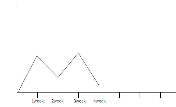
The x-axis is the number of weeks passed.The y-axis is the error rate during this week
This is the effect i want
The data used in the first week is 2018-01-03->2018-01-09.The y-axis is made using all Error/All_Request in this time period.
The data used in the second week is 2018-01-10->2018-01-16 and so on.
I have used many methods, but they can’t be achieved.
- Mark as New
- Bookmark Message
- Subscribe to Message
- Mute Message
- Subscribe to RSS Feed
- Permalink
- Report Inappropriate Content
tscroggins
Influencer
02-20-2021
09:58 PM
The timechart command span option supports binning by week (Sunday through Saturday):
index=_internal
| timechart span=1w@w count(eval(case(log_level=="ERROR",1))) as Error count as All_Request
| _time | Error | All_Request |
| 2020-12-27 | 1 | 123 |
| 2021-01-03 | 2 | 456 |
| 2021-01-10 | 3 | 789 |
| 2021-01-17 | 2 | 123 |
| 2021-01-24 | 1 | 456 |
| 2021-01-31 | 2 | 789 |
| 2021-02-07 | 3 | 123 |
| 2021-02-14 | 4 | 456 |
| 2021-02-21 | 2 | 789 |
Get Updates on the Splunk Community!
September Community Champions: A Shoutout to Our Contributors!
As we close the books on another fantastic month, we want to take a moment to celebrate the people who are the ...
Splunk Decoded: Service Maps vs Service Analyzer Tree View vs Flow Maps
It’s Monday morning, and your phone is buzzing with alert escalations – your customer-facing portal is running ...
What’s New in Splunk Observability – September 2025
What's NewWe are excited to announce the latest enhancements to Splunk Observability, designed to help ITOps ...

