Splunk Search
×
Are you a member of the Splunk Community?
Sign in or Register with your Splunk account to get your questions answered, access valuable resources and connect with experts!
- Find Answers
- :
- Using Splunk
- :
- Splunk Search
- :
- How to plot username (non-numeric) value on the y-...
Options
- Subscribe to RSS Feed
- Mark Topic as New
- Mark Topic as Read
- Float this Topic for Current User
- Bookmark Topic
- Subscribe to Topic
- Mute Topic
- Printer Friendly Page
- Mark as New
- Bookmark Message
- Subscribe to Message
- Mute Message
- Subscribe to RSS Feed
- Permalink
- Report Inappropriate Content
How to plot username (non-numeric) value on the y-axis on a scatter chart?
Venkat_16
Contributor
08-24-2015
02:44 AM
I have a log in the following format:
username=nan time=09:00 operation=login
username=ver time=10:00 opertiaon=logout
username=ves time=09:00 operation=login
username=ves time=10:00 opetaion=logout
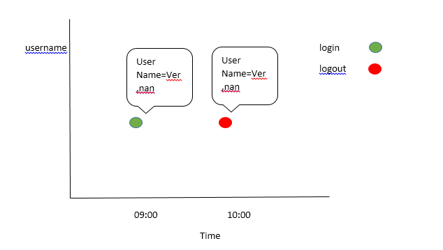
I need the output in the following format as a scatter plot. I am able to make it in a table, but not in scatter chart.
- Mark as New
- Bookmark Message
- Subscribe to Message
- Mute Message
- Subscribe to RSS Feed
- Permalink
- Report Inappropriate Content
aljohnson_splun

Splunk Employee
08-24-2015
03:24 AM
Hey Venkat,
Why not try something like this?
... | timechart count(eval(operation="login")) as logins, count(eval(operation="logout")) as logouts by username
Then chose a bar/column chart visualization?
- Mark as New
- Bookmark Message
- Subscribe to Message
- Mute Message
- Subscribe to RSS Feed
- Permalink
- Report Inappropriate Content
Venkat_16
Contributor
08-24-2015
07:14 AM
Hi aljohnson_splunk,
Thanks for the response, but we have more than 30+ users and 5 to 6 operations , in that case the following solution gives
"These results may be truncated. Your search generated too much data for the current visualization configuration." notifaction
- Mark as New
- Bookmark Message
- Subscribe to Message
- Mute Message
- Subscribe to RSS Feed
- Permalink
- Report Inappropriate Content
aljohnson_splun

Splunk Employee
08-24-2015
07:18 AM
Change the time range and the span, e.g.
... earliest=-2w | timechart span=1d count(eval(operation="operation1")) as operation1 .... and so on
Get Updates on the Splunk Community!
Stay Connected: Your Guide to July Tech Talks, Office Hours, and Webinars!
What are Community Office Hours?Community Office Hours is an interactive 60-minute Zoom series where ...
Updated Data Type Articles, Anniversary Celebrations, and More on Splunk Lantern
Splunk Lantern is a Splunk customer success center that provides advice from Splunk experts on valuable data ...
A Prelude to .conf25: Your Guide to Splunk University
Heading to Boston this September for .conf25? Get a jumpstart by arriving a few days early for Splunk ...

