Turn on suggestions
Auto-suggest helps you quickly narrow down your search results by suggesting possible matches as you type.
Splunk Search
×
Join the Conversation
Without signing in, you're just watching from the sidelines. Sign in or Register to connect, share, and be part of the Splunk Community.
Turn on suggestions
Auto-suggest helps you quickly narrow down your search results by suggesting possible matches as you type.
- Find Answers
- :
- Using Splunk
- :
- Splunk Search
- :
- Re: How to plot username (non-numeric) value on th...
Options
- Subscribe to RSS Feed
- Mark Topic as New
- Mark Topic as Read
- Float this Topic for Current User
- Bookmark Topic
- Subscribe to Topic
- Mute Topic
- Printer Friendly Page
- Mark as New
- Bookmark Message
- Subscribe to Message
- Mute Message
- Subscribe to RSS Feed
- Permalink
- Report Inappropriate Content
How to plot username (non-numeric) value on the y-axis on a scatter chart?
Venkat_16
Contributor
08-24-2015
02:44 AM
I have a log in the following format:
username=nan time=09:00 operation=login
username=ver time=10:00 opertiaon=logout
username=ves time=09:00 operation=login
username=ves time=10:00 opetaion=logout
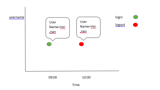
I need the output in the following format as a scatter plot. I am able to make it in a table, but not in scatter chart.
- Mark as New
- Bookmark Message
- Subscribe to Message
- Mute Message
- Subscribe to RSS Feed
- Permalink
- Report Inappropriate Content
aljohnson_splun

Splunk Employee
08-24-2015
03:24 AM
Hey Venkat,
Why not try something like this?
... | timechart count(eval(operation="login")) as logins, count(eval(operation="logout")) as logouts by username
Then chose a bar/column chart visualization?
- Mark as New
- Bookmark Message
- Subscribe to Message
- Mute Message
- Subscribe to RSS Feed
- Permalink
- Report Inappropriate Content
Venkat_16
Contributor
08-24-2015
07:14 AM
Hi aljohnson_splunk,
Thanks for the response, but we have more than 30+ users and 5 to 6 operations , in that case the following solution gives
"These results may be truncated. Your search generated too much data for the current visualization configuration." notifaction
- Mark as New
- Bookmark Message
- Subscribe to Message
- Mute Message
- Subscribe to RSS Feed
- Permalink
- Report Inappropriate Content
aljohnson_splun

Splunk Employee
08-24-2015
07:18 AM
Change the time range and the span, e.g.
... earliest=-2w | timechart span=1d count(eval(operation="operation1")) as operation1 .... and so on
Get Updates on the Splunk Community!
Index This | What is broken 80% of the time by February?
December 2025 Edition
Hayyy Splunk Education Enthusiasts and the Eternally Curious!
We’re back with this ...
Unlock Faster Time-to-Value on Edge and Ingest Processor with New SPL2 Pipeline ...
Hello Splunk Community,
We're thrilled to share an exciting update that will help you manage your data more ...
Splunk MCP & Agentic AI: Machine Data Without Limits
Discover how the Splunk Model Context Protocol (MCP) Server can revolutionize the way your organization uses ...

