Turn on suggestions
Auto-suggest helps you quickly narrow down your search results by suggesting possible matches as you type.
Splunk Search
×
Are you a member of the Splunk Community?
Sign in or Register with your Splunk account to get your questions answered, access valuable resources and connect with experts!
Turn on suggestions
Auto-suggest helps you quickly narrow down your search results by suggesting possible matches as you type.
- Find Answers
- :
- Using Splunk
- :
- Splunk Search
- :
- Re: How to edit my search to display a distributio...
Options
- Subscribe to RSS Feed
- Mark Topic as New
- Mark Topic as Read
- Float this Topic for Current User
- Bookmark Topic
- Subscribe to Topic
- Mute Topic
- Printer Friendly Page
- Mark as New
- Bookmark Message
- Subscribe to Message
- Mute Message
- Subscribe to RSS Feed
- Permalink
- Report Inappropriate Content
kualo
Explorer
11-21-2016
08:51 AM
[2016-xx-xx-xx:xx:xx:xxxx] modelName=model1, modelScore=10
[2016-xx-xx-xx:xx:xx:xxxx] modelName=model2, modelScore=100
[2016-xx-xx-xx:xx:xx:xxxx] modelName=model3, modelScore=50
My log looks something like above
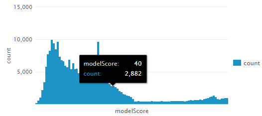
some search| stats count by modelScore | sort modelScore
I have the above search to show the distribution of the modelScore using bar visualization.
However, I would like to show modelScore for each modelName in the same bar graph in different colors.
Is there any way I can do that?
Thanks.
1 Solution
- Mark as New
- Bookmark Message
- Subscribe to Message
- Mute Message
- Subscribe to RSS Feed
- Permalink
- Report Inappropriate Content
gokadroid
Motivator
11-21-2016
09:09 AM
can you try this please based on whichever way you want to chart:
Keeping modelName on x axis
some search| chart count over modelName by modelScore
OR
Keeping modelScore on x axis
some search| chart count over modelScore by modelName
- Mark as New
- Bookmark Message
- Subscribe to Message
- Mute Message
- Subscribe to RSS Feed
- Permalink
- Report Inappropriate Content
aljohnson_splun

Splunk Employee
11-22-2016
08:26 AM
You probably want to use some search| stats count by modelScore | makecontinuous modelScore as to add any potentially empty buckets/bins.
- Mark as New
- Bookmark Message
- Subscribe to Message
- Mute Message
- Subscribe to RSS Feed
- Permalink
- Report Inappropriate Content
gokadroid
Motivator
11-21-2016
09:09 AM
can you try this please based on whichever way you want to chart:
Keeping modelName on x axis
some search| chart count over modelName by modelScore
OR
Keeping modelScore on x axis
some search| chart count over modelScore by modelName
- Mark as New
- Bookmark Message
- Subscribe to Message
- Mute Message
- Subscribe to RSS Feed
- Permalink
- Report Inappropriate Content
kualo
Explorer
11-22-2016
08:31 AM
Thanks! I works perfectly.
Get Updates on the Splunk Community!
Tech Talk Recap | Mastering Threat Hunting
Mastering Threat HuntingDive into the world of threat hunting, exploring the key differences between ...
Observability for AI Applications: Troubleshooting Latency
If you’re working with proprietary company data, you’re probably going to have a locally hosted LLM or many ...
Splunk AI Assistant for SPL vs. ChatGPT: Which One is Better?
In the age of AI, every tool promises to make our lives easier. From summarizing content to writing code, ...

