- Find Answers
- :
- Using Splunk
- :
- Splunk Search
- :
- How to create single value chart based on user for...
- Subscribe to RSS Feed
- Mark Topic as New
- Mark Topic as Read
- Float this Topic for Current User
- Bookmark Topic
- Subscribe to Topic
- Mute Topic
- Printer Friendly Page
- Mark as New
- Bookmark Message
- Subscribe to Message
- Mute Message
- Subscribe to RSS Feed
- Permalink
- Report Inappropriate Content
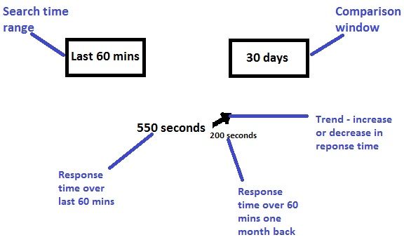
I would like to create a chart that looks like the mockup in the screenshot.
EXPLANATION:
I provide 2 user inputs to the chart:
1. Timeframe (5 mins, 30 mins, 60 mins)
2. Compared to (yesterday, last week, last month)
I would like to display the following as a single value (chart):
1. Average response time for the timeframe selected - This input is given by the user via Timeframe
2. Average response time over the same timeframe yesterday/last week/ last month ago - This input is given by the user via 'Compared to'
3. An arrow which indicates whether the average response time has increased or decreased
For example:
The average response time in the last 60 mins: 550 seconds
Average response time over the same time one month ago: 200 seconds
The response time has increased from 200 seconds to 550 seconds. Hence display an upward arrow.
- Mark as New
- Bookmark Message
- Subscribe to Message
- Mute Message
- Subscribe to RSS Feed
- Permalink
- Report Inappropriate Content
The behavior that you need is not how Single Value trending works. Single Value trend expects a timechart command to get the stats.
So the sparkline is drawn based on time period selected. In other words, if you have to compare monthly stats your time range should be atleast more than a month.
Furhter trend indicator is set by default by Single Value based on time range selected, or else can be overridden by providing Custom Compared To option as 1 Months.
If you want the output exactly the way you have described you might have to use HTML Panels. Or multiple Single Value Indicator and/or Trend Indicator to represent each of the above visualization.
| makeresults | eval message= "Happy Splunking!!!"

