- Find Answers
- :
- Using Splunk
- :
- Splunk Search
- :
- How can I set the y-axis on my bar chart to be in ...
- Subscribe to RSS Feed
- Mark Topic as New
- Mark Topic as Read
- Float this Topic for Current User
- Bookmark Topic
- Subscribe to Topic
- Mute Topic
- Printer Friendly Page
- Mark as New
- Bookmark Message
- Subscribe to Message
- Mute Message
- Subscribe to RSS Feed
- Permalink
- Report Inappropriate Content
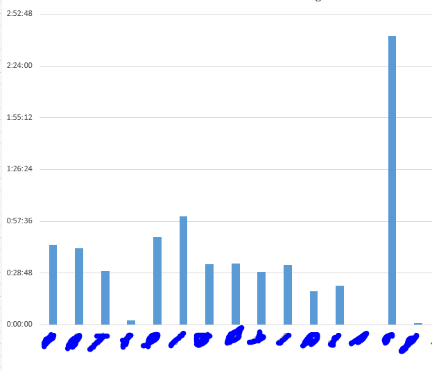
How can I set the y-axis on my bar chart to be in duration?
I have the following search:
....| stats sum(callduration) as "totalcallduration" by Companycalls
Currently my search give me the result in second. I'm trying to get this result convert to duration so that I could map it on my bar chart. Is there an option that splunk could map bar chart for duration like excel? I want to get it to look like this:
- Mark as New
- Bookmark Message
- Subscribe to Message
- Mute Message
- Subscribe to RSS Feed
- Permalink
- Report Inappropriate Content
Try this:
...| stats sum(callduration) as totalcallduration by Companycalls | eval totalcallduration=tostring(totalcallduration,"duration")
- Mark as New
- Bookmark Message
- Subscribe to Message
- Mute Message
- Subscribe to RSS Feed
- Permalink
- Report Inappropriate Content
This work great but when I select the chart. My chart doesn't display anything.
- Mark as New
- Bookmark Message
- Subscribe to Message
- Mute Message
- Subscribe to RSS Feed
- Permalink
- Report Inappropriate Content
By this I mean the y-axis display number like 0-1000 instead of time. And at the end splunk generate an empty bar chart
- Mark as New
- Bookmark Message
- Subscribe to Message
- Mute Message
- Subscribe to RSS Feed
- Permalink
- Report Inappropriate Content
Is the totalcallduration field in seconds?
- Mark as New
- Bookmark Message
- Subscribe to Message
- Mute Message
- Subscribe to RSS Feed
- Permalink
- Report Inappropriate Content
YES! Please help
- Mark as New
- Bookmark Message
- Subscribe to Message
- Mute Message
- Subscribe to RSS Feed
- Permalink
- Report Inappropriate Content
What I gave you worked when I gave it random seconds in the totalcallduration field and it charted it.
- Mark as New
- Bookmark Message
- Subscribe to Message
- Mute Message
- Subscribe to RSS Feed
- Permalink
- Report Inappropriate Content
But this is for data showing purposes, I can not replace the second with just random second. Is there anything else I could do?

