- Find Answers
- :
- Using Splunk
- :
- Splunk Search
- :
- Re: FEATURE REQUEST - Show percentage values on th...
- Subscribe to RSS Feed
- Mark Topic as New
- Mark Topic as Read
- Float this Topic for Current User
- Bookmark Topic
- Subscribe to Topic
- Mute Topic
- Printer Friendly Page
- Mark as New
- Bookmark Message
- Subscribe to Message
- Mute Message
- Subscribe to RSS Feed
- Permalink
- Report Inappropriate Content
FEATURE REQUEST - Show percentage values on the Y-axis of a chart
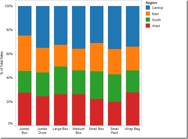
I would like to see the possibility of showing percentage values on the y-axis of my charts (so 1% to 100%). Currently, it's only possible to show numbers without the formatting within Splunk, whereas other packages like Tableau already have many of these functionalities.
- Mark as New
- Bookmark Message
- Subscribe to Message
- Mute Message
- Subscribe to RSS Feed
- Permalink
- Report Inappropriate Content
@mblauw, refer to one of my answers for similar scenario. Ideally Display of % in Y-axis label should be handled in Highcharts configuration itself. I have listed an override through jQuery to handle the same. There is an issue with % disappearing when the browser resizes or edit/debug is attempted. However, refreshing the search in the panel with the chart should get the percent sign back.
Please try out the run anywhere example and confirm.
| makeresults | eval message= "Happy Splunking!!!"
- Mark as New
- Bookmark Message
- Subscribe to Message
- Mute Message
- Subscribe to RSS Feed
- Permalink
- Report Inappropriate Content
Like this:
| makeresults
| eval host="Jumbo Box,Jumbo Drum,Large Box,Medium Box,Small Box,Small Pack,Wrap Bag"
| makemv delim="," host
| mvexpand host
| eval Central=random(), East=random(), South=random(), West=random()

| rename COMMENT AS "Everything above fakes your events; everything below is your solution"

| stats sum(Central) AS Central sum(East) AS East sum(South) AS South sum(West) AS West by host
On the visualization tab select Column Chart, then click Format and select the General tab, click the last/3rd icon for Stack Mode ( Stacked 100% ). It should look exactly like your mockup does. You will just have to adjust the search to output the same set of rows and fields as my mockup+search does.
If your problem is that the values revealed by hovering are the raw values, instead of the percentages and you prefer the percentages, then add this to the bottom of the above search:
| addtotals row=t col=f
| foreach Central East South West [eval <<FIELD>>=100*<<FIELD>>/Total]
| fields - Total
- Mark as New
- Bookmark Message
- Subscribe to Message
- Mute Message
- Subscribe to RSS Feed
- Permalink
- Report Inappropriate Content
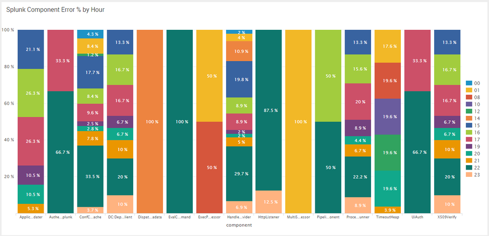
Thank you for your reply. However, stacked 100% is still showing 0 - 100 instead of 0% - 100%.
- Mark as New
- Bookmark Message
- Subscribe to Message
- Mute Message
- Subscribe to RSS Feed
- Permalink
- Report Inappropriate Content
There is no way to fix this with the srandard visualization in simpleXML but you should open an Enhancement Request to add support for unit labels. Thr best that you can do is to set an axis label that says "percent of total" or something similar.
- Mark as New
- Bookmark Message
- Subscribe to Message
- Mute Message
- Subscribe to RSS Feed
- Permalink
- Report Inappropriate Content
Hi mblauw,
insert this request in the Splunk Partner Portal (https://splunkcommunities.force.com/login) as Feature Request.
Bye.
Giuseppe
- Mark as New
- Bookmark Message
- Subscribe to Message
- Mute Message
- Subscribe to RSS Feed
- Permalink
- Report Inappropriate Content
Updated - Based on the example, you are looking for changing the Stack Mode from Visualization Settings to Stacked 100%. This feature is available in Splunk. By default Stack Mode is set to None, so you are not seeing Stacked series in your chart. PS: Stacked Mode is applicable to Column Chart, Bar Chart and Area Chart.
Added Sample screenshot and options for changing the Stack Mode to Stacked 100% from UI or Simple XML.
Option 1- UI
Edit Dashboard --> Edit Panel Settings --> General --> Stack Mode --> stacked 100%
Option 2- Simple XML through Chart Configuration
<option name="charting.chart.stackMode">stacked100</option>
Hopefully this is what you are looking for.
Is this for Column/Bar Chart? Can you add a screenshot of what output you want from Tableau?
| makeresults | eval message= "Happy Splunking!!!"
- Mark as New
- Bookmark Message
- Subscribe to Message
- Mute Message
- Subscribe to RSS Feed
- Permalink
- Report Inappropriate Content
I know this, but it will still display 0-100 instead of 0%-100%
- Mark as New
- Bookmark Message
- Subscribe to Message
- Mute Message
- Subscribe to RSS Feed
- Permalink
- Report Inappropriate Content
PS: Just to add... If your Splunk query itself is giving results as Percent value like 20, 30, 50 etc instead of actual volume, you can directly use Stacked as the Stack Mode.
| makeresults | eval message= "Happy Splunking!!!"
- Mark as New
- Bookmark Message
- Subscribe to Message
- Mute Message
- Subscribe to RSS Feed
- Permalink
- Report Inappropriate Content
Thank you for your answer. I already knew about this option. However, I truly want the formatting of values on the y-axis to be right (%).
- Mark as New
- Bookmark Message
- Subscribe to Message
- Mute Message
- Subscribe to RSS Feed
- Permalink
- Report Inappropriate Content
Both if possible.
Here's an image of how this is shown in Tableau


