- Find Answers
- :
- Using Splunk
- :
- Splunk Search
- :
- Emailed PDF bar chart drops row labels if > 20 row...
- Subscribe to RSS Feed
- Mark Topic as New
- Mark Topic as Read
- Float this Topic for Current User
- Bookmark Topic
- Subscribe to Topic
- Mute Topic
- Printer Friendly Page
- Mark as New
- Bookmark Message
- Subscribe to Message
- Mute Message
- Subscribe to RSS Feed
- Permalink
- Report Inappropriate Content
We are on Splunk 6.2.1
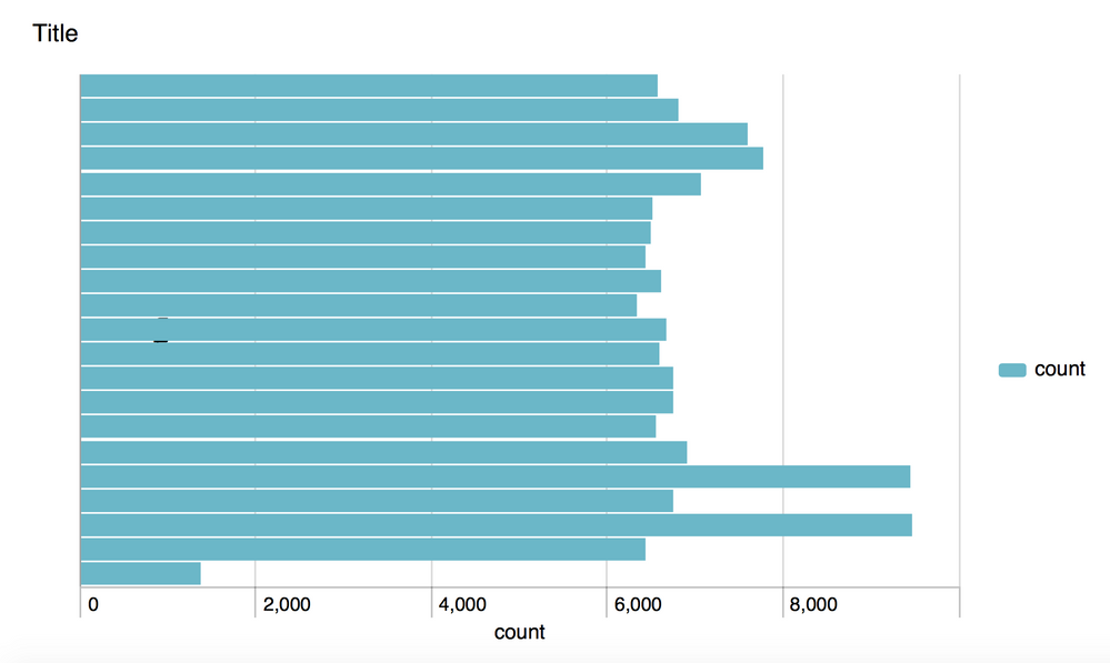
Every night we have Splunk email our executive staff a PDF with a bar chart showing a measure per widget (row). They were very happy. Just recently, the number of widgets we are tracking increased to >20. And the bar chart labels have disappeared. Now the chart is useless.
I can duplicate this with a bar chart dashboard based on this Splunk search:
index=_internal earliest=@m-20m | bin _time span=1m | chart count by _time
Click Edit / Schedule PDF Delivery / Schedule PDF / Preview PDF. Observe bar chart with 21 rows and no labels.
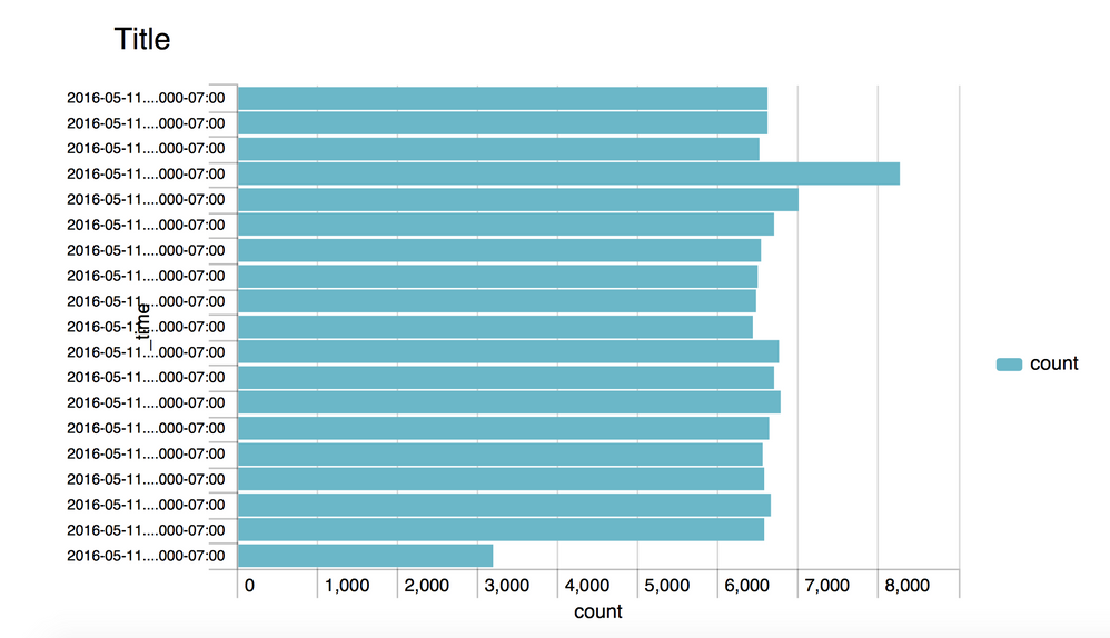
The following search generates a <20 row bar chart with labels intact:
index=_internal earliest=@m-18m | bin _time span=1m | chart count by _time
Setting an explicit height like this:
<option name="height">500</option>
Helps guarantee the row labels appear in the browser view, but does not seem to have any impact on the PDF. Paper size/layout does not seem to have any impact either.
- Mark as New
- Bookmark Message
- Subscribe to Message
- Mute Message
- Subscribe to RSS Feed
- Permalink
- Report Inappropriate Content
Engineering has rejected this as a bug and states that, "this behavior is by design due to when the number of levels increases they might collide and need to be skipped.". They also said they may reconsider this in the future and try to dynamically adjust text or surrounding white space if it's feasible/readable.
- Mark as New
- Bookmark Message
- Subscribe to Message
- Mute Message
- Subscribe to RSS Feed
- Permalink
- Report Inappropriate Content
Disappointed with the resolution as there is plenty of whitespace in our PDF for row labels. But at least I know to quit tinkering with this. Thanks.


