Turn on suggestions
Auto-suggest helps you quickly narrow down your search results by suggesting possible matches as you type.
Splunk Search
×
Are you a member of the Splunk Community?
Sign in or Register with your Splunk account to get your questions answered, access valuable resources and connect with experts!
Turn on suggestions
Auto-suggest helps you quickly narrow down your search results by suggesting possible matches as you type.
- Find Answers
- :
- Using Splunk
- :
- Splunk Search
- :
- Dashboard studio shows two values on y axis
Options
- Subscribe to RSS Feed
- Mark Topic as New
- Mark Topic as Read
- Float this Topic for Current User
- Bookmark Topic
- Subscribe to Topic
- Mute Topic
- Printer Friendly Page
- Mark as New
- Bookmark Message
- Subscribe to Message
- Mute Message
- Subscribe to RSS Feed
- Permalink
- Report Inappropriate Content
xyberdef
Explorer
10-27-2023
04:26 AM
Hello,
I have one more begginers question regarding reports and dashboards 🙂
I am trying to do overview of most used services, I am using this query:
index=notable| top limit=15 app
When I put this report into dashboard studio, there are appearing count as well as percentage:
I would like to remove percentages completely from the chart. Can you tell me how to do it, please?
And one more option just coming to my mind - if I would like to use both - count and percentages, is it possible to adapt x axis in the way that it would use separate scale like 0-100 percent for percentages?
1 Solution
- Mark as New
- Bookmark Message
- Subscribe to Message
- Mute Message
- Subscribe to RSS Feed
- Permalink
- Report Inappropriate Content
ITWhisperer

SplunkTrust
10-27-2023
04:41 AM
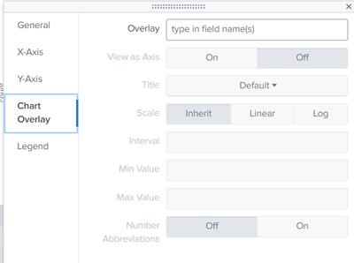
index=notable| top limit=15 app | fields - percentUse chart overlay to have a second y-axis
- Mark as New
- Bookmark Message
- Subscribe to Message
- Mute Message
- Subscribe to RSS Feed
- Permalink
- Report Inappropriate Content
xyberdef
Explorer
10-27-2023
05:03 AM
Amazing, thanks a lot for your help!
- Mark as New
- Bookmark Message
- Subscribe to Message
- Mute Message
- Subscribe to RSS Feed
- Permalink
- Report Inappropriate Content
ITWhisperer

SplunkTrust
10-27-2023
04:41 AM
index=notable| top limit=15 app | fields - percentUse chart overlay to have a second y-axis
Get Updates on the Splunk Community!
Fall Into Learning with New Splunk Education Courses
Every month, Splunk Education releases new courses to help you branch out, strengthen your data science roots, ...
Super Optimize your Splunk Stats Searches: Unlocking the Power of tstats, TERM, and ...
By Martin Hettervik, Senior Consultant and Team Leader at Accelerate at Iver, Splunk MVPThe stats command is ...
How Splunk Observability Cloud Prevented a Major Payment Crisis in Minutes
Your bank's payment processing system is humming along during a busy afternoon, handling millions in hourly ...


