Turn on suggestions
Auto-suggest helps you quickly narrow down your search results by suggesting possible matches as you type.
Showing results for
Splunk Search
Turn on suggestions
Auto-suggest helps you quickly narrow down your search results by suggesting possible matches as you type.
Showing results for
- Find Answers
- :
- Using Splunk
- :
- Splunk Search
- :
- Dashboard studio shows two values on y axis
Options
- Subscribe to RSS Feed
- Mark Topic as New
- Mark Topic as Read
- Float this Topic for Current User
- Bookmark Topic
- Subscribe to Topic
- Mute Topic
- Printer Friendly Page
- Mark as New
- Bookmark Message
- Subscribe to Message
- Mute Message
- Subscribe to RSS Feed
- Permalink
- Report Inappropriate Content
xyberdef
Explorer
10-27-2023
04:26 AM
Hello,
I have one more begginers question regarding reports and dashboards 🙂
I am trying to do overview of most used services, I am using this query:
index=notable| top limit=15 app
When I put this report into dashboard studio, there are appearing count as well as percentage:
I would like to remove percentages completely from the chart. Can you tell me how to do it, please?
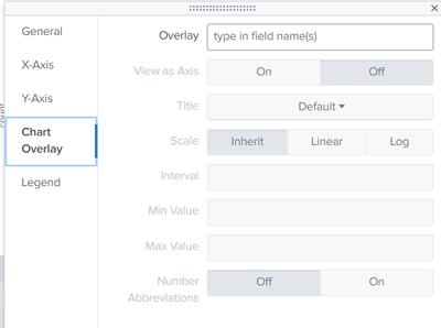
And one more option just coming to my mind - if I would like to use both - count and percentages, is it possible to adapt x axis in the way that it would use separate scale like 0-100 percent for percentages?
1 Solution
- Mark as New
- Bookmark Message
- Subscribe to Message
- Mute Message
- Subscribe to RSS Feed
- Permalink
- Report Inappropriate Content
ITWhisperer

SplunkTrust
10-27-2023
04:41 AM
index=notable| top limit=15 app | fields - percentUse chart overlay to have a second y-axis
- Mark as New
- Bookmark Message
- Subscribe to Message
- Mute Message
- Subscribe to RSS Feed
- Permalink
- Report Inappropriate Content
xyberdef
Explorer
10-27-2023
05:03 AM
Amazing, thanks a lot for your help!
- Mark as New
- Bookmark Message
- Subscribe to Message
- Mute Message
- Subscribe to RSS Feed
- Permalink
- Report Inappropriate Content
ITWhisperer

SplunkTrust
10-27-2023
04:41 AM
index=notable| top limit=15 app | fields - percentUse chart overlay to have a second y-axis
Get Updates on the Splunk Community!
Developer Spotlight with Paul Stout
Welcome to our very first developer spotlight release series where we'll feature some awesome Splunk ...
State of Splunk Careers 2024: Maximizing Career Outcomes and the Continued Value of ...
For the past four years, Splunk has partnered with Enterprise Strategy Group to conduct a survey that gauges ...
Data-Driven Success: Splunk & Financial Services
Splunk streamlines the process of extracting insights from large volumes of data. In this fast-paced world, ...


