Turn on suggestions
Auto-suggest helps you quickly narrow down your search results by suggesting possible matches as you type.
Showing results for
Splunk Search
Turn on suggestions
Auto-suggest helps you quickly narrow down your search results by suggesting possible matches as you type.
Showing results for
- Splunk Answers
- :
- Using Splunk
- :
- Splunk Search
- :
- Dashboard studio shows two values on y axis
Options
- Subscribe to RSS Feed
- Mark Topic as New
- Mark Topic as Read
- Float this Topic for Current User
- Bookmark Topic
- Subscribe to Topic
- Mute Topic
- Printer Friendly Page
- Mark as New
- Bookmark Message
- Subscribe to Message
- Mute Message
- Subscribe to RSS Feed
- Permalink
- Report Inappropriate Content
xyberdef
Explorer
10-27-2023
04:26 AM
Hello,
I have one more begginers question regarding reports and dashboards 🙂
I am trying to do overview of most used services, I am using this query:
index=notable| top limit=15 app
When I put this report into dashboard studio, there are appearing count as well as percentage:
I would like to remove percentages completely from the chart. Can you tell me how to do it, please?
And one more option just coming to my mind - if I would like to use both - count and percentages, is it possible to adapt x axis in the way that it would use separate scale like 0-100 percent for percentages?
1 Solution
- Mark as New
- Bookmark Message
- Subscribe to Message
- Mute Message
- Subscribe to RSS Feed
- Permalink
- Report Inappropriate Content
ITWhisperer

SplunkTrust
10-27-2023
04:41 AM
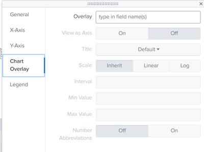
index=notable| top limit=15 app | fields - percentUse chart overlay to have a second y-axis
- Mark as New
- Bookmark Message
- Subscribe to Message
- Mute Message
- Subscribe to RSS Feed
- Permalink
- Report Inappropriate Content
xyberdef
Explorer
10-27-2023
05:03 AM
Amazing, thanks a lot for your help!
- Mark as New
- Bookmark Message
- Subscribe to Message
- Mute Message
- Subscribe to RSS Feed
- Permalink
- Report Inappropriate Content
ITWhisperer

SplunkTrust
10-27-2023
04:41 AM
index=notable| top limit=15 app | fields - percentUse chart overlay to have a second y-axis
Get Updates on the Splunk Community!
Built-in Service Level Objectives Management to Bridge the Gap Between Service & ...
Wednesday, May 29, 2024 | 11AM PST / 2PM ESTRegister now and join us to learn more about how you can ...
Get Your Exclusive Splunk Certified Cybersecurity Defense Engineer at Splunk .conf24 ...
We’re excited to announce a new Splunk certification exam being released at .conf24! If you’re headed to Vegas ...
Share Your Ideas & Meet the Lantern team at .Conf! Plus All of This Month’s New ...
Splunk Lantern is Splunk’s customer success center that provides advice from Splunk experts on valuable data ...


