Turn on suggestions
Auto-suggest helps you quickly narrow down your search results by suggesting possible matches as you type.
Splunk Search
×
Join the Conversation
Without signing in, you're just watching from the sidelines. Sign in or Register to connect, share, and be part of the Splunk Community.
- Find Answers
- :
- Using Splunk
- :
- Splunk Search
- :
- DBSCAN Cluster Visualization Interpretation, Machi...
Options
- Subscribe to RSS Feed
- Mark Topic as New
- Mark Topic as Read
- Float this Topic for Current User
- Bookmark Topic
- Subscribe to Topic
- Mute Topic
- Printer Friendly Page
- Mark as New
- Bookmark Message
- Subscribe to Message
- Mute Message
- Subscribe to RSS Feed
- Permalink
- Report Inappropriate Content
DBSCAN Cluster Visualization Interpretation, Machine Learning Toolkit
michaelsplunk1
Path Finder
06-29-2020
12:47 PM
Hi!
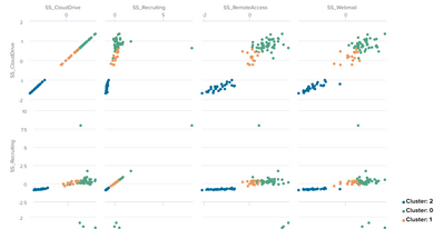
I used the "Cluster Behavior by App Usage" example in the Clustering Numeric Fields workflow within the Splunk MLTK Showcase. It produces the cluster visualization shown below. Can you help me understand the meaning of this visualization or recommend resources for understanding this visualization? How do I know which fields are clustered by looking at this? I understand the coloring has something to do with it, but there are multiple plots, and I would love some help trying to understand what this means.
Thank you so much!
Got questions? Get answers!
Join the Splunk Community Slack to learn, troubleshoot, and make connections with fellow Splunk practitioners in real time!
Meet up IRL or virtually!
Join Splunk User Groups to connect and learn in-person by region or remotely by topic or industry.
Get Updates on the Splunk Community!
Build the Future of Agentic AI: Join the Splunk Agentic Ops Hackathon
AI is changing how teams investigate incidents, detect threats, automate workflows, and build intelligent ...
[Puzzles] Solve, Learn, Repeat: Character substitutions with Regular Expressions
This challenge was first posted on Slack #puzzles channelFor BORE at .conf23, we had a puzzle question which ...
Splunk Community Badges!
Hey everyone! Ready to earn some serious bragging rights in the community? Along with our existing badges ...

