Join the Conversation
- Find Answers
- :
- Using Splunk
- :
- Splunk Search
- :
- Chart count with timespan
- Subscribe to RSS Feed
- Mark Topic as New
- Mark Topic as Read
- Float this Topic for Current User
- Bookmark Topic
- Subscribe to Topic
- Mute Topic
- Printer Friendly Page
- Mark as New
- Bookmark Message
- Subscribe to Message
- Mute Message
- Subscribe to RSS Feed
- Permalink
- Report Inappropriate Content
Chart count with timespan
I have a query that produce a sample of the results below.
| DateTime | Namespace | Type |
| 18-May-20 | sys-uat | Compliance |
| 5-May-20 | emit-ssg-oss | Compliance |
| 5-May-20 | sast-prd | Vulnerability |
| 5-Jun-20 | portal-api | Compliance |
| 8-Jun-20 | ssc-acc | Compliance |
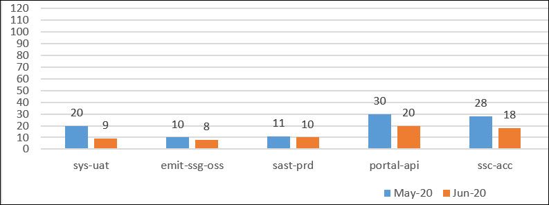
I would like to count the number Type each Namespace has over a period of time. The end result visualization chart should look like this.
This would display the count of each Namespace (grouped by day or month) based on the time picker. For eample, sys-uat has a total 20 count Types for May and 9 count Types for June. This way, I can compare the counts each Namespace has side by side.
If I do this,
| timechart span=1month count by Namespacethe Namespace is split between the months.
I want each Namespace to be displayed side by side. For example, the blue bars should be side by side instead of being split. Is there a way to do this?
Thank you.
- Mark as New
- Bookmark Message
- Subscribe to Message
- Mute Message
- Subscribe to RSS Feed
- Permalink
- Report Inappropriate Content
sample:
| tstats count where index=_internal sourcetype=splunkd* by _time span=1month sourcetype
| xyseries _time sourcetype count
viz >> Column Chart
why don't you try xyseries ?
recommend:
index=yours .....
| bin _time span=1month
| stats count by _time Namespace
| eval DateTime=strftime(_time,"%b-%y")
| xyseries DateTime Namespace count- Mark as New
- Bookmark Message
- Subscribe to Message
- Mute Message
- Subscribe to RSS Feed
- Permalink
- Report Inappropriate Content
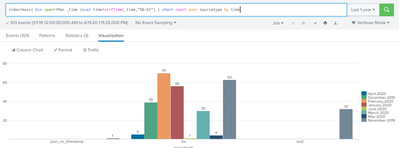
Try using Bin span to group all dates to corresponding months and chart command instead of time chart like in below snippet


