Join the Conversation
- Find Answers
- :
- Using Splunk
- :
- Splunk Search
- :
- Can anyone help me figure out how to make the foll...
- Subscribe to RSS Feed
- Mark Topic as New
- Mark Topic as Read
- Float this Topic for Current User
- Bookmark Topic
- Subscribe to Topic
- Mute Topic
- Printer Friendly Page
- Mark as New
- Bookmark Message
- Subscribe to Message
- Mute Message
- Subscribe to RSS Feed
- Permalink
- Report Inappropriate Content
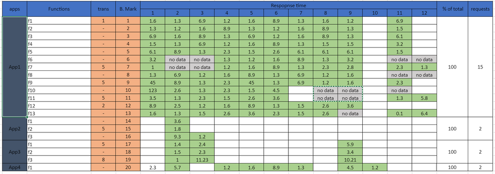
Can anyone help me figure out how to make the following visualization?
Hi All..
I have a requirement to create a table visualization which is a little complex and I am new to Splunk can anyone help me realize the above visualization ?
- Mark as New
- Bookmark Message
- Subscribe to Message
- Mute Message
- Subscribe to RSS Feed
- Permalink
- Report Inappropriate Content
Take a look at the Splunk Dashboard Examples App. There you can find an example called "Table Cell Highlighting".
After playing with that, you might see that you can color "no data" in each column to be gray, blank to be white, and the other values to their colors accordingly.
If this reply helps you, an upvote would be appreciated.
- Mark as New
- Bookmark Message
- Subscribe to Message
- Mute Message
- Subscribe to RSS Feed
- Permalink
- Report Inappropriate Content
the highlighting isn't my actual questions, sorry i am new to Splunk forums.
I wanted to have the similar stucture, whether is it possible in Splunk available dashboard visualizations or i have to learn html counterpart ? if yes. could you please point me to it I am having hard-time realizing the stucture, having one row App1 spread through 12 functions .
- Mark as New
- Bookmark Message
- Subscribe to Message
- Mute Message
- Subscribe to RSS Feed
- Permalink
- Report Inappropriate Content
To help you tune your questions to be more specific, I stand by my suggestion that you look at the Dashboard Examples App, and find if any of those examples come close to what you are looking to do. If one of the examples gets you close, then you can say what you've attempted, what the result was, and how the result you need is different. When people answer questions in Splunk Answers, that's often what they are looking for, in order to know if they can help or not.
If this reply helps you, an upvote would be appreciated.

